I rarely vote low on a shot, but cannot find anything appealing on this shot.
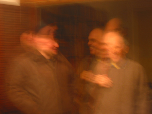
It is way off on color balance, and I am barely able to make out any details due to the long exposure blur. Fitting into the theme of communications is where?
Maybe it was intended as such, but not really something with appeal enough to have hanging on a wall. ((2))
I think this works for the guy on the right, but not so much the guy on the left. The guy on the left looks like he was smooshed, which doesn't appeal to me, while the guy on the right looks whole despite his motion blur, which does appeal to me.
I know you must have purposely set a long shutter for the effect but it just doesn’t work for me. To me it shows more disarray that communication. Just my opinion but I do have to applaud you for thinking outside of the box.
I am sorry but maybe I am just not getting it but it just looks like you just accidentally pushed the shutter and "voila", "here is my entry for this challenge".
I make a point of commenting on my lowest scores: this image is absolutly horrible...and even if this was a concept...the color balance is way off...and I fail to see the liason with the theme of the challenge







 Add photograph to your favorites
 Add photographer to your favorites


