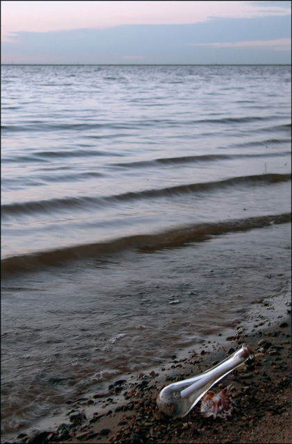
This picture is neat to look at, but goes blurry as soon as you look at the water so that is sort of distractiing. Although I would've liked to have seen the bottle not be so shiny and clean, I do like the picture.
Really like that foreground a lot just seems to fade into the background. The bottom is a ten. Now sure if you want to crop or have it more sharper the background or even more blurred. 9
GREAT idea, but the picture quality needs a litte work. Not sure what is not quite right. Waves aren't quite right maybe? I understand the low light though. Maybe an even longer exposure time to give the waves that cool blur...
Message in a bottle. Problem for me is, the message you're giving is that the bottle is secondary to the shot, and of little importance. The out of focus, blurry waves (and flat lighting), occupy too much of this photo and leave the viewer (AKA me), wanting more.
nice comp. but i do not like the bottle or the soft focus on the waves call me picky but thats what i think.(its just not the type of bottle that you would expect to see in this shot)






 Add photograph to your favorites
 Add photographer to your favorites


 Photographer found comment helpful.


