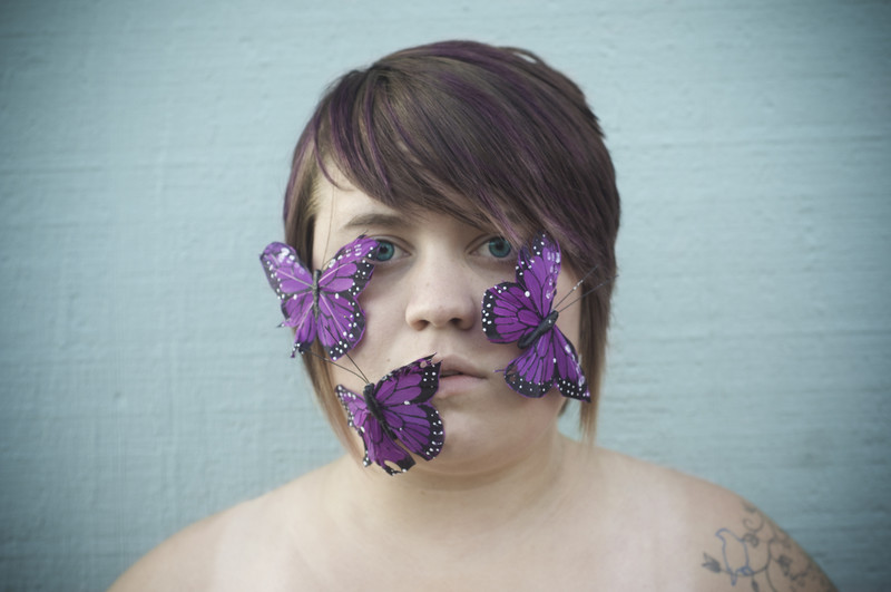
Self portrait of myself with using the secondary colors, purple and cyan. Purple is one of my favorite colors, I brightened the faded purple in my hair, and used cyan to brighten up my naturally blue eyes. The background was gray, but I used selected it, then put cyan as an overlay.
Statistics
Place: 71 out of 107 Avg (all users): 5.3288 Avg (commenters): 7.3333 Avg (participants): 5.1569 Avg (non-participants): 5.7273 Views since voting: 336 Views during voting: 149 Votes: 73 Comments: 5 Favorites: 0
Before anything else, I gotta say I love your name "Boocowski". It made me think of Charles Bukowski, one of the great Beat poets and a one-time acquaintance of mine. Of course, NOW I realize your name is actually Bukowski... I wonder, are you related? But I digress...
Anyway, there's a lot of quirky, human warmth in this image. It's poignant! It gets me making up stories about you. I like the hint of tattoo. I like that you let the butterflies partly obscure your mouth and an eye. The out-of-kilter shoulder (camera-left shoulder is lower and more sloped) adds vulnerability. Overall, it's a touching image, and nicely done in all the ways that matter on a HUMAN level.
On the DPC level, though, you have some issues. One is that the composition is so very static; DPC tends not to like static, centered compositions. Centered can sometimes be acceptable, but there has to be movement into or out of it. Here, for example, is a recently-ribboning centered composition that draws you in:
Another thing that's hurting you is a pretty sickly-looking background. I realize you used it BECAUSE of the challenge, but it's neither technically nor chromatically appealing. You might have selected all of the wall and blurred it significantly, so there was no texture, and that would have helped. We don't normally recommend blurring things into oblivion, because that means "removing major elements", but in this case there's so little texture TO the wall that it would have been acceptable.