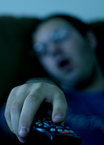
Shot tungsten in daylight, and added more blue/cyanish tint to sort of be like light from a TV. Although I'm not sure if it looks that way, or if people are going to see it the same way. I also underexposed 1 stop.
Post processing is just crop, exaggerating the blue/cyan a bit, and unsharp mask.
Statistics
Place: 250 out of 262 Avg (all users): 3.8162 Avg (commenters): 3.1111 Avg (participants): 3.5091 Avg (non-participants): 4.0247 Views since voting: 918 Views during voting: 360 Votes: 272 Comments: 11 Favorites: 0
I saw your thread on "freaking hypocrits" post and i wanted to offer you my critique to maybe help you out a little.
Composition: it works well, but could be cropped a tiny bit tighter on the top and a little looser on the bottom
Color: way too blue. I would say you should warm this up a bit for a more natural look
Focus: the fingers are clear in some locations (i see one pretty clear finger nail) and a few buttons on the remote are clear, but not enough clarity in the image. The DOF is fine for the face and body, but the hand and remote should be in more focus I would prefer
Lighting: it's a tad bit dark. Esp in bottom left and behind the ear of the person.
Contrast: could use a tiny step up
Communication: TV is communication so you meet the goal
Intrigue: It's really not that interesting to me, personally. It gets the point across, but I don't particularly feel drawn to it when looking at 50 pictures around it. It doesn't catch me and draw me in.
You know, if you didn't find my comment helpful, then I can't even begin to understand what exactly you were looking for.. Moose101 didn't say much different than I did, and some of the other people who commented were pretty helpful as well.
So, sorry I wasn't helpful, but at least I tried to be. This is one of the main reasons commenting is dropping off on this site.. poor sportsmanship from the people getting the comments, causing the commenters to just give up on it.
This could have been a really great picture, I think what you are trying to portray is a 'communication overload'. Especially now a day, TOO MUCH TV! It's everywhere, killing our brain cells one by one. I just didn't like it because of the focus and lighting, if the remote and the hand was in focus together I think this picture would have more potential. Don’t despair, just one opinion. Were all here to learn!
Perhaps you meant to go with the lighting scheme here, but it really doesn't work for me. The hand is too soft, and the remote control is hard to see. When you want your viewer focused on something, it's hard for them to respond if it's buried in the background. Also, for me, just a little weak on "communication"







 Add photograph to your favorites
 Add photographer to your favorites

 Photographer found comment helpful.


