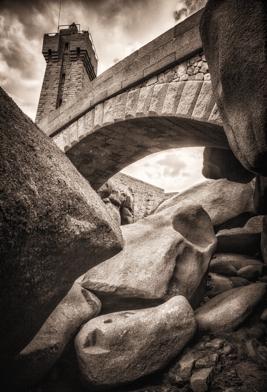
You have great sepia tones in this shot. Looking at the original it has the stairs that act as leading lines that draw the eye up to the tower that is clearly visible in it's entirety. A clear view of the tall tower and something that acts as a leading line to draw the eye to it is missing here. I do see something in this composition that had the potential to act as that leading line but it needed to be composed and framed in the shot better. The arch of the bridge would have been perfect but too much of the composition has the rocks which really don't do much for the photo as a whole. Getting at a higher angle and moving more the the right could have placed the arched bridge coming out from the right bottom corner half of the frame. It would then lead the eye to travel across the frame to where the tower would be on the left hand side. Orientation would have to be horizontal rather than vertical to get the whole of the tower in the frame with the angle I suggest. The photo has a good foundation to work from it just needed to be arranged better for greater visual impact.







 Add photograph to your favorites
 Add photographer to your favorites

 Photographer found comment helpful.


