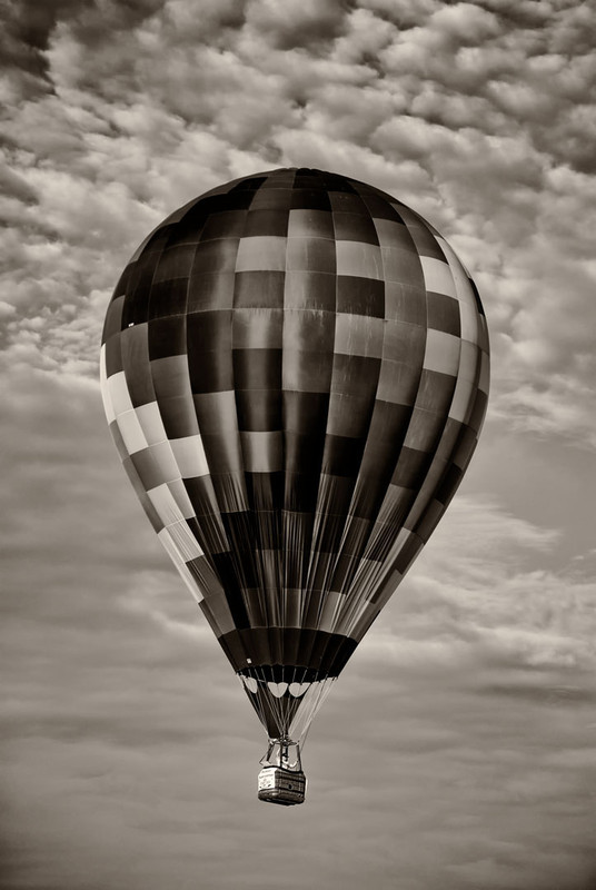
I am amazed at how this actually looks in B&W. I would have never thought the texturing of a colorful hot air balloon would look so nice and contrasty in B&W great idea and execution!
Voted earlier coming back to comment and bumping up.
Excellent tones on the air balloon that really calls my attention to the many squares that compose the design on it. I think the color version is stunning but the drawback would be you don't notice the patterns quite so boldly as one does in this B&W. So I'm torn as to which would have more visual impact. I do have one suggestion that I think would make this shot even more visually appealing. The crop. While the vertical crop complements the shape and height of the balloon it feels 'stunted'/'contained'. When I think of sailing on a balloon I think of the wide horizons and the great blue sky to sail. A horizontal crop would compliment the balloon in that it shows your audience the great horizons that can be explored.






 Add photograph to your favorites
 Add photographer to your favorites


 Photographer found comment helpful.


