| Author | Thread |
Comments Made During the Challenge  |
|
|
09/27/2004 08:56:01 PM |
|
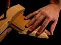
Not a bad shot but there is too much space at the top of it. A little tighter crop would have worked better. Excellent focus but the tighter crop would have even taken out the top part that is slightly out of focus. |
|
 Photographer found comment helpful. Photographer found comment helpful. |
|
|
09/26/2004 01:33:02 AM |
|
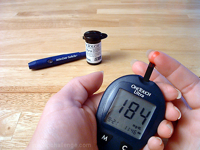
Whoa! thats too high my friend, lay off the candy! Nice photo though! Try and stay around 110! |
|
| Photographer found comment helpful. |
|
|
09/23/2004 09:36:34 AM |
|
ouch.. i feel that. docked you a bit on technical quality.. and would have liked to have seen a tighter crop. |
|
| Photographer found comment helpful. |
|
|
09/23/2004 04:58:30 AM |
|
this is a very good image, the placement of the items is excellent |
|
| Photographer found comment helpful. |
|
|
09/22/2004 06:22:31 PM |
This is pretty good as is, but I think this one might benefit from a tighter crop and a shallower DOF. I'm curious how this one would look if the hands in front were still in focus but the items in the background were blurred more?
|
|
| Photographer found comment helpful. |
|
|
09/22/2004 12:59:19 PM |
|
I can relate to that , get it down to 100 . good shot , great though 7 |
|
| Photographer found comment helpful. |
Home -
Challenges -
Community -
League -
Photos -
Cameras -
Lenses -
Learn -
Help -
Terms of Use -
Privacy -
Top ^
DPChallenge, and website content and design, Copyright © 2001-2026 Challenging Technologies, LLC.
All digital photo copyrights belong to the photographers and may not be used without permission.
Current Server Time: 06/29/2026 03:28:36 PM EDT.