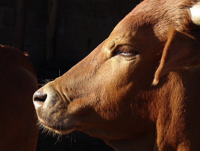
OK - here's the good news and the bad news. Good - It's a great study in texture with a perfect background. The colors are well mixed with a background that makes both the texture and the color stand out. Focus is nicely done. Bad: The composition is "ok" but the horn right on the border drawsy your eye up and out of the frame. It would be far better if you could see more of the eye and especially if the eye had a catchlight. The three white small highlights inside the eye are a bit unfortunate. Bottom line: Does it make me want to touch it? Is the study of texture strong enough to make me "feel" it? YES - but it's not my most favorite of the challenge.






 Add photograph to your favorites
 Add photographer to your favorites


