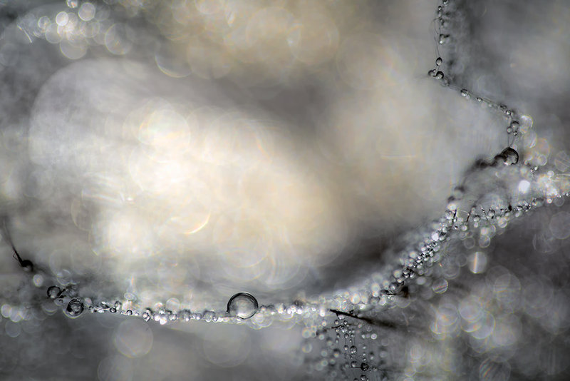
I quite like the gold tones and the contrast in the bubbles. This isn't my favorite of your images, and I can't tell you why not. But...as a technical study, I think you nailed what you were trying to accomplish.
as always Ursula, really beautiful. I love your work. Although I haven't seen it in B&W, but I can relate to what you wrote that you like it this way. I too love the soft "gold" tone in it and imagine I would miss it in a B&W conversion. Pretty all round, what more can I say?
Thanks for the additional comment Ursula. I agree, a deeper contrast usually makes an image pop more and it really works well here. I really like this image for its deep tones and subtle colors. The strings attaching some of the bubbles creates a very interesting image.
@nam, thank you very much for the suggestions. I had tried it in BW, but for me it does not work that way. As to lighten the shadows, thank you again for the suggestion, I will try it, however, I am rather satisfied with the look as it is. But thank you anyway. BTW, I have been emphasizing shadows/blacks in my colour pictures in the last few months, because of listening to Moose Peterson and looking at his work. He intensifies the blacks, and also the whites, for more contrast, to make the images pop. I've discovered that this approach really works, not always, but often. I do it in RAW conversion, which then allows me to do little editing to finish the image. I quite like that. I am talking about colour photography, not BW photography. As a friend of mine likes to say, "to have good light you have to have good shadows". Anyway :)
Love the colors. The string of pearls frames the bokeh quite wonderfully. I almost wish the string formed a shape. For some reason I thought of a dove outline, the one you see in cut-outs, when I saw this even though its not even close. Maybe it was the grays triggering my tired brain cells tonight. Either way this is quite pleasing to look. :)
Lovely lovely bokeh. Like transparent pearls as others have said. I love the gold but did you try it in black and white? And I think you might be able to lighten the shadows to good effect, too, for a different look.
A string of pearly bubbles meandering where they may. I think its fair to call this an abstract - an interpretive distillation of some quality without revealing the whole, which would have an entirely different quality.
I love grays and this one is very beautiful and should be viewed at full size as the b/g just compliments it in that mode. One day ursula I will have to entice you to explain your amazing technique in creating such lovely abstracts that always make me want to feel them against me.
This is so far, my favorite of the serie. It has a story that one can weave (the dream of the pearls going back to the source). Not just an exercise or a pleasant color combination that can go one way or another.
Everything is just the way it should be - the true essence of an art piece.
This is a bit unusual, your sunset colors have all gone to dawn. I like it, & the hint of a 'thread' to string the bubbles on, & the way the bubbles go to bokeh. A lovely visual poem, like all your work.







 Add photograph to your favorites
 Add photographer to your favorites

 Photographer found comment helpful.


