Author Thread
Post actions
I liked the border and thought it an interesting sign... very different from the ones here.
Post actions
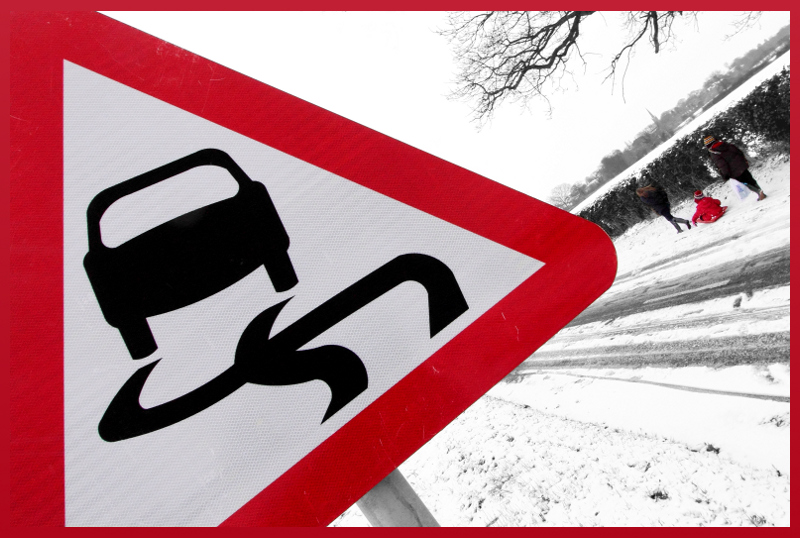
I knew that you would get more flack than credit for that border. I rated this image my highest...The only thing I would have changed this shot is too have the left border the same colour as the road sign red...and the rest of the border black. im thinking this would have created the impression that the road sign is actullly toppling through the frame strengthening the slippery theme. Just my thoughts and would be interesting to see this...maybe it would not look good not sure. Nice take on the challenge either way
Comments Made During the Challenge
Post actions
Post actions
Post actions
Post actions
Great image, I think that titled sign works really well (also in connection with the border). Great find!
Post actions
My favourite of the challenge. Well constructed and thought out. Hope this does well for you.. Voted earlier
Post actions
The angle is absolutely perfect.
Post actions
Nice and I like the boarder.
Post actions
Post actions
I like the choice to tile the camera for this one.
Post actions
I really like that you included the people in this. Nice idea (the whole photo).
Post actions
Post actions
Very good composition however I'm not sure the border helps here.
Post actions
Good concept, but the tilt is too strong IMO; the red border is a distraction.
Post actions
I love this! So... "in your face"!!





 Add photograph to your favorites
 Add photographer to your favorites

 Photographer found comment helpful.


