| Author | Thread |
|
|
08/22/2012 12:30:56 PM |
|
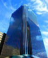
I loved this shot. Well composed. It should have finished higher in my opinion -- blue is the primary color of the image even if the actual architecture is not. Great shot. |
|
 Photographer found comment helpful. Photographer found comment helpful. |
Comments Made During the Challenge  |
|
|
08/21/2012 09:31:16 PM |
Great use of negative space! Would have voted higher if the architecture itself was blue, but still gave it a 7 because it's so striking.
*Voted earlier* |
|
| Photographer found comment helpful. |
|
|
08/21/2012 06:46:19 PM |
|
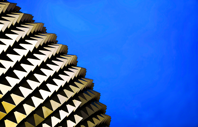
Fascinating shapes! This reminds me of a place I visited in Fremantle, Western Australia. |
|
| Photographer found comment helpful. |
|
|
08/17/2012 09:39:37 PM |
|
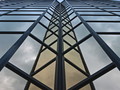
The theme is architecture in blue not blue sky. I see no blue architecture so can't give a high score. sorry.. |
|
| Photographer found comment helpful. |
|
|
08/16/2012 09:33:18 PM |
|
artistically done, but this reeks of DNMC to me, I would of preferred a building in blue, you also have some banding in the sky as well. |
|
| Photographer found comment helpful. |
|
|
08/15/2012 01:25:30 PM |
|
An interesting use of complimentary colors and patterns. |
|
| Photographer found comment helpful. |
|
|
08/15/2012 11:32:19 AM |
|
| Photographer found comment helpful. |
|
|
08/15/2012 02:55:01 AM |
|
Architecture isn't blue.. but the primary colour is. I rate it high but I wonder if others will dock you for it. Good luck! |
|
| Photographer found comment helpful. |
|
|
08/15/2012 01:56:46 AM |
|
This looks awesome. Love the contrast. |
|
| Photographer found comment helpful. |
Home -
Challenges -
Community -
League -
Photos -
Cameras -
Lenses -
Learn -
Help -
Terms of Use -
Privacy -
Top ^
DPChallenge, and website content and design, Copyright © 2001-2026 Challenging Technologies, LLC.
All digital photo copyrights belong to the photographers and may not be used without permission.
Current Server Time: 06/30/2026 10:29:56 PM EDT.