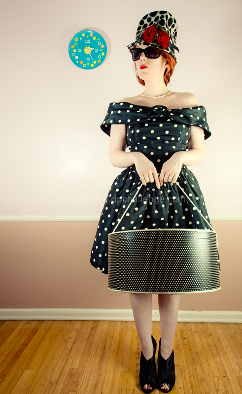
I have previously collaborated with Amanda on a fashion shoot. I was going to enter another image from our session, but after working on it for a couple of days, felt it was too "busy", even though I love the shot. This is a bit quirky and "contrived" but better reflects my particular aesthetic these days. I chose to leave the fiestaware clock in as both a reference to era and an odd color counterpoint.
convert from raw
crop
rotate
CEP classic soft focus
CEP cross process (51% opacity)
save for web
Thanks for all the amazing comments! There sure were a lot of polka dots in this challenge, LOL!
Statistics
Place: 11 out of 95 Avg (all users): 6.3486 Avg (commenters): 7.6667 Avg (participants): 6.3200 Avg (non-participants): 6.3729 Views since voting: 1753 Views during voting: 241 Votes: 109 Comments: 19 Favorites: 0
Congrats on your Sherpet award. This really is a nostalgic image. My hat boxes have been unopened on the top shelf for years. And the clock nuance is brilliant.
ANOTHER AWESOME IMAGE FOR THIS VINTAGE 11 CHALLENGE AND I AM GIVING YOU MY SHERPET RED STAR AWARD OF EXCELLENCE FOR THE VINTAGE FEELING THIS GAVE ME AS IT TOUCHED MY HEART...
being picky the crop is to close to the shoes for me making it top heavy, and the clock really adds nothing and leads my eye away. i like the pose and the outfit, shame about the highlight on the hat box. but still a very good shot, 8
LOL - nice to get some humor - that alone bumps it up. Polka dots are making a come back, I hear. All the accoutrements are fantastic except from this angle the shoes look kind of modern (just my opinion).







 Add photograph to your favorites
 Add photographer to your favorites

 Photographer found comment helpful.


