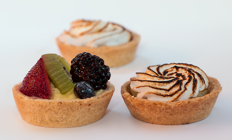
The subject is well lit and focus is crisp. Your dessert looks delicious but in judging this challenge I don't ask "Does this photo make me want to eat this?" I ask "Would I want to hang this on my wall?" This is good technically and would be a good photo for illustrating your dessert in a menu or cookbook, but the presentation is plain and it isn't that exciting for an artistic photo. A much tighter crop would make it more intriguing (most of the berry tart, and just parts of the other two).
Lighting is good on the desserts illuminating all the tasty details. As good as the image is there are a one thing that could make this even better. The arrangement of the composition seems odd - off symmetry. You have the left dessert full with colorful fruit then to balance it on the right you have the sweet treat but it is just cream and some chocolate. My eye goes right to and pretty much stays focused on the fruit tart. I feel this still life arrangement does not work so well. Those nice punches of tasty color just draws the eye's full focus. So I would play up that strength. I think the more effective arrangement would to have been a triangle arrangement where the fruit tart is front & center point while the two cream tarts rest in the back. That way we see this colorful treat and then notice the promise of sweet delights continues out to the horizon.
This is a tough challenge to vote. I'm torn between "what are you trying to do here" and "what do I expect here". Further complicating matters is the question "what would I do here".
What I would expect would be a technically strong piece of eye-candy that would present the dessert in a way that I would want to at least sample it, if not order it. Along these lines I'm looking at technicals: backgrounds, distracting elements, exposure, sharpness. I'm also looking for creativity, imagination, and originality, which can make up for less than perfect technicals.
So, where does this leave me with your image?
Nice idea, but a little over-exposed and unbalanced. You might want to play with some different compositions, such as moving the one on the right a little further back. Also play with turning the one on the left some in order to get more sense of depth (with all the fruits appearing on the same plane, it's flatter than need be). Lastly, I would have swapped the back tart with the right tart, as the darker topping is a little off-putting.
these look yummy. the composition doesn't work for me 100% think I would one of the front tarts staggered back a little the balance seems a little odd to me, that being said there is nothing wrong with this the way it is. nice food shot.





 Add photograph to your favorites
 Add photographer to your favorites


 Photographer found comment helpful.


