This is a tough challenge to vote. I'm torn between "what are you trying to do here" and "what do I expect here". Further complicating matters is the question "what would I do here".
What I would expect would be a technically strong piece of eye-candy that would present the dessert in a way that I would want to at least sample it, if not order it. Along these lines I'm looking at technicals: backgrounds, distracting elements, exposure, sharpness. I'm also looking for creativity, imagination, and originality, which can make up for less than perfect technicals.
So, where does this leave me with your image?
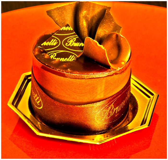
Nice idea, but the lighting is too harsh for me and the tones aren't that inviting.
lovely saturated colors, on my monitor there seems to be a lot of flecks of white like it was over-sharpened or perhaps debris on the lens which detracts from an otherwise really nice shot
The dessert is sweet but there are quite a few elements the are overwhelming the image of the treat. The treat itself has warm light and dark brown tones that are just overpowered by the gold dish and the orange backdrop. The BG should offer contrast so that the dessert can visually pop off the page. The presentation here has the dessert getting lost in color tones that do not give any good contrast to allow this dessert to shine. I am not sure if it is the lighting or processing or both but there are some harsh highlights on the ribbon and some odd hard yellow 'outline' along the edges of the curled and fan-like decorative topping on the top of the treat. If lighting then shooting with different lighting or an adjustment of White Balance on the camera can help.





 Add photograph to your favorites
 Add photographer to your favorites


 Photographer found comment helpful.


