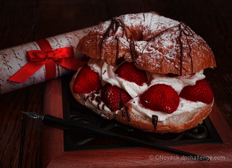
The dessert is called a Strawberry Pillow and like the picture it was very delicious to eat:-) I did another two photoshoots with a slice of Neopolitan Chocolate cake. This one with the Strawberry Pillow Dessert looked the best of the three different shoots.
[Jul. 24th, 2012 10:37:37 PM]
Thanks to all who left comments to tell me what they were 'seeing'. Looking at my finished image on the PC and on the Laptop shows all the details.
However, my husband and I went out with friends on Saturday and I asked if we could look at the image on his IPad - hmmm, details were lost on the bottom half of the image and the strawberries were indeed a bit dark.
Fiddling with the laptop I found that my image looked fine if I had the screen sitting at a 110 angle and I was sitting up straight. All square bars on the calibration bar at the very bottom of voting screen were visible.
However, if I tilted the screen to a full upright position of 90 degrees - 3 bars on the white squares to the left disappeared.
Tilt the screen 140 degrees and 3 bars on the black squares to the right disappear.
Sigh - wouldn't it be absolutely wonderful if all monitors were in a fixed position and all were calibrated the same.
Statistics
Place: 16 out of 51 Avg (all users): 5.9237 Avg (commenters): 6.0000 Avg (participants): 5.8276 Avg (non-participants): 5.9551 Views since voting: 668 Views during voting: 242 Votes: 118 Comments: 9 Favorites: 1 (view)
Looks delicious! I don't know about the notes belonging there, but I think the overall quality of the setup overshadows the odd juxtaposition of items.
Overall the image seems a bit dark. The scroll seems a little distracting and perhaps should be more blurry -- it also goes right through your subject and should have been laid so it's more up-and-down.
Why don't I get notes like these? *sighs* I'd be sweet then!
Anyhow, this is a great photo. Maybe it's my laptop monitor, but the strawberries look a bit dark. The whole things looks very, very delicious, but the ribbon pulls the attention from the actual dessert some. That could be intentional, I guess, a nice letter can be sweet as well... hmmm. Maybe the REAL dessert is in the letter?
This is a tough challenge to vote. I'm torn between "what are you trying to do here" and "what do I expect here". Further complicating matters is the question "what would I do here".
What I would expect would be a technically strong piece of eye-candy that would present the dessert in a way that I would want to at least sample it, if not order it. Along these lines I'm looking at technicals: backgrounds, distracting elements, exposure, sharpness. I'm also looking for creativity, imagination, and originality, which can make up for less than perfect technicals.
So, where does this leave me with your image?
I get the idea, but this seems to be more of a starting point than the final image. For one, it's too dark and the lighting is imbalanced. Except for the basic shape of the pen, there is no detail. For the note, the ribbon is so hot that it attracts too much attention, competing for attention rather than supporting the subject. By itself, the dessert would have been fine, if just exposed a little more.





 Add photograph to your favorites
 Add photographer to your favorites


 Photographer found comment helpful.


