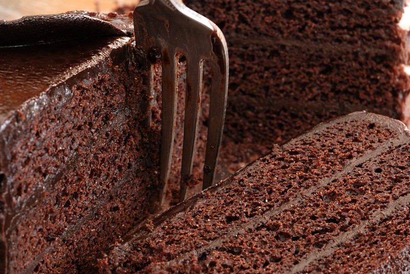
with 3 layers of cake comes with great layering... 3 slices of cake one for foreground, mid ground and background.After setting the cam the shoot started with an aperture of f/11 and ISO 400 but then I wanted more depth to show more cake and fork at mid ground. So since the subject is stationary I lower the ISO to 100 and increase the aperture to f/22 (just enough so the back cake would not be so blur and not so sharp) focused on the foreground cake (near the bottom of the fork)
custom white balance: ZeroCS white balance filter
light source: natural
post processing: brightness +25, contrast +20, unsharp mask (strength 3, radius 0.05 threshold 0)
software: GIMP
Statistics
Place: 17 out of 51 Avg (all users): 5.8824 Avg (commenters): 6.7692 Avg (participants): 5.3103 Avg (non-participants): 6.0667 Views since voting: 674 Views during voting: 246 Votes: 119 Comments: 14 Favorites: 0
Wow, this is a great close-up show off the rich texture of the chocolate cake. I like that you arranged three slices to show off the shapes and texture of the dessert rather than just a very close up shot of one slice. The arrangement adds visual interest and allows my eye to wander up and down to explore the tasty chocolate. The additional element of the fork adds to the imagery for it draws/places your audience into the scene - it is as if I have picked up the fork and am digging in. I do have 2 critiques. First is that I think the fork would look better if it was clean of any chocolate - it plays into the saying 'the first bite is always the best'. I think that giving your audience the impression of getting the first bite will make the mouth water with anticipation of tasting the cake as opposed to an impression that we have already had several bites & and are getting full. Lastly the condensation on the chocolate frosting on the left slice calls gives the top layer a 'bumpy' texture and sheen. Keep the impression of a dessert being rich, silky and smooth. I know picky picky right:-) But the devil is in the details - if you do all you can to make it look dazzling then it will. By lightly brushing the areas with a Q-tip or tissue paper you will absorb the moisture off of the chocolate without wrecking the dessert.
I really like your cropping choice and the composition moves the eyes around the image well and there's good depth. There isn't a lot of variation in the color, though. Maybe white frosting would have looked nice and provided more contrast in the image.
This is a tough challenge to vote. I'm torn between "what are you trying to do here" and "what do I expect here". Further complicating matters is the question "what would I do here".
What I would expect would be a technically strong piece of eye-candy that would present the dessert in a way that I would want to at least sample it, if not order it. Along these lines I'm looking at technicals: backgrounds, distracting elements, exposure, sharpness. I'm also looking for creativity, imagination, and originality, which can make up for less than perfect technicals.
So, where does this leave me with your image?
Not a bad idea, but a couple qualms. It's a little too tight. I see what it is, but it's so in-your-face that it leaves little to the imagination. My biggest problem, though, is the dirty fork. I don't want to eat anything after someone else has had their fork in it.





 Add photograph to your favorites
 Add photographer to your favorites


 Photographer found comment helpful.


