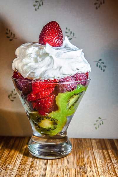
Could of different issues here: First, you horizon is a bit tilted, so it looks a bit off kilter. And many times a shot can be better simply by moving your subject farther away from your background. Also, I think your color looks a little off -- the whipped cream has a definite blue tinge to it. Other than that, the dessert looks delicious! :)
It looks delicious! Overall it's nicely lit and photographed and has good colors, but the presentation is fairly plain. The pattern in the wallpaper only serves to distract from the subject.
Love the presentation of the colorful fruits in the tapered glass. Whipped cream is laid on good and thick with a strawberry on top to finish it off. The prep and presentation 'on the plate' of the dessert if pleasing to the eye. The areas that need work to improve the appeal of the overall photo composition is lighting and choice of backdrop/ground plane. First off the lighting is not evenly balanced throughout the composition resulting in deep harsh shadows thrown on the backdrop and some glaring 'hotspots' highlights on the berries in the glass on the top right and a bit on the strawberry on top. Two lights, one on either side a few feet away could even out the exposure, use of natural light streaming in from a window so that it is diffused or even a light tent (some easy and inexpensive how to make ones are online). The choice of backdrop and setting which the main subject appears in/on can either compliment the image or detract. The light grain and striped texture of the wood distracts attention away from your main focus. A deep dark wood or wood with no texture stripes would be better in that it would not call attention away from the image. The backdrop also suffers from this in that it does not add anything to the dessert other than call attention away from it. The focus should stay on your main subject with all other elements be supporting cast that helps add mood or complementing it in subtle ways.
Great lighting, focus, and color on the dessert. I think a more daring angle would have added a lot, and a solid background and tabletop would have made this one really pop.
This is a tough challenge to vote. I'm torn between "what are you trying to do here" and "what do I expect here". Further complicating matters is the question "what would I do here".
What I would expect would be a technically strong piece of eye-candy that would present the dessert in a way that I would want to at least sample it, if not order it. Along these lines I'm looking at technicals: backgrounds, distracting elements, exposure, sharpness. I'm also looking for creativity, imagination, and originality, which can make up for less than perfect technicals.
So, where does this leave me with your image?
Nice idea, but needs a little more attention to detail. Always check your horizon and rotate so that your lines are straight. Also, your background is a bit distracting; a simple piece of poster board or even printer paper could solve that. The thing is to capture your subject in such a way that the focus is squarely on your subject, without any thing in the image to distract the viewer away from it. Keep working at it - you're not too far off.
The base and background took away from the impact of the dessert itself. The glass seems level, but the horizontal line is crooked which also throws off the image. (But, you could make this dessert for me anytime! It just begs tp be eaten.)





 Add photograph to your favorites
 Add photographer to your favorites


 Photographer found comment helpful.


