| Author | Thread |
|
|
09/09/2004 07:12:20 AM |
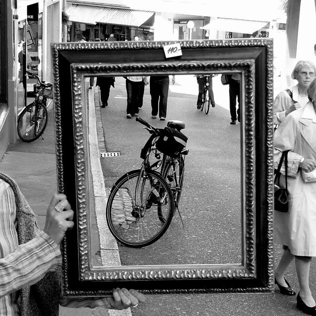
My chief concern with this image is that it's just too busy. You had a great idea, and it was perfect for the challenge. The problem was the conflicting elements that draw you away from the focus of the shot. The second bike outside the frame is distracting. Additionally the cutoff legs at the top of the frame don't add much, and in many ways distract me from the bike.
Waiting just a few minutes more until a body was in the frame with the bike could have made this far stronger. Still great timing on the overall capture. |
|
 Photographer found comment helpful. Photographer found comment helpful. |
|
|
09/09/2004 07:05:09 AM |
Thanks for the comments :)
I'm really happy with the pic and feel that I captured more or less exactly what I wanted. I appreciated that it would not be to everyone's tastes on dpc, but i don't mind :)
Darren |
|
|
|
09/08/2004 06:52:15 AM |
I thought this was a fantastic image. I've no idea why it got any votes less than 5 as it meets the title of the challenge so well.
I guess there must be people out there who have a mouth full of sour grapes and can't stand it when somebody does something they wish they had. The shame is that they have membership of DPC. Maybe if your name was Bill Brandt or Cartier Bresson it would be praised as an example of raw street photography. It seems you have to have a 'name' to be able to break the compositional rules. That's progress eh! |
|
| Photographer found comment helpful. |
Comments Made During the Challenge  |
|
|
09/07/2004 10:54:56 PM |
|
| Photographer found comment helpful. |
|
|
09/07/2004 09:28:40 PM |
|
A cute concept which provokes a smile even as it is being shot. Bumping to 6 |
|
| Photographer found comment helpful. |
|
|
09/07/2004 03:50:54 PM |
|
Nice one....symmetry too. |
|
| Photographer found comment helpful. |
|
|
09/07/2004 02:34:28 AM |
|
simply the best - this composition is stunning, alive and yet a moment of framed stillness sits there amongst the busy street scene, truly an exceptional shot! |
|
| Photographer found comment helpful. |
|
|
09/07/2004 01:49:16 AM |
I was wondering if someone would do something like this! It works OK in this example, but it's too busy. There are too many unneeded elements in the shot. It would probably be OK if all the peds were outside (or inside) the frame...
TC |
|
| Photographer found comment helpful. |
|
|
09/06/2004 11:19:59 PM |
|
I love this image. Contrasts galore, between the squares and the circles, the darks and the lights - so much to look at. Your eyes never seem to stop: the people are only partly there and moving, there are reflections in the windows, there's a foreground a background and an "around the corner" to think about. The detail is really nice. It's a fun image to examine. Oh, yeah - and there is a frame! Congratulations. |
|
| Photographer found comment helpful. |
|
|
09/05/2004 08:55:00 PM |
|
Cute idea. I'd like to see this with the woman's face on the right cropped out. She is the only woman I can see, and I find it distracting. Better none than one, if the subject is the frame and the bike. Great exposure and tones. |
|
| Photographer found comment helpful. |
|
|
09/04/2004 10:23:46 PM |
|
great idea, and very nice shot |
|
| Photographer found comment helpful. |
|
|
09/04/2004 08:41:04 PM |
|
This has a great deal of appeal. The clarity is all around excellent; many interesting textures are visible throughout the image. The contrast is just right. Lovely! |
|
| Photographer found comment helpful. |
|
|
09/03/2004 11:16:31 PM |
|
Excellent. Love the old fashoned feel here. Got to be in the top 10, hopefully a ribbon :) |
|
| Photographer found comment helpful. |
|
|
09/03/2004 03:34:53 AM |
Everithing outsitde the frame is useless ... My opinion ...
Good luck. |
|
| Photographer found comment helpful. |
|
|
09/02/2004 05:21:55 PM |
|
This to me is a great (though not original) idea that has not been executed as well as it could have. Why do I say that? Because, if one uses a frame to highlight a segment of the overall image, there should be some discernable compositional strength to what is included within that frame. Whilst I like the inclusion of the bike, and it's lower left position within the frame, I really dislike the inclusion of a series of anonymous legs. I also don't like the way the curb fights for attention with the left vertical of the frame. I also can't see that what is outside of the frame adds much to the image - those women at the right are quite distracting. I think it would be nice to have the frame used to isolate one small detail or scene (the bike would work) within a larger scene (the street) but ensure that interior and exterior both had interest and strength. If this doesn't make sense, just drop me a line, though I'm offline for a week so don't be upset if you don't get an immediate response. :o) |
|
| Photographer found comment helpful. |
|
|
09/02/2004 03:14:08 PM |
Might seem a bit obvious for the challenge....but I think it works incredibly well and the fact that you see the person holding the frame and the people in the street just adds to the effect. I love how the line of the kerb runs all the way up the frame.
A nice touch keeping the price tag on..judging from the style of the 1`s, this is somewhere in Europe...France or Spain ?
Excellent work...9 |
|
| Photographer found comment helpful. |
|
|
09/02/2004 10:09:53 AM |
|
| Photographer found comment helpful. |
|
|
09/01/2004 10:51:49 AM |
|
This is an awesome idea and shot. I think a bit closer cropping would have really made it though. You could have cut out most of the overexposure at the top and the women's face to the right which draws away from your subject and doesn't add anything. Great job. |
|
| Photographer found comment helpful. |
|
|
09/01/2004 05:25:06 AM |
|
Well done, like the idea! |
|
| Photographer found comment helpful. |
|
|
09/01/2004 02:41:15 AM |
|
good idea, like that you didnt crop the background |
|
| Photographer found comment helpful. |
|
|
09/01/2004 02:34:42 AM |
|
Take of the pricetag next time, even if you just borrow the frame from the shop. |
|
| Photographer found comment helpful. |
|
|
09/01/2004 01:27:43 AM |
|
Very cool idea. (8) Good luck... |
|
| Photographer found comment helpful. |
Home -
Challenges -
Community -
League -
Photos -
Cameras -
Lenses -
Learn -
Help -
Terms of Use -
Privacy -
Top ^
DPChallenge, and website content and design, Copyright © 2001-2026 Challenging Technologies, LLC.
All digital photo copyrights belong to the photographers and may not be used without permission.
Current Server Time: 06/28/2026 08:40:45 AM EDT.