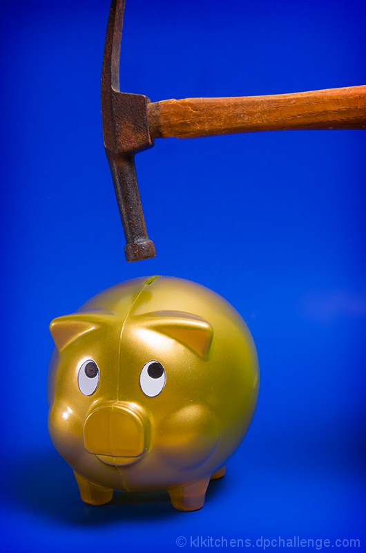
I pretty much agree with the other comments - hammer "in motion" would have helped, intense blue background, over-intense lighting, etc.
But for me, it is the inconsistencies in the image that make that tiny shade of difference between good and great. For example, it isn't the blue that is the problem, it is that the blue takes the image out of the realm of reality; it is that the blue's interaction with the gold of the piggy and the almost-too-red tone of the hammer don't quite mesh nicely.
Also, you have a shiny piggy bank with a non-shiny hammer. Contrasting materials can be used to great effect, but that doesn't seem to be the case here.
Your above 5.5 score accurately reflects the crispness of the image, good lighting, lack of harsh shadows, and many other elements your image absolutely nails.
5.9's not a bad score, I gave it a 5 at the time but it is one of those shots I probably could have given 6 easily. Probably not higher though, it's crisp and snappy but that detail brings out the plastic look of the bank and the old look of the hammer (they kind of don't match). The blue dosen't bother me at all.
I generally agree with the other post-challenge comments, but I did have to mention that I loved how the piggy bank was "looking" up at the hammer! Overall, nice take on the challenge.
Nicely composed and lit, but the image was very static (the hammer really needed to be 'in motion') and there were at least two other entries of very similar style in the challenge.
As others have said, the electric blue background is pretty harsh, but i found that it did cause the bank to really stand out as the focal point here.
A slight blur in the hammer could add a greater sense of urgency to this and take the eyes from watching something hanging over him to being scared of the oncoming blunt object trying to destroy him.
The only other thing i'd say is that the lighting seems to be a bit too intense as there's glaring reflections on the bank - a more muted light source to provide even light would've helped with that. (i've been getting a lot of light criticism on my own photos, it seems to be truly one of the hardest parts to master).
I like everything about the shot except the harsh blue BG. The lighting is great and the shot itself is sharp but the BG takes away from an otherwise excellent idea and execution. As someone else said, the fact that the piggies eyes are looking up toward the hammer is perfect. I didn't vote in the challenge but if I had I would have given this a 6 probably a 7 or 8 with a different BG.
This photo didn't really excite me too much. Perhaps due to the cheap plastic piggy bank and a not very interesting hammer. I also felt the blue background was a bit too intense. The subject matter looks like it should look less static - perhaps a bit of motion blur on the hammer would have improved it. Technically, the focussing looks spot on but the photo just didn't warm to me.
Everybody talks about the Sword of Damocles, what people don't know is that there's also a Hammer of Damocles - it's always hanging just above your money.
Fits the bill perfectly as far as the theme of the challenge is concerned. It is well photographed technically but other then that has no visual impact or anything that makes it more then average to me. 5






 Add photograph to your favorites
 Add photographer to your favorites

 Photographer found comment helpful.


