| Author | Thread |
|
|
01/06/2003 08:14:21 AM |
Critique Club
Initial thoughts
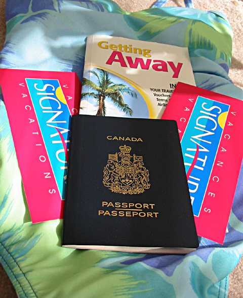
Good colour, interesting content, composition a little static.
Composition/ Content
The content is good – I like the strong colours and the very strong connection to the challenge. The background of sarong and sand is also very appropriate.
For me the composition is a little less satisfactory – I don’t have anything against centred compositions but it just seems a little boring in this case. However I do like the way the lines of the passport, book and tickets converge towards the back/ top of the image – it makes the viewpoint a little more interesting.
Background
As above, very appropriate and appealing colours and textures – wouldn’t mind a touch more sand.
Camera Work - Technical
Looks good to me…
Digital Processing - Technical
Ditto…
Fits The Challenge
Very much so.
Your Opinion On The Photo
I like the colours and the content but find the composition doesn’t feel quite right.
|
|
Comments Made During the Challenge  |
|
|
01/05/2003 07:24:25 PM |
|
It's either too cluttered or cropped to tightly. I can't decide which. I think cluttered, because it appears you used two copies of the same brochure; maybe to make it look like more? One or two brochures is enough. And the background bothers me. Again if zoomed back more we could see that it is a bathing suit laying on something else. These are just personal opinions. Still I'd give this a 6 |
|
|
|
01/05/2003 04:45:08 PM |
|
Pretty bathing suite (??). Good composition, and excellent crisp focus and lighting. I like how the sand beneath (or carpet that looks like sand) contributes to the message. Hope you had a good time? |
|
|
|
01/05/2003 12:56:51 AM |
|
When are we leaving??? Like how the colors came out! |
|
|
|
01/04/2003 07:54:12 PM |
|
very, very crisp. on the negative side, i find the crop a tad narrow. Is that a bathing suit under the passport/ If so, would have been good to see more of it. Dealer's choice. |
|
|
|
01/03/2003 08:38:45 AM |
|
Meets the challenge. Nice color, focus and lighting are good. 7 waltoml. |
|
|
|
01/02/2003 08:07:59 PM |
|
I like the using of the bathing suit and the passport tapers back nicely but the (4) items all centered seem too much. Maybe just one ticket so the items would be (3) would make more of an impact..technically well done. |
|
|
|
12/30/2002 05:16:33 PM |
|
Like the idea of putting the stuff on a swimsuit. But it looks a bit too much setup and uncomplete in a way. Technically it is ok, but there it doesn't appeal so much. 7 |
|
|
|
12/30/2002 03:02:47 AM |
|
The color is really nice to see |
|
Home -
Challenges -
Community -
League -
Photos -
Cameras -
Lenses -
Learn -
Help -
Terms of Use -
Privacy -
Top ^
DPChallenge, and website content and design, Copyright © 2001-2026 Challenging Technologies, LLC.
All digital photo copyrights belong to the photographers and may not be used without permission.
Current Server Time: 06/28/2026 07:47:37 PM EDT.