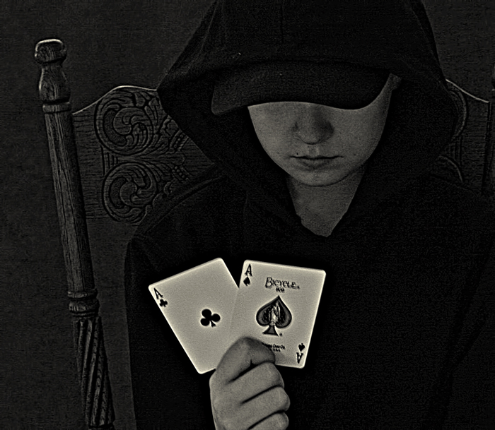
This is a great concept, but I am distracted by the graininess of the photo and the blur on the cards. I think if the noise was toned down a bit it would be more powerful.
the composition is there and I like the chair you chose and the idea of concealing the face of the subject to put the focus on the playing cards but the lighting isn't there at all. The image is very very flat and dull. I can see you tried fixing it with some HDR tone mapping but I feel that it isn't necessary for this shot. There is also a weird contrast between a vintage photo and super modern playing cards and the kid wearing a baseball cap. Again I think why this image isn't successful is mainly because of poor lighting.







 Add photograph to your favorites
 Add photographer to your favorites


 Photographer found comment helpful.


