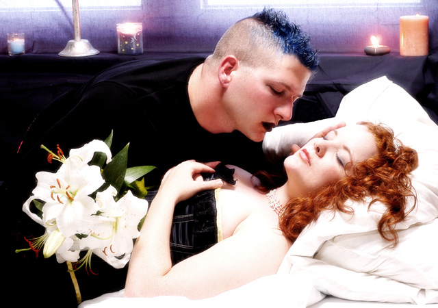
The day I read we had a Fairy Tale challenge I ran straight to the Libary and got as many picture fairy Tale books I could find. I decided to use the drawing from a book of Sleeping Beauty retold and illustrated by Mercer Mayer.
I was going to use a studio to shoot this, but decided that using an acual bedroom would give me more natural lighting and better props. (Unless I wanted to disassemble a bed and set it up in a studio many miles away)
After taking the photo, I moved it to Adobe Photoshop where I used curves, cropped it, and softened it. That's about all I did to this one.
Statistics
Place: 30 out of 104 Avg (all users): 5.9151 Avg (commenters): 7.3500 Avg (participants): 5.7846 Avg (non-participants): 5.9728 Views since voting: 1851 Views during voting: 494 Votes: 212 Comments: 26 Favorites: 1 (view)
AHHHH I LOVE THIS. It's so perfect. I love the very very dark darks and the very white whites. I love the purple textured bit at the top... yeah, this is just fantastic.
I openly picked this one for the red in the associated recent thread. I thought it was the hippest image and certain to score. Do not despair, you are talented and your port looks good. Will look forward to more of your work.
This is quite the modern take on Sleeping Beauty! I love the colours of this, and the wonderful contrast between the whites surrounding her and the blacks surrounding him. The cool tones in the background give this a nice atmosphere and compliment the blue hair; I'm glad you chose a relatively light background in favour of a dark one, which would have swallowed him up. Very nice work :)
Brought to date with class and style. There is some loss of texture specially apparant where the pillow blends right unto the forehead. Regardless, the image is one of the most exciting and certain to ribbon. At least I hope so, otherwise I want my money back. .lol Ay least you have my 7
very refreshingly modern idea about the 'same old same old' theme - I would have liked a little less brightness allover though in order for the sheets to not be overexposed
Love the idea, but the composition seems off somehow. His black shirt seems to leave too much dead space on the left side of the image, and the tips of the windows at the top are distracting. The lighting is great, though.
Very nice - I like how the light is on her, makes it look magical. The lips on the "prince" adds a twist that I like. I think that the light across the top of the background is distracting.
Get rid of the freakish prince with the freshly and rather poorly died blue hair (no offense if it's you, I actually died my hair blue black for this challenge too but then ended up going black and white anyway :) and you have yourself a winning photo here.





 Add photograph to your favorites
 Add photographer to your favorites

 Photographer found comment helpful.


