| Author | Thread |
|
|
07/22/2012 09:53:09 PM · #1 |
 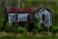
I have a tendency to make my pictures to dark when I edit them. I like them that way but I would like some of your opinions!
Thanks
Message edited by author 2012-07-22 21:55:42. |
|
|
|
07/22/2012 10:04:28 PM · #2 |
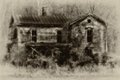
I think the darker one suits the subject better in this case. For something else I probably would find it too dark.
|
|
|
|
07/22/2012 10:06:15 PM · #3 |
You're gonna hate me... Sorry!
My honest opinion here is that even the lightest one is much too dark, the tonemapping feels heavy handed, and both are oversatured in a strange sort of way (topaz adjust's color functions I'm guessing)... It combines to make the image look strange, soft and kinda glowy...
In any case, it's a nice subject, but I'm not loving the processing. Forgive me.
Cheers,
-Cory
*(FYI-Other than the darkness, there is a group of folks who love this look...)
ETA:
Apparently there are some fans of the darkness too..
Originally posted by Yo_Spiff:
I think the darker one suits the subject better in this case. For something else I probably would find it too dark. |
Message edited by author 2012-07-22 22:07:34. |
|
|
|
07/22/2012 10:10:57 PM · #4 |
Originally posted by Cory:
It combines to make the image look strange, soft and kinda glowy...
In any case, it's a nice subject, but I'm not loving the processing. Forgive me. |
Looks a bit like the glamor glow look I get from Color Efex. Maybe a bit heavy handed, but I presume it's what she was going for. How about a moody b/w for this?
|
|
|
|
07/22/2012 10:12:10 PM · #5 |
| I'm one for a lighter hand, too. In this case I think it looks as if you have followed the steps to create a digital Orton look. If that is the case, I would back off on the amount of blur (10 or at the most 15) and the opacity of the layer after you apply multiply (60% or lower - I often go 40%). You will still have the rich, soft glow which you like but it won't be as heavy. I do think this subject is a nice candidate for that technique though others would work as well. |
|
|
|
07/22/2012 10:26:48 PM · #6 |
Originally posted by Yo_Spiff:
Originally posted by Cory:
It combines to make the image look strange, soft and kinda glowy...
In any case, it's a nice subject, but I'm not loving the processing. Forgive me. |
Looks a bit like the glamor glow look I get from Color Efex. Maybe a bit heavy handed, but I presume it's what she was going for. How about a moody b/w for this? |
For me? A grainy b&w treatment, ala Nik Silver Efex, would make this image really rock, and would suit the subject far better.
But.. That's me, for her, she said she loves this look, so, I guess it's awesome if you want the strange soft-glowy feel, cause it nails that perfectly. |
|
|
|
07/22/2012 10:28:58 PM · #7 |
Originally posted by Cory:
Originally posted by Yo_Spiff:
Originally posted by Cory:
It combines to make the image look strange, soft and kinda glowy...
In any case, it's a nice subject, but I'm not loving the processing. Forgive me. |
Looks a bit like the glamor glow look I get from Color Efex. Maybe a bit heavy handed, but I presume it's what she was going for. How about a moody b/w for this? |
For me? A grainy b&w treatment, ala Nik Silver Efex, would make this image really rock, and would suit the subject far better.
But.. That's me, for her, she said she loves this look, so, I guess it's awesome if you want the strange soft-glowy feel, cause it nails that perfectly. |
Could you show me an example? |
|
|
|
07/22/2012 10:39:02 PM · #8 |
Originally posted by meow:
Could you show me an example? |
Just a quickie here,
|
|
|
|
07/22/2012 10:45:08 PM · #9 |
Originally posted by Yo_Spiff:
Originally posted by meow:
Could you show me an example? |
Just a quickie here,
|
I like this,thanks! |
|
|
|
07/23/2012 07:20:44 PM · #10 |
The photo looks like one of those surrealistic HDR images. Everyone has their own tastes but personally i think its a bit too soft and over saturated.The edited one however does seems to be quite breath taking.
still with a little tweaks i think you can get an amazing look in the first one |
|
|
|
07/25/2012 01:13:35 PM · #11 |
I love them both but under different lighting situations. The first one is perfect for a normally lit wall but the second one would really "pop" in a darker room with a halogen spot on it with a low intensity beam.
Beautiful work!! |
|
|
|
07/25/2012 07:02:52 PM · #12 |
I like the lighter one better. However, I can't help but think what it would look like in a rustic processing. More detail instead of blur and possibly some noise. Let the structure speak for it's self. Just my opinion based on your title and possible details that may have been lost in blur.
Scott |
|
Home -
Challenges -
Community -
League -
Photos -
Cameras -
Lenses -
Learn -
Prints! -
Help -
Terms of Use -
Privacy -
Top ^
DPChallenge, and website content and design, Copyright © 2001-2024 Challenging Technologies, LLC.
All digital photo copyrights belong to the photographers and may not be used without permission.
Current Server Time: 05/05/2024 01:03:03 PM EDT.


