| Author | Thread |
|
|
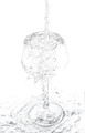
03/25/2022 08:32:33 AM · #1 |
Hi all,
I don't care about how this finished in the challenge, but I'm curious about people's reactions to it.
I found it fascinating that the water basically defined the glass, and I liked the movement of it. I wasn't at all happy with the angle -- I would have rather have been shooting straight on, instead of the downward angle. But it was in the sink, and I couldn't raise it up and still have it work.
It thought it was interesting, but, on average, people found it quite "meh" compared to the top 10 shots and not particularly comment worthy.
So I'm curious what was lacking? Is it the angle? The processing (I had an awful time with that and will start another thread on that shortly. I'd post the problems here, but I'm more curious as to people's reactions to the shot.), the subject?
Feel free to rip it apart. I don't care about it's placement in the challenge. It's more that this type of shot fascinates me, and usually my tastes run more main stream. :)
Thanks!
 |
|
|
|
03/25/2022 08:48:51 AM · #2 |
I spent two seconds looking at it and moved on.
There's nothing that holds my attention.
A lot of the interesting aspects of the water are lost with the lack of contrast. |
|
|
|
03/25/2022 09:00:46 AM · #3 |
Originally posted by Venser:
I spent two seconds looking at it and moved on.
There's nothing that holds my attention.
A lot of the interesting aspects of the water are lost with the lack of contrast. |
Yup -- see the white processing thread. You're right. I would have been better off leaving the blotchy background problem alone. The more contrasty one has much more interest. |
|
|
|
03/25/2022 11:40:35 AM · #4 |
Wendy, you wrote that you "found it fascinating that the water basically defined the glass." I liked the image because, to my way of observation, there wasn't any glass at all, just the water in the shape of a glass. These impressions are rather similar. Furthermore, I was most tickled by the shapes within the glass. My overall take is that there are seeds pouring down, which grow to become flowers within the bowl, roots twine down the stem and finally anchor themselves in the earth. Probably too fanciful.
In any case, it is a co-favorite with Ammie's image, "Overflowing." Both were given 8's. |
|
|
|
03/25/2022 01:23:18 PM · #5 |
| I gave it an 8 as well. For all the reasons you and the pigeon like it: there IS no glass, and the water movement is very absorbing. More contrast probably would have helped you. I'm not entirely surprised the voters didn't like it more, but it's one of the more worthy entries, certainly more worthy than my rather cliched take on the topic. In my defense, I haven't done a glass-and-refraction shot before :-) |
|
|
|
03/25/2022 01:27:54 PM · #6 |
Here's a very quick take at a contrastier version...
 |
|
|
|
03/25/2022 03:47:00 PM · #7 |
Originally posted by streetpigeon:
Wendy, you wrote that you "found it fascinating that the water basically defined the glass." I liked the image because, to my way of observation, there wasn't any glass at all, just the water in the shape of a glass. These impressions are rather similar. Furthermore, I was most tickled by the shapes within the glass. My overall take is that there are seeds pouring down, which grow to become flowers within the bowl, roots twine down the stem and finally anchor themselves in the earth. Probably too fanciful.
... |
that is what I wanted to say. Bear's version makes it ordinary, less fanciful. |
|
|
|
03/25/2022 10:55:17 PM · #8 |
Originally posted by tnun:
that is what I wanted to say. Bear's version makes it ordinary, less fanciful. |
I didn't do a very good job of explaining myself :-( *I* prefer the dreamier version and I gave it an 8, I was opining that a contrastier version might have *scored* better with the voters as a whole. |
|
|
|
03/26/2022 02:04:15 AM · #9 |
|
|
|
03/26/2022 12:27:32 PM · #10 |
Thanks! If there is anyone that gave it a 5 or below, I would be curious to hear your thoughts.
It was interesting, I went to an artshow last night, and spoke to the artist who judged the show. I completely and totally didn't understand his choice for third place. So I asked him about it. It was very interesting to hear his take on things. I do wish we did more post-challenge critiques.
If people wonder why participants score lower than non-participants, this challenge may be a good example.
I thought the difficultly with this challenge was using a clear glass clear water, with specific instructions not to tint the water. So even though Kasaba's entry was lovely, I gave it a 5, because I felt that having a colored background too away a lot of the difficulty of the challenge and felt like it was bypassing the no colored water. Although I usually only subtract a point or two for not meeting the challenge, so I gave it a 5. Grahamgator's shot was completely lovely, but there was so much going on, it seemed like the glass of water was almost an afterthought. However, in looking at it now, I judged way too quickly, and didn't even notice the complex reflection that's absolutely incredible. I love that you get the window reflection on the table and not in the glass. I'm finding that very intriguing and should have scored it much higher than the 7 that I gave it.
I wasn't all that impressed with the images this time around. My highest scores give were to Markwiley -- incredibly creative and fits the challenge wonderfully. Ytshuva, distantcolors, and skewsme.
Highest vote give - 8 lowest vote given - 5 |
|
|
|
03/26/2022 06:17:24 PM · #11 |
Okay, I gave you a 5, so I suppose I'd better tell you why. To me it looks scratchy, like a pencil sketch but without particular artistic merit. If it had a bit more contrast and a bit more structure and a bit more smoothness - after all, water and glass are smooth - I'd have given you more. I don't particularly love the centralized, vertical composition so it still wouldn't have made my top few. Sorry for being harsh - that's why I didn't leave a comment in the beginning.
By the way, there was no mention about colour in the background in the challenge description. I'm pretty sure, as you downvoted the winner, you would have downvoted me too on that point. |
|
|
|
03/26/2022 06:19:13 PM · #12 |
Originally posted by vawendy:
Hi all,
I don't care about how this finished in the challenge, but I'm curious about people's reactions to it.
I found it fascinating that the water basically defined the glass, and I liked the movement of it. I wasn't at all happy with the angle -- I would have rather have been shooting straight on, instead of the downward angle. But it was in the sink, and I couldn't raise it up and still have it work.
It thought it was interesting, but, on average, people found it quite "meh" compared to the top 10 shots and not particularly comment worthy.
So I'm curious what was lacking? Is it the angle? The processing (I had an awful time with that and will start another thread on that shortly. I'd post the problems here, but I'm more curious as to people's reactions to the shot.), the subject?
Feel free to rip it apart. I don't care about it's placement in the challenge. It's more that this type of shot fascinates me, and usually my tastes run more main stream. :)
Hi. Late to this thread. My 2 cents is only based on my personal experience with high key - they just don�t generate much interest.
Thanks!
|
|
|
|
|
03/26/2022 09:21:47 PM · #13 |
Originally posted by jomari:
Okay, I gave you a 5, so I suppose I'd better tell you why. To me it looks scratchy, like a pencil sketch but without particular artistic merit. If it had a bit more contrast and a bit more structure and a bit more smoothness - after all, water and glass are smooth - I'd have given you more. I don't particularly love the centralized, vertical composition so it still wouldn't have made my top few. Sorry for being harsh - that's why I didn't leave a comment in the beginning.
By the way, there was no mention about colour in the background in the challenge description. I'm pretty sure, as you downvoted the winner, you would have downvoted me too on that point. |
That�s not harsh - it�s a good critique and what I was hoping for, (I�m too tired to rewrite that sentence so it doesn�t end with a preposition) I�m was just curious what people saw when looking at it. I appreciate.
As to yours, I gave you a 5. It wasn�t because of the colored background. It was just with all the colors, and with all the facets, and then the colors in the facets, it ended up feeling very busy. It�s rather odd, but it makes me feel a little uncomfortable, like it�s stressing me a bit. I almost wish that the glass on the left wasn�t there to give my eyes a little bit of a resting spot. It�s kind of funny, when reading your comments on mine � I was thinking the blacks were too heavy in yours and perhaps a bit less contrast would work better.
Thanks again � this is the type of back and forth that helps me a lot. |
|
|
|
03/26/2022 10:46:39 PM · #14 |
Originally posted by vawendy:
I thought the difficultly with this challenge was using a clear glass clear water, with specific instructions not to tint the water. So even though Kasaba's entry was lovely, I gave it a 5, because I felt that having a colored background too away a lot of the difficulty of the challenge and felt like it was bypassing the no colored water. Although I usually only subtract a point or two for not meeting the challenge, so I gave it a 5. Grahamgator's shot was completely lovely, but there was so much going on, it seemed like the glass of water was almost an afterthought. However, in looking at it now, I judged way too quickly, and didn't even notice the complex reflection that's absolutely incredible. I love that you get the window reflection on the table and not in the glass. I'm finding that very intriguing and should have scored it much higher than the 7 that I gave it.
I wasn't all that impressed with the images this time around. My highest scores give were to Markwiley -- incredibly creative and fits the challenge wonderfully. Ytshuva, distantcolors, and skewsme. |
Hoping you only took off 1/2 since half of my water wasn�t tinted due to the background LOL |
|
|
|
03/26/2022 11:34:01 PM · #15 |
Originally posted by ErinKirsten:
Originally posted by vawendy:
I thought the difficultly with this challenge was using a clear glass clear water, with specific instructions not to tint the water. So even though Kasaba's entry was lovely, I gave it a 5, because I felt that having a colored background too away a lot of the difficulty of the challenge and felt like it was bypassing the no colored water. Although I usually only subtract a point or two for not meeting the challenge, so I gave it a 5. Grahamgator's shot was completely lovely, but there was so much going on, it seemed like the glass of water was almost an afterthought. However, in looking at it now, I judged way too quickly, and didn't even notice the complex reflection that's absolutely incredible. I love that you get the window reflection on the table and not in the glass. I'm finding that very intriguing and should have scored it much higher than the 7 that I gave it.
I wasn't all that impressed with the images this time around. My highest scores give were to Markwiley -- incredibly creative and fits the challenge wonderfully. Ytshuva, distantcolors, and skewsme. |
Hoping you only took off 1/2 since half of my water wasn�t tinted due to the background LOL |
Didn�t take anything off. I thought you melded the two beautifully. Best of both worlds. :)
Message edited by author 2022-03-26 23:34:27. |
|
|
|
03/27/2022 01:08:02 AM · #16 |
Originally posted by vawendy:
Originally posted by ErinKirsten:
Originally posted by vawendy:
I thought the difficultly with this challenge was using a clear glass clear water, with specific instructions not to tint the water. So even though Kasaba's entry was lovely, I gave it a 5, because I felt that having a colored background too away a lot of the difficulty of the challenge and felt like it was bypassing the no colored water. Although I usually only subtract a point or two for not meeting the challenge, so I gave it a 5. Grahamgator's shot was completely lovely, but there was so much going on, it seemed like the glass of water was almost an afterthought. However, in looking at it now, I judged way too quickly, and didn't even notice the complex reflection that's absolutely incredible. I love that you get the window reflection on the table and not in the glass. I'm finding that very intriguing and should have scored it much higher than the 7 that I gave it.
I wasn't all that impressed with the images this time around. My highest scores give were to Markwiley -- incredibly creative and fits the challenge wonderfully. Ytshuva, distantcolors, and skewsme. |
Hoping you only took off 1/2 since half of my water wasn�t tinted due to the background LOL |
Didn�t take anything off. I thought you melded the two beautifully. Best of both worlds. :) |
I was totally be facetious - I hadn�t even considered not coloring the water through a colored backdrop, as long as it was uniform from the backdrop through the glass - I LOVE seeing how other�s interpret the challenges!
Message edited by author 2022-03-27 01:08:57. |
|
|
|
03/27/2022 09:30:11 AM · #17 |
Originally posted by ErinKirsten:
Originally posted by vawendy:
Originally posted by ErinKirsten:
Originally posted by vawendy:
I thought the difficultly with this challenge was using a clear glass clear water, with specific instructions not to tint the water. So even though Kasaba's entry was lovely, I gave it a 5, because I felt that having a colored background too away a lot of the difficulty of the challenge and felt like it was bypassing the no colored water. Although I usually only subtract a point or two for not meeting the challenge, so I gave it a 5. Grahamgator's shot was completely lovely, but there was so much going on, it seemed like the glass of water was almost an afterthought. However, in looking at it now, I judged way too quickly, and didn't even notice the complex reflection that's absolutely incredible. I love that you get the window reflection on the table and not in the glass. I'm finding that very intriguing and should have scored it much higher than the 7 that I gave it.
I wasn't all that impressed with the images this time around. My highest scores give were to Markwiley -- incredibly creative and fits the challenge wonderfully. Ytshuva, distantcolors, and skewsme. |
Hoping you only took off 1/2 since half of my water wasn�t tinted due to the background LOL |
Didn�t take anything off. I thought you melded the two beautifully. Best of both worlds. :) |
I was totally be facetious - I hadn�t even considered not coloring the water through a colored backdrop, as long as it was uniform from the backdrop through the glass - I LOVE seeing how other�s interpret the challenges! |
I know you were being facetious, but I actually loved that you had that twist of colored/not colored water. Plus the yellow was a fun choice. :) |
|
|
|
03/27/2022 10:01:28 AM · #18 |
Without reading other comments, so please excuse any duplication...
First response - the processing is not consistent with the subject. Water is typically thought of as having a smooth surface, but the way you processed it makes it looks like it has a sand-paper like surface texture - especially across the opening of the glass. Further, the texture isn't consistent - dippled here, smooth there.
Second response - it is a bit too expected. The glass is right side up. It is centered in the frame. Nothing really catches one's curiosity.
What I like: The splashing / overflowing water makes multiple shapes. Nice stop-action shot. You did it all without color (which the ribbon winners used to capture the eye). |
|
|
|
03/27/2022 10:04:13 AM · #19 |
| [user]Bear[/user]'s version addresses my 1st response - at least the look is consistent throughout. Also, the processing kind-of brings out "eyes" in the overflow. |
|
|
|
03/27/2022 11:54:46 AM · #20 |
Originally posted by dtremain:
Without reading other comments, so please excuse any duplication...
First response - the processing is not consistent with the subject. Water is typically thought of as having a smooth surface, but the way you processed it makes it looks like it has a sand-paper like surface texture - especially across the opening of the glass. Further, the texture isn't consistent - dippled here, smooth there.
Second response - it is a bit too expected. The glass is right side up. It is centered in the frame. Nothing really catches one's curiosity.
What I like: The splashing / overflowing water makes multiple shapes. Nice stop-action shot. You did it all without color (which the ribbon winners used to capture the eye). |
Cool , thanks! |
|
|
|
03/27/2022 10:56:44 PM · #21 |
Originally posted by vawendy:
Originally posted by jomari:
Okay, I gave you a 5, so I suppose I'd better tell you why. To me it looks scratchy, like a pencil sketch but without particular artistic merit. If it had a bit more contrast and a bit more structure and a bit more smoothness - after all, water and glass are smooth - I'd have given you more. I don't particularly love the centralized, vertical composition so it still wouldn't have made my top few. Sorry for being harsh - that's why I didn't leave a comment in the beginning.
By the way, there was no mention about colour in the background in the challenge description. I'm pretty sure, as you downvoted the winner, you would have downvoted me too on that point. |
That�s not harsh - it�s a good critique and what I was hoping for, (I�m too tired to rewrite that sentence so it doesn�t end with a preposition) I�m was just curious what people saw when looking at it. I appreciate.
As to yours, I gave you a 5. It wasn�t because of the colored background. It was just with all the colors, and with all the facets, and then the colors in the facets, it ended up feeling very busy. It�s rather odd, but it makes me feel a little uncomfortable, like it�s stressing me a bit. I almost wish that the glass on the left wasn�t there to give my eyes a little bit of a resting spot. It�s kind of funny, when reading your comments on mine � I was thinking the blacks were too heavy in yours and perhaps a bit less contrast would work better.
Thanks again � this is the type of back and forth that helps me a lot. |
Thank you, too, Wendy. Feedback is good. |
|
|
|
03/28/2022 07:17:40 PM · #22 |
I am so late to this and I missed this challenge but my 2cents. I do not think high key works when there is any degree of detail. I rather like it when the
composition is minimal or the lines are sweeping and not in need of contrast. To me, this is too tentative.... I love that you are experimenting and clearly it
worked for some people.. I've looked at it for a long time and it just does not sing, unlike most of your work. |
|
|
|
03/28/2022 08:18:40 PM · #23 |
Originally posted by MeMex2:
I am so late to this and I missed this challenge but my 2cents. I do not think high key works when there is any degree of detail. I rather like it when the
composition is minimal or the lines are sweeping and not in need of contrast. To me, this is too tentative.... I love that you are experimenting and clearly it
worked for some people.. I've looked at it for a long time and it just does not sing, unlike most of your work. |
I like that reason, "it doesn't sing". That actually explains a lot.
|
|
|
|
03/29/2022 02:27:26 PM · #24 |
Originally posted by vawendy:
It thought it was interesting, but, on average, people found it quite "meh" compared to the top 10 shots and not particularly comment worthy. |
You've got it backwards. "Meh" gets high votes and interesting gets downvoted. Your shot was interesting. |
|
|
|
03/29/2022 03:05:21 PM · #25 |
Originally posted by posthumous:
Originally posted by vawendy:
It thought it was interesting, but, on average, people found it quite "meh" compared to the top 10 shots and not particularly comment worthy. |
You've got it backwards. "Meh" gets high votes and interesting gets downvoted. Your shot was interesting. |
:) |
|


