| Author | Thread |
|
|
03/18/2010 07:21:58 PM · #26 |
Ah, yes. Another take on "Fine Art" Here's mine:
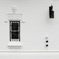
Three
First there are three major objects in the picture. Then each of the objects is made up of three or multiples of three parts. There are 3 or multiples of 3 bars in two, a lock in the 3rd.
The placement of the three objects in the frame tends to keep the viewer in the frame (not overlooking the bit of red in the lantern).
Ruminating on the significance of bars, threes and lock, it might be possible to read your own thoughts and awareness through this picture.
That's all. But as far as I'm concerned, that is also Art (with a capital "A".)
In any event that is why I submitted this in a Fine Art Challenge.
|
|
|
|
03/18/2010 07:29:16 PM · #27 |
Originally posted by Spork99:
 Louis's comment "Nice as urban/street, not quote "fine art" though" raises another "issue" (for lack of a better word). What is art to one, may not be art to another. Is street photography "fine art". Why or why not? What constitutes "Fine Art"? I'm sure there was some big thread before the challenge, discussing exactly that...I dunno. Louis's comment "Nice as urban/street, not quote "fine art" though" raises another "issue" (for lack of a better word). What is art to one, may not be art to another. Is street photography "fine art". Why or why not? What constitutes "Fine Art"? I'm sure there was some big thread before the challenge, discussing exactly that...I dunno.
I'm not trying to call Louis out or get into some kind of philosophical pissing match over whose definition of art is "right". |
I think street photography can be fine art. As I said to DrAchoo or somebody, in my opinion anything can be fine art, but the fine art genre is greedy -- the classification of what is fine art goes one way. So whereas some street photography may be fine art, not all is, and certainly one wouldn't call fine art "street photography".
When I commented on the challenge (I didn't vote), many of my comments were similar to the one I left you: "This isn't fine art to me." Here's the definition I used: fine art is that genre of photography that attempts to intentionally meaningfully connect to a population of viewers. For me, an artistic photograph carries the weight of a punch, and to be considered as fine art, must have resonance with the viewer. The best way to achieve this is through metaphor, but not in-your-face metaphor -- that's boring. "Oblique" metaphor, or the message that does not appear to be a message, is the best way. This is possible with all genres, including abstract. There were many abstracts in the challenge that I thought were extremely impacting, like  zeuszen's for example. zeuszen's for example.
I know for a fact that this is all very esoteric, and certainly only one person's opinion, and so I agree that a fine art competition is problematic. I do think it's worthwhile, though, if for nothing but to generate dialogue about the way people view imagery, specifically photographs. |
|
|
|
03/18/2010 07:39:32 PM · #28 |
Originally posted by Louis:
The best way to achieve this is through metaphor, but not in-your-face metaphor -- that's boring. "Oblique" metaphor, or the message that does not appear to be a message, is the best way. |
Most of the jury's top finishers, particularly the very top finishers couldn't be any more "in your face" if they smacked you in the nose with their camera. Of course, IMNSHO. |
|
|
|
03/18/2010 07:47:57 PM · #29 |
Originally posted by scarbrd:
Originally posted by Louis:
The best way to achieve this is through metaphor, but not in-your-face metaphor -- that's boring. "Oblique" metaphor, or the message that does not appear to be a message, is the best way. |
Most of the jury's top finishers, particularly the very top finishers couldn't be any more "in your face" if they smacked you in the nose with their camera. Of course, IMNSHO. |
Maybe. I didn't like the first blue -- I thought it was kind of manipulative or sentimental for my taste -- but I was blown away by the second blue they awarded, per my comments on it. Personally I didn't particularly dig any of the others awarded, except for one. And imo there were other photos that were more deserving of awards and honourable mentions. But I feel that way with the official results of almost every challenge. |
|
|
|
03/18/2010 08:30:11 PM · #30 |
 I don't really know if this is considered Fine Art. I had other ideas but because of a back injury several weeks ago, I can't really get out to shoot anything except out the car window. So...Tina is putting new stuff on the walls around the bathtub and it looked like this when she took the old stuff off. The chrome and the grunge just attracted me. I liked it tilted because I liked the way the faucets looked and I especially liked the lines from the caulk. I decided to put the razor where those lines meet just to add to the grungy look. Oh...and I love the "h". I have always liked shooting things that evoke feelings of nostalgia and this does. Looks like it did for a few people that commented on it too. Or...it all might be the strong pain meds I'm on! LOL I don't really know if this is considered Fine Art. I had other ideas but because of a back injury several weeks ago, I can't really get out to shoot anything except out the car window. So...Tina is putting new stuff on the walls around the bathtub and it looked like this when she took the old stuff off. The chrome and the grunge just attracted me. I liked it tilted because I liked the way the faucets looked and I especially liked the lines from the caulk. I decided to put the razor where those lines meet just to add to the grungy look. Oh...and I love the "h". I have always liked shooting things that evoke feelings of nostalgia and this does. Looks like it did for a few people that commented on it too. Or...it all might be the strong pain meds I'm on! LOL
Would you consider this "fine art" or did I miss the whole idea? |
|
|
|
03/19/2010 11:29:08 AM · #31 |
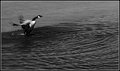
I was going for an old school arty B&W film look on this one (which apparently was not what the challenge was about). The texture of the ice (which is what is in the background -- it is even mentioned in the title) and the motion of the splash gives it a grainy feel, but there is actually no grain/noise in the photo. I thought that the slight blur of the wings gave it a feeling of joy as the birds are heading north and returning to their ponds as the ice melts.
Then again maybe it is just a photo of a bird playing in the water. |
|
|
|
03/19/2010 11:46:21 AM · #32 |
Originally posted by Louis:
I know for a fact that this is all very esoteric, and certainly only one person's opinion, and so I agree that a fine art competition is problematic. I do think it's worthwhile, though, if for nothing but to generate dialogue about the way people view imagery, specifically photographs. |
I think wording it Fine Art put people out or on guard a bit, made the second guess what they do. If the Challenge was just called "Art" you would have had a Free Study. I mean...what isn't Art? Almost anything camera related has some artistic qualities...even some snapshots which aren't considered art could be seen in an artistic light if you dig a little. So, anything with artistic qualities, however slim would have fit into an Art Challenge...without much effort.
If you look at what the Challenge produced there was a wide range styles and things entered BUT there was something in the imagery that did set it far apart from Free Study work and certainly the perennial Challenge winning shots. There's no comparison between the two on the whole so, people must have had some idea of the differences OR the images would have looked exactly the same as a Free Study. That's testimony enough...
I doubt that image would ever have captured a Blue unless people weren't thinking on a completely different line and posthumous' entry would never have placed 12th. We can discuss art...Fine Art, whatever but the wording of the Challenge did bring people to an unusual place by DPC standards. It might have made some people uncomfortable but that was necessary and the effect was undeniable.
Everyone should also keep in mind that this was new ground for many people and they had only a quick weeks time to produce something they had just began thinking about. Imagine what they will come up with in 5 years time if they dedicate themselves more this type of expression? Time was a bit of an enemy and IMHO has little place in this type Challenge...
Message edited by author 2010-03-19 12:01:22. |
|
Home -
Challenges -
Community -
League -
Photos -
Cameras -
Lenses -
Learn -
Help -
Terms of Use -
Privacy -
Top ^
DPChallenge, and website content and design, Copyright © 2001-2026 Challenging Technologies, LLC.
All digital photo copyrights belong to the photographers and may not be used without permission.
Current Server Time: 07/25/2026 11:04:57 AM EDT.


