| Author | Thread |
|
|
12/07/2009 01:28:24 PM · #26 |
Originally posted by glad2badad:
Another consideration in shooting B&W and what you see in the final output, is the use of filters. A yellow filter was standard in most camera bags when shooting B&W film. I know in digital conversion the application of red/green/blue filters can really make an obvious difference and impact on the image. |
I like to use a very pale/soft blue in my duotones......
|
|
|
|
12/07/2009 01:34:21 PM · #27 |
|
Color is great for design. It can cover up just about every flaw and give even the most empty of vessels buoyancy to the casual eye, hence it's great appeal in the commercial landscape. Now B/W strip it's subject matter of everything down to it's raw being. It's nude photography. It's understandable that people are skeptical of b/w photography because we live in a society that fears the unknown. We like our burqas. |
|
|
|
12/07/2009 01:38:04 PM · #28 |
Originally posted by yanko:
We like our burqas. |
!!! |
|
|
|
12/07/2009 02:11:49 PM · #29 |
Originally posted by Melethia:
Originally posted by jasonlprice:
Don't go shooting b/w jpgs only and try to convert to color :) |
LOL!!! I suppose you could paint them... :-) |
B&W original (scan of film/print):  Retouched final: Retouched final:  |
|
|
|
12/07/2009 02:12:35 PM · #30 |
Originally posted by NikonJeb:
Originally posted by glad2badad:
Another consideration in shooting B&W and what you see in the final output, is the use of filters. A yellow filter was standard in most camera bags when shooting B&W film. I know in digital conversion the application of red/green/blue filters can really make an obvious difference and impact on the image. |
I like to use a very pale/soft blue in my duotones......
|
That's not actually what he's referring to, Jeb. He's talking about how much you can manipulate the tonality of a scene by choosing which color channels to amp and which to mute in the conversion to monochrome. It's the digital, PP equivalent of using red, yellow, green etc filters when shooting with B/W film; it greatly effects the tonality of the B/W image.
For just the most obvious example, using a red filter when shooting B/W is the equivalent of using preponderantly the Red channel in converting, and this has the effect of rendering anything blue much darker. Thus, in landscape photography, the skies become much darker and the shadows (usually lit by reflected blue skylight) become very rich and deep. If, on the other hand, you use a BLUE filter whilst shooting the same landscape, or convert with primarily the blue channel, you get a LIGHTER sky and the shadows are much less contrasty.
So there's a lot of previsualization that needs to take place, if you're seriously shooting B/W. For my money, it's MUCH harder to shoot B/W than color, there's MUCH less margin for error and sloppy visualization...
R. |
|
|
|
12/07/2009 03:02:25 PM · #31 |
Originally posted by scalvert:
Originally posted by jasonlprice:
I shoot in b/w mode (in RAW), so I can say this is definatly the case with me. Every once in a while I will revert my RAW file back to color to hide the black and white "imperfections". |
You've got some grayt images in your portfolio. ;-) |
Thanks! Gray is my favorite color. |
|
|
|
12/07/2009 03:07:33 PM · #32 |
I can see how you might come to this conclusion, but if you're just getting started, I'm thinking that perhaps you haven't played around with this very much. I am completely amazed at how difficult it is to come up with a good B&W image. I thought all I had to do was to remove the color. Or, to play with the color channels and get something even better. NOPE! There are definitely images that work better in black and white and definitely images that work better in color. For some of us, it is a learning process. We like the photo, it doesn't feel quite right, we think perhaps it would be better in black and white. In my case, it's only better in black and white about 5% of the time.
B&W is truly an art form. That's why I keep telling  Melethia that she's such an incredible photographer. She just gets it. I'm still learning. So if it's the case that someone turns something into B&W just because they didn't like the color version. That's ok. They're learning of what a good b&w photo consists. Then at some point, they'll reach the day when they know when they take the picture, "this should be in b&w". That's what DPC is about; learning to be a better photographer. The conversion to b&w didn't make it a good picture. It already was a good picture. They just learned what style works best. Melethia that she's such an incredible photographer. She just gets it. I'm still learning. So if it's the case that someone turns something into B&W just because they didn't like the color version. That's ok. They're learning of what a good b&w photo consists. Then at some point, they'll reach the day when they know when they take the picture, "this should be in b&w". That's what DPC is about; learning to be a better photographer. The conversion to b&w didn't make it a good picture. It already was a good picture. They just learned what style works best. |
|
|
|
12/07/2009 03:19:38 PM · #33 |
Originally posted by Melethia:
Originally posted by jasonlprice:
Right, the only difference between shooting in RAW color and RAW b/w is what you see on the camera's viewfinder..it is RAW after all. It is the same way when you shoot just raw (not RAW+JPG). Don't go shooting b/w jpgs only and try to convert to color :) |
LOL!!! I suppose you could paint them... :-) |
Yeah painting works...

|
|
|
|
12/07/2009 04:06:32 PM · #34 |
Originally posted by Melethia:
Heck, I *think* in B&W.... |
Yeah - apparently some models didn't come with full colour until the 1960's . .
:- P
Message edited by author 2009-12-07 16:07:05. |
|
|
|
12/07/2009 04:15:07 PM · #35 |
Originally posted by NikonJeb:
There are some things that just won't translate to B&W...[e.g.] flowers... |
Robert Mapplethorpe. |
|
|
|
12/07/2009 04:16:03 PM · #36 |
Originally posted by Jedusi:
Originally posted by Melethia:
Heck, I *think* in B&W.... |
Yeah - apparently some models didn't come with full colour until the 1960's . .
:- P |
Oh... oh... you are indeed fortunate, you old geezer, you, that I am leaving this side of the Atlantic soon.... |
|
|
|
12/07/2009 04:18:40 PM · #37 |
Originally posted by stewzdaman:
Converting to B&W is one method I have noticed being used more and more... |
:-)
What does this mean, really?
;-) |
|
|
|
12/07/2009 04:20:49 PM · #38 |
Originally posted by Zigomar:
Originally posted by stewzdaman:
Converting to B&W is one method I have noticed being used more and more... |
:-)
What does this mean, really?
;-) |
Shhh.... it means we're winning... :-) |
|
|
|
12/07/2009 05:19:50 PM · #39 |
Originally posted by stewzdaman:
This is just an opinion/observation ;
Some say B&W photography is an art form, and I agree. It works in many situations. However, looking at the last several challenges, I notice many people are using B&W conversions to hide imperfections in color qualiy of the original photo.
I am by no means an top flight photographer myself, still learning and have a long way to go. However, IMO when more effort is spent in the developement / correction of the photo rather than in taking the photo itself I feel it is going against the spirt of the challenge.
Converting to B&W is one method I have noticed being used more and more and I am curious if these photos would be judged the same if they were in the orignial color form.
Maybe it is time for a color ruleset - like color only / B&W only, or mixed to go along with basic/advanced editing. |
Interesting statement. I presume you've discovered this through your own images?
As already stated, if you don't see the original version, it is difficult to compare.
B&W is not a cover up of "imperfect colours", imho.
B&W gives more meaning, more body to a photograph which is lending itself to it. It underlines the story, gives it more breath.
Some photographs become stronger by it.
|
|
|
|
12/07/2009 05:35:50 PM · #40 |
Originally posted by yanko:
Color is great for design. It can cover up just about every flaw and give even the most empty of vessels buoyancy to the casual eye, hence it's great appeal in the commercial landscape. Now B/W strip it's subject matter of everything down to it's raw being. It's nude photography. It's understandable that people are skeptical of b/w photography because we live in a society that fears the unknown. We like our burqas. |
Wow....like...deep man:)
Richard, can I have whatever you're having? |
|
|
|
12/07/2009 05:55:36 PM · #41 |
Originally posted by MichaelC:
Originally posted by yanko:
Color is great for design. It can cover up just about every flaw and give even the most empty of vessels buoyancy to the casual eye, hence it's great appeal in the commercial landscape. Now B/W strip it's subject matter of everything down to it's raw being. It's nude photography. It's understandable that people are skeptical of b/w photography because we live in a society that fears the unknown. We like our burqas. |
Wow....like...deep man:)
Richard, can I have whatever you're having? |
Unfortunately, I think the drug is just called yanko. :P |
|
|
|
12/07/2009 06:13:05 PM · #42 |
I don't think it's "hiding," it's just seeing in a different light. Like infrared - do you know how light those trees really are? No, but they sure as hell look white in IR. Same goes for B&W - you take what you SHOT, and you process it until it's transformed into you SAW.
I may see a whole lot of colors, and may need to combine exposures (HDR) to show what I saw. I may see a few simple shapes, and I may have to take out color variations to emphasize those shapes (B&W). I'm just showing you what I saw, I'm not "hiding reality." I'm just skewing your viewpoint a bit so that what you see matches what I saw. Photography is pretty deceptive, and I think you're thinking of it as too much of a super strict medium rather than a "as the photographer saw it" medium. Try to see it as it's presented and assume it's the way the photographer saw it.
Message edited by author 2009-12-07 18:15:25. |
|
|
|
12/07/2009 06:51:20 PM · #43 |
Originally posted by george917:
I don't think it's "hiding," it's just seeing in a different light. Like infrared - do you know how light those trees really are? No, but they sure as hell look white in IR. Same goes for B&W - you take what you SHOT, and you process it until it's transformed into you SAW.
I may see a whole lot of colors, and may need to combine exposures (HDR) to show what I saw. I may see a few simple shapes, and I may have to take out color variations to emphasize those shapes (B&W). I'm just showing you what I saw, I'm not "hiding reality." I'm just skewing your viewpoint a bit so that what you see matches what I saw. Photography is pretty deceptive, and I think you're thinking of it as too much of a super strict medium rather than a "as the photographer saw it" medium. Try to see it as it's presented and assume it's the way the photographer saw it. |
I agree but I think the best word to use is experienced. Saw comes with too much baggage. |
|
|
|
12/07/2009 06:59:40 PM · #44 |
Originally posted by yanko:
Originally posted by george917:
[my whole post] |
I agree but I think the best word to use is experienced. Saw comes with too much baggage. |
I was speaking figuratively, of course... but I could see how someone could think I was just colorblind and literally saw shapes and no colors. So yes, I do agree - experienced is the right word. |
|
|
|
12/07/2009 07:16:08 PM · #45 |
Originally posted by NikonJeb:
There are some things that just won't translate to B&W...[e.g.] flowers... |
Originally posted by Louis:
Robert Mapplethorpe. |
Well.....if you go to this site: //www.mapplethorpe.org/portfolios/
There are 36 truly fine images of his....two are in color....wanna guess what the subjects are?
My point is in some images you just cannot translate the soft color of the perfect color in nature.
Not that this is any incredible image or anything, but how could you ever convey the soft lavender beauty of this flower in B&W?

|
|
|
|
12/07/2009 07:26:34 PM · #46 |
Originally posted by NikonJeb:
Originally posted by NikonJeb:
There are some things that just won't translate to B&W...[e.g.] flowers... |
Originally posted by Louis:
Robert Mapplethorpe. |
Well.....if you go to this site: //www.mapplethorpe.org/portfolios/
There are 36 truly fine images of his....two are in color....wanna guess what the subjects are?
My point is in some images you just cannot translate the soft color of the perfect color in nature.
Not that this is any incredible image or anything, but how could you ever convey the soft lavender beauty of this flower in B&W?
|
B&W photography is about light, and tone. EVERY subject can be rendered for light and tone. There are many, many fine examples of flower photography done in B&W. In a search for such things, I even came across some beautiful examples of sunsets in B&W.
Obviously, if you want to convey the color of something in a photograph, you don't use B&W, but even subjects where 'color' would seem to be the main point, ie: crayons, or rainbows, you can still use B&W to some astounding tonal effects.
Don't get stuck in the mentality that you 'cannot translate' anything. You can, it's just that when you do, you are doing so for different reasons. |
|
|
|
12/07/2009 07:55:50 PM · #47 |
Originally posted by K10DGuy:
Originally posted by NikonJeb:
Originally posted by NikonJeb:
There are some things that just won't translate to B&W...[e.g.] flowers... |
Originally posted by Louis:
Robert Mapplethorpe. |
Well.....if you go to this site: //www.mapplethorpe.org/portfolios/
There are 36 truly fine images of his....two are in color....wanna guess what the subjects are?
My point is in some images you just cannot translate the soft color of the perfect color in nature.
Not that this is any incredible image or anything, but how could you ever convey the soft lavender beauty of this flower in B&W?
|
B&W photography is about light, and tone. EVERY subject can be rendered for light and tone. There are many, many fine examples of flower photography done in B&W. In a search for such things, I even came across some beautiful examples of sunsets in B&W.
Obviously, if you want to convey the color of something in a photograph, you don't use B&W, but even subjects where 'color' would seem to be the main point, ie: crayons, or rainbows, you can still use B&W to some astounding tonal effects.
Don't get stuck in the mentality that you 'cannot translate' anything. You can, it's just that when you do, you are doing so for different reasons. |
Example? |
|
|
|
12/07/2009 09:31:39 PM · #48 |
Originally posted by K10DGuy:
Obviously, if you want to convey the color of something in a photograph, you don't use B&W, but even subjects where 'color' would seem to be the main point, ie: crayons, or rainbows, you can still use B&W to some astounding tonal effects. |
I'm not disputing the beauty of B&W for tones, textures, light & shadows....that would be ridiculous.
Originally posted by K10DGuy:
Don't get stuck in the mentality that you 'cannot translate' anything. You can, it's just that when you do, you are doing so for different reasons. |
I will always be "Stuck in the mentality that you cannot translate" lavendar; that subtle fade of the colors themselves in the skies of change at the beginning and end of the day......you'll never convince me that you can. I know what the colors are like and it's just not the same with the tone shift.
This isn't too bad, though I still prefer the color version.....the detail, texture, and the beauty of the shape of the flower carry the image just fine.
 
But there's just no way anyone will convince me that this will ever translate....I'm sorry, but the color shift is what makes this image for me.

I'm decidedly no expert on B&W shots, and I've all too recently discovered the beauty of its use and applications. I have some images that just don't look right in color.....but I also have the reverse. Each has its place and IMNSHO, they're not automatically interchangeable.
ETA: Someone take this image and make it into a B&W and try and convey lavender....it's a Workshop image here....

Message edited by author 2009-12-07 21:40:00.
|
|
|
|
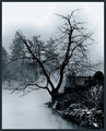
12/07/2009 09:37:53 PM · #49 |
|
I like my black and white and think when i use black and whites it is more powerful to the shot |
|
|
|
12/07/2009 09:58:27 PM · #50 |
Originally posted by NikonJeb:
I'm decidedly no expert on B&W shots, and I've all too recently discovered the beauty of its use and applications. I have some images that just don't look right in color.....but I also have the reverse. Each has its place and IMNSHO, they're not automatically interchangeable. |
That's a far cry from the claim that flowers "do not translate", to use your words, into black and white. Mapplethorpe's lilies and other flower photographs are considered not just some of his finest work, but the finest work of their kind. |
|
Home -
Challenges -
Community -
League -
Photos -
Cameras -
Lenses -
Learn -
Help -
Terms of Use -
Privacy -
Top ^
DPChallenge, and website content and design, Copyright © 2001-2026 Challenging Technologies, LLC.
All digital photo copyrights belong to the photographers and may not be used without permission.
Current Server Time: 07/26/2026 03:56:37 AM EDT.


