| Author | Thread |
|
|
10/08/2009 07:28:32 PM · #1 |
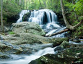
This was my submission to the September Free Study. Of course it did not do as well as I expected (5.57). I received one comment about a lack of enough contrast. Is it the composition, is it too flat, just why did it fall short? I know free studies are tough, but my tendency is to vote higher for a good image regardless of how other images appear.....and this one failed me.
 |
|
|
|
10/08/2009 07:34:28 PM · #2 |
Probably the biggest issue is that it's a bit overexposed.
Like you said, people seem to be fairly critical on Free Studies in particular, so shots really need to have a "wow" factor to score really well. Other than being overexposed, there's nothing really wrong with this... it's just something that people have seen many, many times here and lacks the zing to make it stand out. |
|
|
|
10/08/2009 07:39:29 PM · #3 |
| I gave it a 6, as it was good and deserved a vote on the positive side, but I agree it lacked the wow-factor that tends to grab the higher votes. |
|
|
|
10/08/2009 07:42:24 PM · #4 |
There are a few areas of improvement. I have done a quick edit so you can compare.

1 - The running water draws my attention to the left, yet there is quite a bit of negative space on the right hand side. I would have turned the camera a bit to the left to follow the flow of the river. Alternatively, cropping out the right hand side helps the eye flow through the photo.
2 - DPC loves over processed images. Your photo feels a little overexposed, as well as under processed.
3 - I find some sharpening, and a frame always add to the presentation.
4 - The water is a little overexposed in comparison to the surroundings. In the future, using a circular polarizer or some ND filters can help reduce the difference in exposures.
I hope you find these helpful. If you have any questions, feel free to pm me. |
|
|
|
10/08/2009 07:52:09 PM · #5 |
Hi Randy,
A score of 5.57 is pretty much right in the middle of the possible score range (5.5 is the middle of a 1-10 scale). It's a technically competent image, perhaps a touch overexposed but not troublingly or unforgivably so.
Technicals aside, a successful entry needs something that makes it stand out from the crowd. That's probably even more true in a free study than in a themed challenge. This photo doesn't really have anything that makes it stand out from the hundreds of waterfall photos that have been posted here before. Voters tend to score such photos in the mid-5's if they're technically very good, and that's right where this ended up.
~Terry
|
|
|
|
10/08/2009 07:58:57 PM · #6 |
| Thanks all, I would never have guessed that it would be deemed over exposed...interesting. In response to the one comment, I was using a circular polarizing filter. |
|
|
|
10/08/2009 08:13:25 PM · #7 |
| Did you use a tripod? The stony areas seems a bit soft due to camerashake or something. Water is excellent though. |
|
|
|
10/08/2009 08:28:39 PM · #8 |
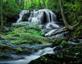
Here's a more dramatic take on the original. Some might call it oversaturated, but the overexposure is taken care of and there was some need for something dynamic here, and the amped green/yellows was the easiest route to that.
R. |
|
|
|
10/08/2009 08:41:10 PM · #9 |
Originally posted by rlewis:
Thanks all, I would never have guessed that it would be deemed over exposed...interesting. In response to the one comment, I was using a circular polarizing filter. |
Let's address that from two angles:
1.) Technical exposure
2.) Perceptual
From the first perspective, it is slightly overexposed. The blue channel is blown in the brighter areas of the water, and the green channel is very slightly as well. It's so close that I'd bet it is completely recoverable if it was shot in RAW. If shot in JPEG, it might have been processing that kicked it over the edge. When you process (heck, when you shoot as well), always use the RGB histogram, and make sure you're not blowing one channel. The luminosity histogram will very often not show one blown channel.
From the second perspective, let's assume that you had recovered highlights, so the small areas in the water were not really blown. It's still possible to have a scene exposed "technically correct" and yet too bright to convey the ambiance of the place. An extreme example would be a night scene, where exposing to bring it to daylight brightness is almost always a bad idea. I think that your submission is probably a little bright, but it certainly is not way too bright, IMO. It's within the range of personal taste. I'd have toned it down a little, somewhere between yours and Robert's submission.
Message edited by author 2009-10-08 20:41:59. |
|
|
|
10/08/2009 08:58:36 PM · #10 |
| What about that odd tree on the right? Where the log across the stream meets the two tree trunks. For me, that is distracting enough to knock off some points. It makes me wonder: is this the best he could do? what if he moved to the left a little so he could crop it out of the frame. A high scoring photo has to be perfect. |
|
|
|
10/08/2009 09:07:50 PM · #11 |
Wow... that's a remarkable edit, in my opinion!
Originally posted by Bear_Music:
Here's a more dramatic take on the original. Some might call it oversaturated, but the overexposure is taken care of and there was some need for something dynamic here, and the amped green/yellows was the easiest route to that.
R. |
|
|
|
|
10/08/2009 09:22:46 PM · #12 |
| Yes, to a couple of questions asked. It was shot from a tripod and it was shot in RAW. |
|
|
|
10/08/2009 09:29:00 PM · #13 |
I have to admit that Robert's edit really brings out the best in this image. We should all be so competent at PP. This is a perfect example of why you need to be a good photographer AND a very competent photo editor to do well here in challenges. It's all a part of the process of growing as a competitor on this site.
Originally posted by alanfreed:
Wow... that's a remarkable edit, in my opinion!
Originally posted by Bear_Music:
Here's a more dramatic take on the original. Some might call it oversaturated, but the overexposure is taken care of and there was some need for something dynamic here, and the amped green/yellows was the easiest route to that.
R. |
|
|
|
|
|
10/08/2009 09:29:04 PM · #14 |
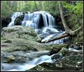
I don't know if it's my eyes or what but your image seems a little out of focus. In addition to greater sharpness I think it might benefit from some cropping which would move the waterfall away from the center a bit. Finally, it does seem a bit "flat" and maybe could benefit from some "LCE." Here's a shot at "improving" it. I tried to recover some of the water detail with Topaz (limited to the water only) and did a small bit of sharpening, LCE, and cropping. Perhaps a bit overdone but I think in the right direction, at least!
However, as it is, it so much better than many of my efforts that I can see why you were puzzled. I often score MUCH worse than I expect.
 |
|
|
|
10/08/2009 09:47:17 PM · #15 |
Originally posted by kirbic:
It's still possible to have a scene exposed "technically correct" and yet too bright to convey the ambiance of the place. An extreme example would be a night scene, where exposing to bring it to daylight brightness is almost always a bad idea. I think that your submission is probably a little bright, but it certainly is not way too bright, IMO. It's within the range of personal taste. I'd have toned it down a little, somewhere between yours and Robert's submission. |
Kirbic brings up a good point, and, curiously, one that drove my manipulation of the image: for me it wasn't just that the water was "blown", it's that the whole surround of the water fairly shrieks of "sylvan grotto" to me, and I wanted the whole thing to be down-key and moody, like a summer glade scene, a sense of dappled sunlight and mysterious shadows even in broad daylight.
I have no idea if that's how it WAS, but that's how it seemed to me, looking at it. "Correct exposure" is a meaningless concept, perceptually; as Kirbic says, a moonlight shot is not going to use the whole histogram, for example.
This is why I placed so much emphasis on "previsualization" when I used to teach; before you even capture the image, it should be clear in your mind how you want the print to look.
R. |
|
|
|
10/08/2009 09:48:36 PM · #16 |

Could have done more with noise with a RAW. Here is a stab at it though. |
|
|
|
10/08/2009 09:48:58 PM · #17 |
Originally posted by Bear_Music:
Originally posted by kirbic:
It's still possible to have a scene exposed "technically correct" and yet too bright to convey the ambiance of the place. An extreme example would be a night scene, where exposing to bring it to daylight brightness is almost always a bad idea. I think that your submission is probably a little bright, but it certainly is not way too bright, IMO. It's within the range of personal taste. I'd have toned it down a little, somewhere between yours and Robert's submission. |
Kirbic brings up a good point, and, curiously, one that drove my manipulation of the image: for me it wasn't just that the water was "blown", it's that the whole surround of the water fairly shrieks of "sylvan grotto" to me, and I wanted the whole thing to be down-key and moody, like a summer glade scene, a sense of dappled sunlight and mysterious shadows even in broad daylight.
I have no idea if that's how it WAS, but that's how it seemed to me, looking at it. "Correct exposure" is a meaningless concept, perceptually; as Kirbic says, a moonlight shot is not going to use the whole histogram, for example.
This is why I placed so much emphasis on "previsualization" when I used to teach; before you even capture the image, it should be clear in your mind how you want the print to look.
R. |
Well said! |
|
Home -
Challenges -
Community -
League -
Photos -
Cameras -
Lenses -
Learn -
Help -
Terms of Use -
Privacy -
Top ^
DPChallenge, and website content and design, Copyright © 2001-2026 Challenging Technologies, LLC.
All digital photo copyrights belong to the photographers and may not be used without permission.
Current Server Time: 04/29/2026 10:32:33 AM EDT.


