| Author | Thread |
|
|
07/10/2008 05:11:30 PM · #1 |
First, I'll start off with "I'm not complaining about the score." I'm not. It was above my average, which is good. What I'm looking for is feedback. I've decided I have a tendency to shoot rather straight-on, boring shots. So when I went out for this challenge and found my subject (the Kurhaus and grounds), I tried some different angles/compositions, then picked one I thought was most visually different than my usual straight-on boring shot. How did I do?
Second, I do realize that B&W probably isn't the best choice. The color was OK - it was late evening and has warm golden evening tones. I just happen to prefer B&W. What I would like to be able to do is make the B&W more  jdannels-ish. Give it more depth. Maybe not possible in basic, but I'd appreciate guidance on how to see the possibilities, if they're there, or a "not possible" if further attempts at post processing aren't really going to help matters much. jdannels-ish. Give it more depth. Maybe not possible in basic, but I'd appreciate guidance on how to see the possibilities, if they're there, or a "not possible" if further attempts at post processing aren't really going to help matters much.
And thanks to Robert for his post-challenge comment that at least points out one aspect I forgot to try - more sky, less foreground. Definitely something to keep in mind when I get the chance to shoot lots of different perspectives and angles!
Entry: 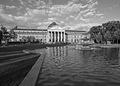 Original: [thumb]697728[/thumb] Original: [thumb]697728[/thumb]
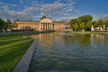
Alternate perspectives: 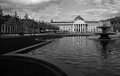 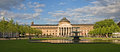 [thumb]697729[/thumb] [thumb]697729[/thumb]
Message edited by author 2008-07-10 17:19:16. |
|
|
|
07/11/2008 12:57:01 AM · #2 |
|
|
|
07/11/2008 01:17:03 AM · #3 |
| it's hard to say how i would shoot this differently. none of these shots are bad but none really pop either. i kinda like the 2nd alternate one (the wider one). i noticed there are a couple rows of trees in the scene. maybe trying to catch those in a unique way as part of the shot and still have the building as the main subject, or maybe a pedestrian taking a more prominent position in the side/foreground. |
|
|
|
07/11/2008 01:22:04 AM · #4 |
First of all, your entry has some good contrast and the leading line of the water's edge. However, that leading line is more of a distraction to me and the grass(?) on the left an unneeded part of the image.
This leads me to the image I prefer. [thumb]697729[/thumb]
In this image there's a lot going on, the ripples in the water seem to draw the eye to the building, as do the clouds. The lawn is diminished and the reflection is given a more prominent role in the image. To me, it's much more dynamic than your entry.
Message edited by author 2008-07-11 01:22:53. |
|
|
|
07/11/2008 01:39:21 AM · #5 |
Thanks guys, much appreciated! (And thanks to the two commenters on one of the alternate shots as well.)
I'll pretty much conclude that my experiment to try different angles was a moderate success in at least providing different angles, but that the shot and or subject overall was kinda dull as presented. |
|
|
|
07/11/2008 01:47:30 AM · #6 |
Agree with  cpanaioti. Her preferred image has a focus by way of the dynamics that the others lack. Your subject has so many features including the sky and the water, not to mention where to put that fountain, that something very strong is needed to pull it together: the enveloping sky and water with their natural ripples and clouds give us a sort of comfort place in which to take in these imposing works of civilization. It is such a nice light and the colours are so right. (May contemplate the black and white possibilities later). cpanaioti. Her preferred image has a focus by way of the dynamics that the others lack. Your subject has so many features including the sky and the water, not to mention where to put that fountain, that something very strong is needed to pull it together: the enveloping sky and water with their natural ripples and clouds give us a sort of comfort place in which to take in these imposing works of civilization. It is such a nice light and the colours are so right. (May contemplate the black and white possibilities later). |
|
|
|
07/11/2008 03:14:13 AM · #7 |
There are too many competing elements in these. The main subject, the building I presume, is kind of left in the back as an afterthought. I think the best way to shoot this is maybe get a head-on shot with just the water in front and sky above and focus on the building. Really build a strong center of interest.
I also think the BW was a much better choice. The color doesn't really lend itself to the picture very well. |
|
|
|
07/11/2008 03:21:23 AM · #8 |
The building was part of the picture, but not intended to be the sole focus, since the subject of the challenge was "landscape". I do agree that there are just too many competing elements, especially for the size that we're limited to here. I will say it looks pretty cool as my desktop, though, where it can be seen a bit bigger.
And I agree that the other image is a stronger one. Not sure why I didn't give it more consideration as a potential challenge entry! |
|
|
|
07/11/2008 01:23:21 PM · #9 |
| That may be it: the size restriction radically limits the detail in the black and white. In fact when I look again (and again) at the black and white, it is a far more interesting picture, almost radical, in terms of challenging the viewer to take in all the elements. The fountain and the trees on the right do not come out well at this size, or on my lcd screen which has rather limited dynamic range. (Oh technology!). |
|
|
|
07/11/2008 01:43:23 PM · #10 |
I tend to like strong perspectives that lead me to the subject. I prefer the color version of your entry.
[thumb]697728[/thumb]
Maybe punching up the the blues some to give it some more "wow". ...Or maybe not, as I did that on my own entry in the same challenge and it came in a fair amount under your B/W entry. |
|
|
|
07/11/2008 01:54:00 PM · #11 |
Originally posted by yospiff:
I tend to like strong perspectives that lead me to the subject. I prefer the color version of your entry.
[thumb]697728[/thumb]
Maybe punching up the the blues some to give it some more "wow". ...Or maybe not, as I did that on my own entry in the same challenge and it came in a fair amount under your B/W entry. |
I prefer the color version also, I like warm light on stone buildings. Here's the exact same image punched up in shadow/highlight, no other changes...
R.
|
|
|
|
07/11/2008 02:57:55 PM · #12 |
| I may play with one or two with advanced editing, just for fun. I tend to be overly cautious using shadows/highlights because of the spirit of the rule with respect to tonemapping. I know that sounds weird. Well, that, and I tend not to edit too strongly. What I need to do is edit the CRAP out of something, then tone it back. I'd be more likely to get closer to what it really needs to be. :-) I really do appreciate all the input - thank you kindly!! |
|
|
|
07/11/2008 04:40:49 PM · #13 |
Forgive this edit PLEASE!

But if you put the building into a "third", it is stronger as an image IMO.
I added content (poorly) to the bottom and right sides.
Come to think of it, it was already pretty thirdsy. I guess I just like squarey.
Message edited by author 2008-07-11 19:13:36. |
|
Home -
Challenges -
Community -
League -
Photos -
Cameras -
Lenses -
Learn -
Help -
Terms of Use -
Privacy -
Top ^
DPChallenge, and website content and design, Copyright © 2001-2026 Challenging Technologies, LLC.
All digital photo copyrights belong to the photographers and may not be used without permission.
Current Server Time: 05/02/2026 07:40:00 PM EDT.


