| Author | Thread |
|
|
07/09/2008 12:16:21 AM · #1 |
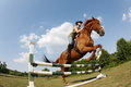
While pleased with my June Free Study entry, I came to realize that to pull myself from the bottom to the top half of six, I need to greatly improve my post processing skills. I did buy Photoshop CS3 but am currently only using 1-2% of its full potential.
What I am asking is for some of the resident masters (or anyone else) to share some of your tactics to see what you can make of my entry. Below is a link to my original raw file (in dng format) that you can download from mediafire. Take it, work your magic, and please share how you did it. The more detailed the better. If you can stay within the advanced editing rules, all the better.
I hope I am not asking for two much. Hopefully all of us can learn a think or two (or more in my case).
DNG File |
|
|
|
07/09/2008 12:23:44 AM · #2 |
|
I don't see anything wrong with the editing. Of course, one can do all kinds weird shit to it but I don't think it's necessary to got that route considering the subject and the purpose of the photo, which I assume was more on the documentary/photojournalistic side. Well, ok, maybe somewhat contrasty and toned B&W might look good but that's as far as I'd personally be willing to go on this one. |
|
|
|
07/09/2008 12:30:53 AM · #3 |
I think it's a fantastic photo and I don't see anything wrong with the pp at all. The color is perfect and it's really clear and sharp overall.
The only thing that I might have done differently would be to change the composition a little. The horse is just about to jump right out of the photo. It might have worked better if everything had been shifted to allow more space on the right side of the photo, and possibly a little more space on top. I think that's just personal preference though. I really do like the photo and it's definitely a respectable score, especially for a free study. |
|
|
|
07/09/2008 12:36:50 AM · #4 |
I have to agree with the PP's that its perfect the way it is. I dont think there is much more you can do to it!
|
|
|
|
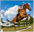
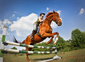
07/09/2008 12:44:40 AM · #5 |
I really do appreciate the compliments, but there has to be something missing to take images that one step up from low six to high six (and even the elusive seven). Granted the starting product has a large amount to do with it, but I am seeing the photos that really shine are not something you would typically see straight out of a camera. That is the magic I am looking for.
As far as the starting product is concerned, I was lying on my back in horse manure under the hot July sun with a horse landing so close to my head that I could feel the ground shake. That is about as good as a starting product as I will be getting in the near future.
For reference, here is the 'out of the box' image...
The reason for the tight crop on the right is because I didn't like the sideways trees caused by the fisheye lens. |
|
|
|
07/09/2008 12:45:06 AM · #6 |
Originally posted by gwe21:
I have to agree with the PP's that its perfect the way it is. I dont think there is much more you can do to it! |
Hogwash. It clearly needs something more...
 |
|
|
|
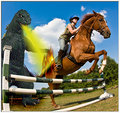
07/09/2008 12:51:25 AM · #7 |
I knew I could count on you Art!!! ROFLMAO too.
But I suspect you may not have followed the advanced editing rules. ;)
ETA: I just noticed the eyes of the poor horse. Man, you leave no leaf unturned.
Message edited by author 2008-07-09 00:52:54. |
|
|
|
07/09/2008 12:55:07 AM · #8 |
How about this one:
Used Color Efex Pro 3.0 to intensify the color and used Alien Skin Snap Art to create the oil painting effect.
ETA: Uh... probably not legal for DPC. :)
Message edited by author 2008-07-09 00:55:52.
|
|
|
|
07/09/2008 01:18:44 AM · #9 |
|
|
|
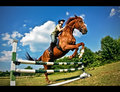
07/09/2008 01:26:16 AM · #10 |
|
Call me crazy, but a square crop wasn't the best choice. The space around the horse/rider in the uncropped version really sets up the nice leading lines of the poles. |
|
|
|
07/09/2008 01:34:53 AM · #11 |
Hi Paolo,
Here's my edit, and a few suggestions. I'm not saying mine would do better, but it's just my editing preferences:
- Lose the border - they're loathed around here. =)
- I altered the perspective and leveled the horizon a bit with Filters->Distort->Lens Correction, and cropped wide
- Why a wide crop? In an action shot, it's nice to have a bit of open space where the subject is moving into.
- With all those megapixels, there's no need for soft images. Use unsharp mask in a couple passes, starting with a small radius (0.5 - 2 pixels).
- Use masks to apply that sharpening selectively (ie not on the trees)
- A bit of vignette looks nice on wide angle images, imo
- Play with selective color layers to get nice colors. There's no formula, just play. =)
- I'm not big on the ultra-saturated blue sky, but do it your own taste.
Oh and the most important thing: never over do it! =) Good luck!
-Jeff
Message edited by author 2008-07-09 01:38:29. |
|
|
|
07/09/2008 01:51:16 AM · #12 |
[thumb]697140[/thumb] Here's my take.
Basically used the same overlay in different modes, hard light and multiply. And used lens distortion to get rid of some of the fish. Copied image and rand a High pass filter and masked out the effects on the sky. Crop. |
|
|
|
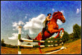
07/09/2008 02:42:02 AM · #13 |
Just playing around with it... my first thought was to get rid of the barrel distortion.
I used your small file, as I don't use DNG - so it was a limited fix.
Hue/Sat and cranked the luminance in LR. Then (like Joe) used Lens Correction.
Some quick curves for linear contrast.
A bit more usm (again - using your small & already sharpened image limited this)
Cropped it & added the vignette & border (i know, i know... enough with the border already). ;OP
Not even sure that I like it - but hey, it's just another option.
Message edited by author 2008-07-09 02:45:48. |
|
|
|
07/09/2008 02:46:35 AM · #14 |
Maybe something like this?
[thumb]697221[/thumb] |
|
|
|
07/09/2008 02:52:22 AM · #15 |
Originally posted by Trinch:
But I suspect you may not have followed the advanced editing rules. |
"If you can stay within the advanced editing rules, all the better."
Sounded like a suggestion, not a rule. ;-)
On a more serious note - there may be lots of awesome (and legal) editing variations, but I agree with some of the others - your entry was as good as any of them might be. If anything, the lack of searing flames probably hurt its score, but that's just how I see it. ;-) |
|
|
|
07/09/2008 03:32:31 AM · #16 |
Here's my version:
Cropping is different, primarily in losing the post on the left. I did a little contrast masking to isolate and tone down the highlights, basically. I used "apply image" in the multiply mode on the contrast mask layer for a little more pop. I did some vignetting and some gradient from top down on a multiply layer, pretty subtle. A touch of hue/sat in the reds and yellows, to mute them. Might have muted the blue but decided not to, kind of a personal call though. Sharpened with high pass filter.
R.
|
|
|
|
07/09/2008 03:40:25 AM · #17 |
[thumb]697244[/thumb]
Basically just a black&white layer, where I darkened blue and cyan and brightened red and yellow, with a hue/sat layer below it to play a bit with the saturation (which only affects the brightness then). A 2nd hue/sat layer above for sepia toning. |
|
|
|
07/09/2008 04:09:56 AM · #18 |
Originally posted by eyewave:
[thumb]697244[/thumb] |
Very, very nice. I think you have a winner there (IMHO). |
|
Home -
Challenges -
Community -
League -
Photos -
Cameras -
Lenses -
Learn -
Help -
Terms of Use -
Privacy -
Top ^
DPChallenge, and website content and design, Copyright © 2001-2026 Challenging Technologies, LLC.
All digital photo copyrights belong to the photographers and may not be used without permission.
Current Server Time: 07/06/2026 03:00:14 AM EDT.


