| Author | Thread |
|
|
06/09/2008 08:23:40 PM · #1 |
Would red on blue be considered high contrast?
|
|
|
|
06/09/2008 08:45:30 PM · #2 |
Originally posted by JaimeVinas:
Would red on blue be considered high contrast? |
Well to me it would depend on the saturation levels.... but maybe you should play a it a little safer. |
|
|
|
06/10/2008 12:03:05 AM · #3 |
Originally posted by andrewt:
Originally posted by JaimeVinas:
Would red on blue be considered high contrast? |
Well to me it would depend on the saturation levels.... but maybe you should play a it a little safer. |
Blue on red has much more contrast.

|
|
|
|
06/10/2008 12:04:41 AM · #4 |
Originally posted by JaimeVinas:
Would red on blue be considered high contrast? |
i thought high contrast was more about the lighting...i'm confused now |
|
|
|
06/10/2008 12:18:48 AM · #5 |
Originally posted by smardaz:
Originally posted by JaimeVinas:
Would red on blue be considered high contrast? |
i thought high contrast was more about the lighting...i'm confused now |
Like andrewt said, I think it depends on the saturation. My reading is that high contrast is light subject, dark background or dark subject, light background (where dark and light are simply relative to one another).
Thoughts?
|
|
|
|
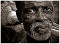
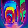
06/10/2008 12:20:54 AM · #6 |
this is what *I* think of for high contrast...
 |
|
|
|
06/10/2008 12:51:47 AM · #7 |
high contrast in my opinoin can mean opposite colours aswell, like for example green and red. google colour wheel...
Message edited by author 2008-06-10 00:52:53. |
|
|
|
06/10/2008 12:56:58 AM · #8 |
"define high contrast"
Not givin' any opinions, just postin' mah findin's :) |
|
|
|
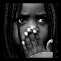
06/10/2008 03:09:51 AM · #9 |
|
... so it can be achieved with colors, saturation, levels, lightning , etc. |
|
|
|
06/10/2008 03:20:57 AM · #10 |
I suspect about 80% of the entries will be black & whites, with curves layers used to the max. I shall be more open-minded than that though when voting.
Anyone that uses contrast in theme as well as tone or colour is liable to get a bonus point or possibly two from me.
Message edited by author 2008-06-10 03:22:09. |
|
|
|
06/10/2008 03:21:38 AM · #11 |
Originally posted by goc:
... so it can be achieved with colors, saturation, levels, lightning , etc. |
But what if we don't have a thunderstorm? ;-) |
|
|
|
06/10/2008 04:25:52 AM · #12 |
|
You might look back at the first two "high contrast" challenges. You'll find the top ten or twenty photos each time include b&w, sepia, and color images. They all seem to work with the voters. |
|
|
|
06/10/2008 07:34:36 AM · #13 |
Originally posted by SoulMan1978:
Originally posted by goc:
... so it can be achieved with colors, saturation, levels, lightning , etc. |
But what if we don't have a thunderstorm? ;-) |
:)!
|
|
|
|
06/10/2008 08:19:55 AM · #14 |
Originally posted by HawkeyeLonewolf:
Originally posted by SoulMan1978:
Originally posted by goc:
... so it can be achieved with colors, saturation, levels, lightning , etc. |
But what if we don't have a thunderstorm? ;-) |
:)! |
yea. you can draw one yourself in photoshop. (if you don't have appropriate lighting)  |
|
|
|
06/10/2008 08:40:05 AM · #15 |
|
|
|
06/10/2008 10:18:57 AM · #16 |
|
Still confused as too difference, if any, between high-contrast and high-key. Ditto low-key and low-contrast. Where are threads to High Contrast I and II? |
|
|
|
06/10/2008 10:20:12 AM · #17 |
Originally posted by SoulMan1978:
I suspect about 80% of the entries will be black & whites, with curves layers used to the max. I shall be more open-minded than that though when voting.
Anyone that uses contrast in theme as well as tone or colour is liable to get a bonus point or possibly two from me. |
Exactly...but people called this high-key, not high-contrast...
Message edited by author 2008-06-10 10:21:44. |
|
|
|
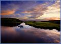
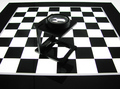
06/10/2008 10:22:41 AM · #18 |
This one ribboned in High Contrast in 2005, before being DQ'd because camera date was set wrong... So color is definitely possible...
R.
Message edited by author 2008-06-10 10:23:12.
|
|
|
|
06/10/2008 10:27:30 AM · #19 |
Originally posted by snaffles:
Originally posted by SoulMan1978:
I suspect about 80% of the entries will be black & whites, with curves layers used to the max. I shall be more open-minded than that though when voting.
Anyone that uses contrast in theme as well as tone or colour is liable to get a bonus point or possibly two from me. |
Exactly...but people called this high-key, not high-contrast... |
Never underestimate the ignorance of voters. In anything.
Unrelated to that, this one:
took fourth. Lots of color there.
Message edited by author 2008-06-10 10:29:53.
|
|
|
|
06/10/2008 11:35:51 AM · #20 |
|
This should be interesting. Not getting very much conversation regarding this subject now, but you just wait until rollover and it will be the hot topic in the 'High Contrast III' scores thread. :-P |
|
|
|
06/10/2008 11:45:04 AM · #21 |
My contrast will be the poor photo I have submitted compared to incredible ones that others will submit. Subtle but effective. :)
|
|
|
|
06/10/2008 12:08:13 PM · #22 |
Originally posted by Citadel:
My contrast will be the poor photo I have submitted compared to incredible ones that others will submit. Subtle but effective. :) |
Based on this thread, I converted mine to B&W and while ok... I don't like it as much as the color one. But likewise, I'm a little nervous to submit that one due to voter irregularity (yes, I meant that). :)
Guess I'll go with what I like and let the chips falleth.
|
|
|
|
06/10/2008 12:12:20 PM · #23 |
Originally posted by HawkeyeLonewolf:
Originally posted by Citadel:
My contrast will be the poor photo I have submitted compared to incredible ones that others will submit. Subtle but effective. :) |
Based on this thread, I converted mine to B&W and while ok... I don't like it as much as the color one. But likewise, I'm a little nervous to submit that one due to voter irregularity (yes, I meant that). :)
Guess I'll go with what I like and let the chips falleth. |
I wish I could go into more detail on my shot but my subject used to be orange and the day I shot it there was a marvelous sky for a background. Unfortunately the orange parts are now gone (for now) so I had to convert to b&w to create the contrast. The black and white still looks pretty wild though. *shrug* we'll see. Its too cloudy and overcast to go out for a reshoot today so I guess what I've submitted will be my entry.
|
|
|
|
06/10/2008 12:18:45 PM · #24 |
Originally posted by glad2badad:
Some are going to expect high extremes of B/W photographs ... |
My entry into a Black & White challenge ... |
|
|
|
06/10/2008 12:34:34 PM · #25 |
This one is tougher still because of Basic editing vs. the others which were advanced.
|
|
Home -
Challenges -
Community -
League -
Photos -
Cameras -
Lenses -
Learn -
Help -
Terms of Use -
Privacy -
Top ^
DPChallenge, and website content and design, Copyright © 2001-2026 Challenging Technologies, LLC.
All digital photo copyrights belong to the photographers and may not be used without permission.
Current Server Time: 07/19/2026 07:02:01 AM EDT.