| Author | Thread |
|
|
06/11/2008 09:06:20 AM · #801 |
|
|
|
06/11/2008 09:56:07 AM · #802 |
The Cowboy
Votes: 111
Views: 200
Avg Vote: 5.7477
Comments: 6
High Contrast III
Votes: 33
Views: 45
Avg Vote: 5.1212
Comments: 1
Oh well so long as they're both over 5 lol...and a TSer gave me a great Hi-C comment AND score! Woohoo!
Saw my cowboy model today, he was asking if there are any more shoots coming up...:-)
|
|
|
|
06/11/2008 10:03:23 AM · #803 |
Well as you can see my hi-c is sucking along just like I thought it would.
Votes: 32
Views: 50
Avg Vote: 3.4063
Comments: 0
and cowboy is doing just a little better not much.
Votes: 114
Views: 178
Avg Vote: 5.3158
Comments: 3
|
|
|
|
06/11/2008 10:05:19 AM · #804 |
Originally posted by xianart:
peter -you're triplets!
do people even know what high contrast is????? argh!!!!! |
I should have asked you before I took any pictures because I tried to find some good definitions with examples that would stick in my head and I was not successful. (So I submitted something anyway haha) Maybe you could post a definition? That might at least help in voting. :)
Message edited by author 2008-06-11 10:05:47. |
|
|
|
06/11/2008 10:05:40 AM · #805 |
Originally posted by raish:
4.2273 |
ROFL! Avg Vote: 4.3333 |
|
|
|
06/11/2008 10:09:46 AM · #806 |
|
I got nothing. On Sunday my Internet went down and last night was a complete blackout. Jesus doesn't want me to enter any more challenges. :( |
|
|
|
06/11/2008 10:33:55 AM · #807 |
basically, i'm pretty sure high contrast has a limited tonal range of high and low tones, with very few intermediate tones. the ultimate high contrast is pure black and white, no greys. the more greys or intermediate tones, the less high contrast it is.
|
|
|
|
06/11/2008 10:43:03 AM · #808 |
Originally posted by xianart:
basically, i'm pretty sure high contrast has a limited tonal range of high and low tones, with very few intermediate tones. the ultimate high contrast is pure black and white, no greys. the more greys or intermediate tones, the less high contrast it is. |
Ok so very limited color transition (gradient) from one to the other? If it's a color photo, do the colors have to be complementary or can it be any pair of colors?
I'm coming to you next time I have a technical question lol. This helped - thanks! |
|
|
|
06/11/2008 12:03:01 PM · #809 |
complementary is a completely different thing - just darks and lights for contrast. complementary does make it more obvious. purple and yellow are the most contrasty, then blue and orang, with red and green having pretty well the same tonal value.
|
|
|
|
06/11/2008 12:06:27 PM · #810 |
I think Christian has it about right. You can contrast colours, of course, as with red/green complementary colours next to each other. As I see it, hi-c would be all about having those colours very close to their primary/secondary tones and fully saturated etc etc. You could contrast the focussed and unfocussed, I suppose, but I think that might be pushing it.
The challenge actually asks for hi-c as technique, with use hi-c to create impact...
I think I would read that as saying that the definition of hi-c can be flexible as long as something that is arguably hi-c is making an impact.
So what we really want is the definition of impact. |
|
|
|
06/11/2008 12:08:53 PM · #811 |
|
|
|
06/11/2008 12:19:42 PM · #812 |
That oughta do it.
[rant]
Have you noticed how an awful lot of entries are like plastic guns that exude little flags with 'bang' written on them (apologetically)?
Grrrr
[/rant] |
|
|
|
06/11/2008 12:26:44 PM · #813 |
That may be what my problem is.....I went for the image being as bright as possible without blowing out, thereby having definition/detail.
That's kind of what I took high contrast to be......and what has been my interpretation.
|
|
|
|
06/11/2008 12:49:30 PM · #814 |
|
Thanks for the discussion - I've learned quite a bit today :) |
|
|
|
06/11/2008 01:32:53 PM · #815 |
|
Would someone please give me a comment on my Hi-C entry? It's the one with high contrast!! Please make it a good comment also. I know, I know, I'm not asking for much am I? |
|
|
|
06/11/2008 01:34:25 PM · #816 |
Originally posted by NikonJeb:
That may be what my problem is.....I went for the image being as bright as possible without blowing out, thereby having definition/detail.
That's kind of what I took high contrast to be......and what has been my interpretation. |
To me, I love high contrast shots that have areas that are blown out. Look at past winners. Most of them have blown out portions in their image. |
|
|
|
06/11/2008 01:38:58 PM · #817 |
High Contrast
Low Contrast
|
|
|
|
06/11/2008 01:42:39 PM · #818 |
Originally posted by bmartuch:
Originally posted by NikonJeb:
That may be what my problem is.....I went for the image being as bright as possible without blowing out, thereby having definition/detail.
That's kind of what I took high contrast to be......and what has been my interpretation. |
To me, I love high contrast shots that have areas that are blown out. Look at past winners. Most of them have blown out portions in their image. |
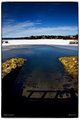
Winning Images ==> 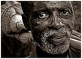 , , 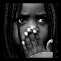
Nothing "blown" on these winners from the last two HC challenges. :-) |
|
|
|
06/11/2008 01:49:57 PM · #819 |
Originally posted by glad2badad:
Originally posted by bmartuch:
Originally posted by NikonJeb:
That may be what my problem is.....I went for the image being as bright as possible without blowing out, thereby having definition/detail.
That's kind of what I took high contrast to be......and what has been my interpretation. |
To me, I love high contrast shots that have areas that are blown out. Look at past winners. Most of them have blown out portions in their image. |
Winning Images ==> ,
Nothing "blown" on these winners from the last two HC challenges. :-) |
Are you telling me that the nose and fingernails aren't blown out. One of the commenters even mentioned it! She even mentioned that she had to crop very tightly to avoid it. The other shot is blown out on the broom. If that was brought under control, it wouldn't have the same effect. I think the blown out sections really add to it. I like it.
Message edited by author 2008-06-11 13:52:30. |
|
|
|
06/11/2008 02:14:05 PM · #820 |
Originally posted by bmartuch:
Originally posted by glad2badad:
Originally posted by bmartuch:
To me, I love high contrast shots that have areas that are blown out. Look at past winners. Most of them have blown out portions in their image. |
Nothing "blown" on these winners from the last two HC challenges. :-) |
Are you telling me that the nose and fingernails aren't blown out. One of the commenters even mentioned it! She even mentioned that she had to crop very tightly to avoid it. The other shot is blown out on the broom. If that was brought under control, it wouldn't have the same effect. I think the blown out sections really add to it. I like it. |
Yep. You're right, there are some blown highlights on the two examples (the Blue Ribbon winners) I posted. However, I think those are more incidental highlights (especially the broom) rather than a key component of the image. When you mentioned "areas that are blown out" and "blown out portions" it sounded more like larger pieces of the composition than what is presented in the winners. |
|
|
|
06/11/2008 02:49:24 PM · #821 |
Originally posted by glad2badad:
Originally posted by bmartuch:
Originally posted by glad2badad:
Originally posted by bmartuch:
To me, I love high contrast shots that have areas that are blown out. Look at past winners. Most of them have blown out portions in their image. |
Nothing "blown" on these winners from the last two HC challenges. :-) |
Are you telling me that the nose and fingernails aren't blown out. One of the commenters even mentioned it! She even mentioned that she had to crop very tightly to avoid it. The other shot is blown out on the broom. If that was brought under control, it wouldn't have the same effect. I think the blown out sections really add to it. I like it. |
Yep. You're right, there are some blown highlights on the two examples (the Blue Ribbon winners) I posted. However, I think those are more incidental highlights (especially the broom) rather than a key component of the image. When you mentioned "areas that are blown out" and "blown out portions" it sounded more like larger pieces of the composition than what is presented in the winners. |
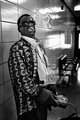
These two shots are blown out but I absolutely love them. I know most people don't like this but in my book, they are supurb.
  |
|
|
|
06/11/2008 02:50:34 PM · #822 |
Originally posted by My Photo Prof in university:
a well exposed and processed image should have pure black and pure white areas and every tone in between. |
a pure white area is not necessarily 'blown out'.
|
|
|
|
06/11/2008 02:57:19 PM · #823 |
Originally posted by bmartuch:
Originally posted by glad2badad:
Originally posted by bmartuch:
Originally posted by glad2badad:
Originally posted by bmartuch:
To me, I love high contrast shots that have areas that are blown out. Look at past winners. Most of them have blown out portions in their image. |
Nothing "blown" on these winners from the last two HC challenges. :-) |
Are you telling me that the nose and fingernails aren't blown out. One of the commenters even mentioned it! She even mentioned that she had to crop very tightly to avoid it. The other shot is blown out on the broom. If that was brought under control, it wouldn't have the same effect. I think the blown out sections really add to it. I like it. |
Yep. You're right, there are some blown highlights on the two examples (the Blue Ribbon winners) I posted. However, I think those are more incidental highlights (especially the broom) rather than a key component of the image. When you mentioned "areas that are blown out" and "blown out portions" it sounded more like larger pieces of the composition than what is presented in the winners. |
These two shots are blown out but I absolutely love them. I know most people don't like this but in my book, they are supurb.
|
Ahhh...but now you're not looking at winners anymore. These are buried quite deep in the challenge results. I can understand the personal choice of liking them. To me the blown areas make them seem more high-key, where that treatment is more common/acceptable. |
|
|
|
06/11/2008 03:05:12 PM · #824 |
Originally posted by glad2badad:
Originally posted by bmartuch:
Originally posted by glad2badad:
Originally posted by bmartuch:
Originally posted by glad2badad:
Originally posted by bmartuch:
To me, I love high contrast shots that have areas that are blown out. Look at past winners. Most of them have blown out portions in their image. |
Nothing "blown" on these winners from the last two HC challenges. :-) |
Are you telling me that the nose and fingernails aren't blown out. One of the commenters even mentioned it! She even mentioned that she had to crop very tightly to avoid it. The other shot is blown out on the broom. If that was brought under control, it wouldn't have the same effect. I think the blown out sections really add to it. I like it. |
Yep. You're right, there are some blown highlights on the two examples (the Blue Ribbon winners) I posted. However, I think those are more incidental highlights (especially the broom) rather than a key component of the image. When you mentioned "areas that are blown out" and "blown out portions" it sounded more like larger pieces of the composition than what is presented in the winners. |
These two shots are blown out but I absolutely love them. I know most people don't like this but in my book, they are supurb.
|
Ahhh...but now you're not looking at winners anymore. These are buried quite deep in the challenge results. I can understand the personal choice of liking them. To me the blown areas make them seem more high-key, where that treatment is more common/acceptable. |
You're right, they are not winners. I really like this style of processing though, but unfortunately, most don't. To me, they just have so much character. As far as the previous winners, I think they are fabulous shots and I wish I could figure out how they can get that much contrast without blowing some areas out. It almost seems impossible. But she did say that she cropped extremely tight to eliminate almost everything else. |
|
|
|
06/11/2008 03:29:38 PM · #825 |
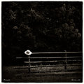
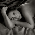
frankly, i would call high key generally overexposed, whereas high contrast can be mainly dark as well - the main thing is the high and low tones with no intermediate. high key is all high tones.
high key, high contrast: 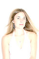 high key, low contrast: high key, low contrast: 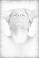
low key, high contrast:  low key, low contrast: low key, low contrast:
high contrast:  low contrast: low contrast: 
if there is no qualifier (high or low key) the image is understood to be exposed 'correctly' or averagely.
Message edited by author 2008-06-11 15:41:05.
|
|
Home -
Challenges -
Community -
League -
Photos -
Cameras -
Lenses -
Learn -
Help -
Terms of Use -
Privacy -
Top ^
DPChallenge, and website content and design, Copyright © 2001-2026 Challenging Technologies, LLC.
All digital photo copyrights belong to the photographers and may not be used without permission.
Current Server Time: 07/25/2026 01:03:00 AM EDT.


