| Author | Thread |
|
|
02/08/2008 12:33:54 AM · #1 |
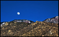
any insight anyone can give as to why this didn't do better would be appreciated. it may not be the most exciting photo, but i thought it was solid and would get around 5.5 - 5.6.
 |
|
|
|
02/08/2008 12:46:56 AM · #2 |
| I think you hit it when you said not the most exciting photo. For me the foreground is just there with nothing to really study and take in. The moon is sharp and color of the sky great but still not enough to pull it all together. |
|
|
|
02/08/2008 12:51:33 AM · #3 |
Judging from all the 5 votes, I think voters agree about the not so exciting.
I think it's a bit over-sharpened and over-saturated too.
Message edited by author 2008-02-08 00:52:33.
|
|
|
|
02/08/2008 12:54:46 AM · #4 |
|
|
|
02/08/2008 12:56:40 AM · #5 |
| i liked it...and as people love to say (which never makes you feel better) it could always be worse! |
|
|
|
02/08/2008 12:57:39 AM · #6 |
| i was more concerned about the 34 voters who voted 4 or less. no...it's not exciting, but it is pretty and i would like to understand why so many people thought it was "below" average. none of them commented. |
|
|
|
02/08/2008 12:59:00 AM · #7 |
Originally posted by FocusPoint:
you are missing "aurora" |
lol...i was trying to avoid saying that :D |
|
|
|
02/08/2008 01:00:40 AM · #8 |
Originally posted by smardaz:
i liked it...and as people love to say (which never makes you feel better) it could always be worse! |
awwww...i thought yours was very sweet :) |
|
|
|
02/08/2008 01:00:46 AM · #9 |
Originally posted by smardaz:
i liked it...and as people love to say (which never makes you feel better) it could always be worse! |
awwww...i thought yours was very sweet :) |
|
|
|
02/08/2008 01:03:27 AM · #10 |
| Colors are great subject is great. I think what is going on here is the mountains. The view seems too pulled back and there is probably too much busyness at a fine detail level. I think to some extent the mountains and moon are fighting for dominance as the subject. perhaps cropping in a bit, so that the moon is clearly the subject would help some. The processing of the colors is really good, it has a lot of "pow" to it in that area. |
|
|
|
02/08/2008 01:06:06 AM · #11 |
Originally posted by desertoddity:
i was more concerned about the 34 voters who voted 4 or less. |
Look at the top 10... they get them too... as they say, can't please everyone.
|
|
|
|
02/08/2008 01:07:49 AM · #12 |
| I usually make an automatic mental adjustment of between 0.8 to 1.6 points when comparing a photo's "DPC score" to its likely "real world" rating ... perhaps a better assessment than the raw score might be made by comparing your photo to the ten or twenty images which finished immediately ahead of it and a likewise number which finished lower, and seeing if it still seems markedly out of place given the overall context of how this pool of voters acted/reacted. |
|
|
|
02/08/2008 01:13:54 AM · #13 |
Originally posted by fotomann_forever:
Judging from all the 5 votes, I think voters agree about the not so exciting.
I think it's a bit over-sharpened and over-saturated too. |
thanks. that helps. over-sharpened seems to be becoming a running theme in the comments i get. i thought i had toned it down in this one. i will keep trying to find that balance. |
|
|
|
02/08/2008 01:15:40 AM · #14 |
Originally posted by yospiff:
Colors are great subject is great. I think what is going on here is the mountains. The view seems too pulled back and there is probably too much busyness at a fine detail level. I think to some extent the mountains and moon are fighting for dominance as the subject. perhaps cropping in a bit, so that the moon is clearly the subject would help some. The processing of the colors is really good, it has a lot of "pow" to it in that area. |
that sounds like a good idea (the cropping). i think i'll try it and see what happens. |
|
|
|
02/08/2008 01:17:48 AM · #15 |
Originally posted by GeneralE:
I usually make an automatic mental adjustment of between 0.8 to 1.6 points when comparing a photo's "DPC score" to its likely "real world" rating ... perhaps a better assessment than the raw score might be made by comparing your photo to the ten or twenty images which finished immediately ahead of it and a likewise number which finished lower, and seeing if it still seems markedly out of place given the overall context of how this pool of voters acted/reacted. |
may be an idea, but i find it a little difficult to compare my landscape photo with a pair of legs wearing snowshoes or smardaz cute romantic candy. |
|
|
|
02/08/2008 02:53:53 AM · #16 |
| Did leave you a comment , just in case you missed it. |
|
Home -
Challenges -
Community -
League -
Photos -
Cameras -
Lenses -
Learn -
Help -
Terms of Use -
Privacy -
Top ^
DPChallenge, and website content and design, Copyright © 2001-2026 Challenging Technologies, LLC.
All digital photo copyrights belong to the photographers and may not be used without permission.
Current Server Time: 05/01/2026 11:10:05 PM EDT.


