| Author | Thread |
|
|
10/06/2007 11:24:23 PM · #1 |
I was going to put this in slippy's thread about the wedding he just shot, but I didn't want to highjack the thread.
He posted several black and whites...all of which I thought had nice contrast and tones to them. There were a few comments about how "dull" the b/w's appeared and I'd like some more discussion about that sort of thing.
It seems that if a white is a true white we get blasted by the "whites are blown out" crew. If, however, the whites are toned down, we're told the shot appears dull.
Can someone post some examples of a good shot and the same (or similar? shot being dull and/or blown out? Does anyone else notice this catch-22 on contrast levels for b/w? It's especially prevailent in wedding shots and portraits (any white clothing.) |
|
|
|
10/06/2007 11:43:43 PM · #2 |
You are right. Black and white can be very tricky. My dad had me shoot some shots of some carvings he did which I did in color for a booklet he wants to put together but for cost reasons he now wants them in black and white. I thought it would be simple but it was very hard to get them to look decent. He is in another state or I probably would have prefered to reshoot them. One of the problems I encountered was the limited range of tones. In color they looked fine but converted to BW they were pretty flat.
In more answer to your question, given the option between a possibly considered blown highlight and a dull grey look, go for the blown highlight. Just try to make sure you have a good black somewhere to counter balance it (unless you are doing high key).
I think this black and white worked pretty well for me (HM ribbon at the San Diego County Fair)

This one I shot in black and white and is unedited. I think it worked very well.

|
|
|
|
10/06/2007 11:55:32 PM · #3 |
I think there's a subtle distinction missing.
To me, "blown" means a sizable area of pure white. That can be a good thing or a bad thing depending on what you want, but it's an area devoid of detail that's also bright. Detail-free areas can be any shade, of course. When they're black, they're usually called underexposed.
But you can certainly have small areas of pure white without them being called blown-out. Highlights, for instance.
Dull tones, on the other hand, mean that everything's crowded in the middle of the full range from black to white. Nothing's really white or black, but some shade of gray.
To avoid both problems, stretch your histogram out so there's at least something pure white and pure black. That usually provide good contrast through the middle, and it's contrast that creates detail.
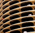
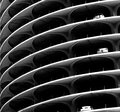
Here's an example of mine that demonstrates both in one picture, and also shows the problem I think you ran into.

The sky is blown out. Looking at the building, when it was in color, there was nice contrast. But after I converted to black and white, I forgot to increase contrast again, so it's washed out or dull. Nothing in the building is really black, and all of the grays are crowded into the middle of the range.
Then there's the question of who you're trying to please. Many people, including me, like really high-contrast shots that are going to have some blown out areas. For example, I love these shots:
 
Whereas some will complain the instant more than one pixel goes to white.
Message edited by author 2007-10-07 00:04:02.
|
|
|
|
10/07/2007 12:01:15 AM · #4 |
You may want to try reducing saturation to near zero, then tinker with brightness, in each color, one at a time to see which channel gives the best looking B&W from the image. Sometimes one color will work much better than all 3 to convert to B&W. The technique is similar to shooting with strongly colored filters when shooting B&W film during that era. I am sure that there is a tutorial about this somewhere here.
I don't know what I am saying, but I know how to do it. : )
Message edited by author 2007-10-07 00:05:29.
|
|
|
|
10/07/2007 01:00:29 AM · #5 |
Originally posted by MelonMusketeer:
You may want to try reducing saturation to near zero, then tinker with brightness, in each color, one at a time to see which channel gives the best looking B&W from the image. Sometimes one color will work much better than all 3 to convert to B&W. The technique is similar to shooting with strongly colored filters when shooting B&W film during that era. I am sure that there is a tutorial about this somewhere here.
I don't know what I am saying, but I know how to do it. : ) |
Right. It's a fact.
Example: Blue sky, bright red flower, about same luminance (brightness) on each) macro shot 1/2 flower 1/2 sky.
Use the blue channel, the sky is white and the flower is black. Use the red channel, flower is white and sky is black. Use the green channel, values will be the same assuming luminosity was the same to start with.
More or less.
It makes a huge difference, which channel you emphasize in conversion. The green channel is very often the best channel in landscapes, for example; you might use 50% green and 25% blue and red...
Pick some strongly colored images of your own and experiment. There's a thing called "channel mixer" to do it in.
R.
Message edited by author 2007-10-07 01:00:58.
|
|
|
|
10/07/2007 01:35:50 AM · #6 |
Here's an example of what Bear said: original, red channel, and blue channel.
VERY different look between the two channels.
|
|
|
|
10/07/2007 01:59:58 AM · #7 |
Might be a good idea to mention the channel mixer and CS3's black and white adjustment layers. Both allow you to adjust the b/w conversion by channel. Other tools like desaturation and gradient map don't do a good job at all. Sometimes they will produce acceptable results at random but you rather be in control of the conversion and not the software.
ETA: Just noticed Bear already mention the channel mixer. The black and white adjustment layer in CS3 is basically like the channel mixer on steriods. It allows you to adjust CMY colors as well as RGB at the same time.
Message edited by author 2007-10-07 02:06:05.
|
|
|
|
10/07/2007 08:18:17 AM · #8 |
Originally posted by JeffryZ:
You are right. Black and white can be very tricky.
I think this black and white worked pretty well for me (HM ribbon at the San Diego County Fair)
|
I like this image. It is a fine image and I glad the people of San Diego saw how good it was too. For the sake of discussion I'd like to make an observation from an untrained eye. When I opened the image my eyes went directly to the whitest part of the image (the skylights) and the blackest part of the image (the time clock). I kind of had to force myself to look at the rest of the image.
For me, the reason for the high contrast is to draw attention to something. I think that something should be the subject of the image The areas of less contrast are there to support the rest of the image or give it context. Now of course there are exceptions too.
So your image looks a bit unbalanced to me, a little "top heavy".
An image worth a ribbon certainly. Just some early morning ramblings.
I may be off base here but that's one way I look at a B&W image.
Message edited by author 2007-10-07 08:19:13. |
|
|
|
10/07/2007 09:28:30 AM · #9 |
That's good information about the different looks in different color channels.
My question is more DPC specific. It seems to me that voters dock points off of a b/w with anything true white and call it a blown highlight, and yet if there is NOT any true whites the photo gets called dull and flat.
So I guess this is partly rant :) Am I the only one who has this perception? I need to go back and look at some b/w challenges and see if I'm just blowing smoke here. Obviously, I've had a photo score affected by this, but then I also saw the comments on those wedding photos - which I thought had good b/w tones - so that's really what prompted the thread.
EDITED TO ADD: Slippy's thread with B/W wedding photos
ANOTHER EDIT :) If my perception is right, and DPC'rs are picky either way, I suppose I'd like to know what's more acceptable in the wider photographic community. Are a few blown highlights considered an acceptable thing in order to get a nice contrast overall in a photo? Is it expected to have more even tones throughout? In the overall scheme of things do most photographers look that closely at the technicals or more at the overall impact of a photo? Inquiring minds want to know. Examples are helpful.
Feel free to continue to have this an informational thread on processing b/w shots. It is good information to have.
Message edited by author 2007-10-07 09:39:24. |
|
|
|
10/07/2007 10:31:35 AM · #10 |
BTW, you're not alone in thinking some DPCers are a bit loony about white. They don't seem to understand that some things are actually white. :)
|
|
|
|
10/07/2007 10:35:17 AM · #11 |
Originally posted by jpochard:
My question is more DPC specific. It seems to me that voters dock points off of a b/w with anything true white and call it a blown highlight... |
It ain't just B/W, they do it with color images too.
R.
|
|
|
|
10/07/2007 11:00:42 AM · #12 |
|
|
|
10/07/2007 11:05:43 AM · #13 |
Originally posted by jpochard:
If my perception is right, and DPC'rs are picky either way, I suppose I'd like to know what's more acceptable in the wider photographic community. Are a few blown highlights considered an acceptable thing in order to get a nice contrast overall in a photo? |
Latest issue of BW Magazine just came out. Go buy it (seriously, it's great). Flipping through, I can count on one hand the number of images that have a true white point set. At least a dozen have completely blown out highlights (big areas too, like windows). The majority of shots have a true black point and a large amount of dark to middle grays with very few highlights at all.
Half the shots are out of focus. Maybe 10-20% are paying some sort of heed to rule of thirds.
That's just one non-dpc source to reference, but I think it's a pretty good reference considering the artists behind those photos. |
|
|
|
10/07/2007 01:25:24 PM · #14 |
Originally posted by routerguy666:
Latest issue of BW Magazine just came out....That's just one non-dpc source to reference, but I think it's a pretty good reference considering the artists behind those photos. |
That's an excellent magazine, and perusing it is a good way to rid yourself of all the so-called "rules" everyone with a camera is supposed to be following, including the odious "rule of thirds".
This discussion is a good venue to talk about how rules, when used merely to clobber over peoples' heads or to parrot when barely understood, should be a starting point, not an end point. This is particularly true for the "rule of thirds". I would hope that a half-way serious photographer understands what a good composition looks like, without having to consciously refer to this rule while taking photos. After all, even the theory behind this rule assumes that the most pleasing compositions follow it due to the innate perceptions of the viewers, who in most cases know nothing about it. You don't need to know of the existence of the rule to be moved by a photo that follows it. Similarly, neither do you need to think about it or even know of it when composing the photograph.
The same goes for blown highlights, black clipping, contrast, and so on.
Also take look at Gordon's natural light black and white portrait for a beautiful example that uses blown whites to great effect. |
|
|
|
10/07/2007 01:35:06 PM · #15 |
Here's one in my port to ponder...Totally blown out background, but sometimes you just got to take the shot. I don't know if this is good or bad, but I think the blown area (not harsh) forces us back to the subject matter. I think a good expression helps.
[thumb]509857[/thumb]
|
|
|
|
10/07/2007 02:31:59 PM · #16 |
It also depends on the image. As a voter, I can be either be tolerant or unforgiving of blown highlights. I have to decide and feel, when (in what confined context) it works or doesn't. Some of  goodman's images are often blown out, yet appropriately so. grigrigirl's is another port, where you'll find images, you might value not despite such an imperfection, but because of it. goodman's images are often blown out, yet appropriately so. grigrigirl's is another port, where you'll find images, you might value not despite such an imperfection, but because of it. |
|
|
|
10/07/2007 06:15:10 PM · #17 |
Sorry...double post
Message edited by author 2007-10-07 18:15:50. |
|
|
|
10/07/2007 06:15:11 PM · #18 |
I suppose...like most subjective discussions here...it depends mostly on what you like as the photographer. Sometimes I think I just get a bit of tunnel/dpc-vision, using what I've learned here, when editing. It HAS taught me to look for some detail elements I hadn't considered before. I have learned, however, that non-photographers definitely see these things differently!
For instance this photo: [thumb]596803[/thumb]
I almost didn't even include it with their proofs because I hated it. Bad color, bad focus, bad lighting etc. However, IT was the most ordered photo of that group! They love it. Go figure.
aliqui...I can see what you mean in the wedding photos. I would have to see the first two in print to see which I liked best. Thanks for posting the examples. |
|
|
|
10/07/2007 11:17:29 PM · #19 |
Heh. I just got a comment on my free study that said it was blurry and blown out. Well, yes. It is blurry and blown out. Intentionally, and the majority of my comments are quite positive even though the score is low.
So choose your audience - all of DPC, or whatever segment shares your taste. The first if you want high scores, the second if you want to connect strongly with a small group.
Edited to add that I go for both at different times, depending on the shot I have or the challenge topic, or both.
Message edited by author 2007-10-07 23:17:58.
|
|
|
|
10/07/2007 11:19:12 PM · #20 |
Originally posted by jpochard:
aliqui...I can see what you mean in the wedding photos. I would have to see the first two in print to see which I liked best. Thanks for posting the examples. |
I wonder if it has something to do with the light grey of DPC's background. The original seems to blend in. Maybe in a different setting the whites would be just fine. |
|
Home -
Challenges -
Community -
League -
Photos -
Cameras -
Lenses -
Learn -
Help -
Terms of Use -
Privacy -
Top ^
DPChallenge, and website content and design, Copyright © 2001-2026 Challenging Technologies, LLC.
All digital photo copyrights belong to the photographers and may not be used without permission.
Current Server Time: 05/07/2026 01:20:24 PM EDT.


