|
| Author | Thread |
|
|
04/28/2007 04:27:25 AM · #26 |
|
|
|
04/28/2007 10:42:13 AM · #27 |
|
Ok, let's cap the images now -- I'll do the ones that are posted, but it may take me until Sunday. Thanks everyone! |
|
|
|
04/28/2007 01:15:25 PM · #28 |
Originally posted by Sting11165:
Ok, let's cap the images now -- I'll do the ones that are posted, but it may take me until Sunday. Thanks everyone! |
Thank YOU!
|
|
|
|
04/28/2007 06:47:09 PM · #29 |
Originally posted by Greetmir:
Wutcha think?
 |
I like the subject -- I'm a sucker for flower shots myself, and this tulip is strange looking in a neat way. The lighting seems good and the small depth of field (blurring the background) is appropriate for the type of image. The semi-transparent border (with the stem going across it) is very appropriate -- I was actually thinking of doing a similar border on one of my own images lately.
Compositionally, a centered flower makes sense, although the petals are symmetric but not quite symmetric -- that bothers me a little bit. Nothing major though.
Saturation seems good, although I'd like to see a little more and compare -- it might help a bit.
Three major complaints though:
1. Focus. The front of the flower is in focus, the back isn't. It detracts a lot from the quality of the image since there is a lot of detail in the back of the flower. Actually, looking at it, the flower looks almost superimposed on the background -- did you use a soft focus filter or is it just my eyes playing tricks on me?
2. Blown highlights. The tips of the petals are blown to full white, as far as I can tell. This is one of those cases where shooting raw might help and decreasing your exposure slightly to avoid blowing the highlights.
3. Noise. The image has a decent amount of noise to it, especially in the background. Noise in the flower doesn't show too much but the background noise hurts the image. The good news is that neatimage is free to download, and there are a host of other programs that would clear that up yet leave the detail in the flower.
Obviously, 1 and 2 need to be addressed when the image is taken, and 3 could be fixed now. The good news is it really isn't the subject and composition, all of that is good. Just a little more aperture and a little less exposure and you'd have a great file to process. Overall, a good image and good presentation, just a few minor things to fix to make it a great image. |
|
|
|
04/28/2007 07:00:01 PM · #30 |
Originally posted by mia67:

Hope you still have time, so thanks in advance. |
First off, good subject, good expression, good composition, good looking kid. I really like the desat and border too.
The image has a lot of grain to it which I could go either way on. Part of me wants to see the whole thing softer with low noise, and part of my likes the grain (even exagerate it). I don't think either way is wrong, but I'd decide which way you want to go and try doing it a bit more than it is to see what it looks like.
It has good contrast but the arms are a bit blown out. For what you're trying to portray, the arms are a bit too harsh (this is definitely a photo you want to have a soft feel in both sharpness and emotion). Maybe a little burning would help the face draw the eyes.
The image isn't the sharpest, but I'm not sure it should be. It isn't a sharp moment.
Conclusion: Good image, maybe some minor post processing you can do to it. As far as avoiding blowing out the arms, I'll be the first to admit you rarely get a chance to think about stuff like that when shooting your kids. I think instead you should congratulate yourself on getting a good expression on her face: IMHO, that's the hardest thing of all.
If you have time, I'd say play around with some advanced processing: burning the arms, smoothing the noise (or increasing the noise), maybe even a vignette effect. It'd be a great learning experience. |
|
|
|
04/28/2007 07:20:04 PM · #31 |
Originally posted by TheStick:
Would love to hear thoughts on this one...
 |
I'm not a car guy, but I'll do my best :)
I like the subject choice and the angle/composition of it all. The nice thing about cars is they look good from a lot of different directions by design. If I dare say so, the center of interest ('sexiest part') is the air exhaust (?) behind the window. And you've done a good job of putting the focus on it.
The desat is a good idea -- the car looks smooth, has good contrast, but the car hasn't been turned white. Focus and sharpness is excellent (maybe a tiny bit of oversharpening shows above the rear window, but forgivable since everything else looks perfectly sharp but not too sharp).
My main complaint -- the selective saturation of the blue stripe. I assume this is an identifying characteristic of this fastback, but there's two problems with selectively leaving it blue. First, the color draws your eye away from the rest of the car, which is, IMO, more interesting. Second, once your eye is there, it is quite frustrating that you can't see the full hood and there is a large flaw in it (reflection? light?) in the upper right of the blue.
I think you'd be a lot better off desaturating everything because the quality of the photo (and the car) speaks for itself. |
|
|
|
04/28/2007 07:40:54 PM · #32 |
Originally posted by Liehsc:

Any comments appreciated. Thanks |
Last one for now -- I'll do the rest tonight after dinner or tomorrow.
Nice silhouette -- this is a type of image that I've never really done before but am looking forward to it. It clearly tells a story (boy looking at train) without clearly showing the boy or train. Good sharpness, good contrast. Good selective focus on the boy (it would lose the dreamy quality if the train was sharp, I think). After all, the subject of the photo is the boy.
Definitely like the desaturation in this one. I'm not sure it'd work in color.
Composition is good, although I'd like to see a tighter crop to make the image a bit more 'intimate'. Really draw the viewer in to the boy. You could crop out the white space above the train easily, you might even be able to crop out the top half of the train and still keep the idea (probably not though, now that I think about it). A lower vantage point might help, if you could take it again, to get tight with the boy yet clearly show the train.
That's about it -- a nice image.
Oh, one other thought -- would it be cool if you could get some motion blur on the train? Good luck getting the kid to sit still though :) |
|
|
|
04/28/2007 09:03:37 PM · #33 |
|
Hey, Thanks again for your comments I appreciate it. |
|
|
|
04/28/2007 09:51:30 PM · #34 |
Heres a cupple of my shots if you wanna hit me up a bit, sorry that they wernt thumbnails, there from my photobucket n i dont know the code for thumbnail links.


 |
|
|
|
04/28/2007 11:33:54 PM · #35 |
Originally posted by trnqlty:

If you feel like it. Thanks |
Not much I can say about this one simply because you are well beyond my level. Contrast = very good, color = very good, model = very good, lighting = very good, etc.
So, with no complaints to technicals, what about the image? Yes, it is processed to look like a lipstick ad and it does a good job (for a lipstick ad, it might not be processed enough :) the mole on the neck under her chin stands out!).
Compositionally it is really good. Center of focus is her eyes and lips (as it should be -- ever notice her right eye isn't as green as her left?). You show enough skin of her upper torso to make you wonder if she is naked.
Honestly, this is such a perfect image, I'm wondering if you have specific concerns. I browsed around your profile and it appears this is a re-edit are you wondering about the quality of the re-edit? Could you post the original images so I could compare (it was unclear from your portfolio images). |
|
|
|
04/28/2007 11:46:08 PM · #36 |
Originally posted by dcb300:

his is a photo I took during a walk along the river. Without having much time to cange any of the camera settings, what could I have done to make the photo better.
Your comments are appreciated.
I am very new to photography |
So, you are asking about the processing once you have the photo? I'll try to lean towards that.
The subject is pretty cool -- a hairy spider, out in the open, on a pretty uniform background. It looks a bit out of focus (or maybe your shutter speed was too low to hold your camera in your hands). Also, the image is pretty flat (all similar shades) but that is common for unedited images.
Other than the focus/blurred subject (which you'll have a lot of difficulty getting super sharp, although some people know tricks), you can help the image a lot. First, playing with curves / contrast /histogram adjustment or whatever it is called in your software would help you figure out how to make the spider stand out more. You seem to have a lot of grays and blacks but no super-white whites.
Next, consider desaturating it (removing the color). For one thing, the bluish spots on the rock are rather distracting, and there isn't much color in the image. If you desaturate it, increase contrast (maybe even increase it a lot to make the scene more dramatic, it might help a lot).
Compositionally, I like the crop quite a bit how it is. I think it'd be too boring with the spider smack in the center and nothing looks bad in the image.
So, if you are a beginner, this is a great picture. Top priority should be learning to process images (Photoshop elements, Paint Shop Pro XI, and others all have free 30-day trials -- download them and start playing with them!). You could also ask someone at DPC to do a quick edit on it -- it'd give you an idea of the potential of an image like that.
Aside from that, where did you find such a huge hairy spider? I'd love to photograph a spider like that! (as long as it isn't poisonous :) ) |
|
|
|
04/29/2007 12:15:03 AM · #37 |
Originally posted by Gringo:
 |
Gringo also sent me this in a PM:
I’d love to get just a couple bullet points from you on it to see if you see the same problems with it that I do. Sometimes we are our worst critic. I want to see if the issues that trouble me with this image are noticeable by others.
Ok, I'll try to keep it short (not one of my strengths).
Desat, focus, border, contrast, etc seem to be all good. I like the desat on this image, it'd probably look pretty gross (melting snow in winter) otherwise.
You also have some next textures and shapes in the old building and the wagon. The wagon particularly is interesting and could make a great image on it's own.
Compositionally I think this image has problems (which is probably why you are troubled by it). It just doesn't look right. One problem is that the centers of interest (wagon, building) are centered with empty space on each side. This could be easily fixed by cropping, possibly even a portrait orientation would be nice.
There's also a large dark area to the right of the building -- I find it very distracting and it sucks my eyes in.
Finally, the road cuts the image into two. It'd be fine if the wagon was higher (you used a lower viewpoint) and broke up that line, but the way it looks now, it cuts the image right in half and makes it feel un-unified (if that is a word). And no matter how you crop it, you can't get rid of that line. You'd have to do some 'advanced' editing to break it up.
Other than composition, this image has a ton of stuff going for it. Great texture, the snow is interesting, and great subjects. |
|
|
|
04/29/2007 12:22:42 AM · #38 |
Ok, that's it. I'm done (phew)...
Oh, wait, jimbo post some.
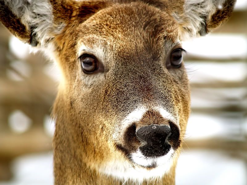
Jimbo:
I'm not going to do full critiques on those images, but I will say they are all really wonderful (that's why I'm not doing a full critique). The color, proximity, and subjects themselves are pretty awesome. How do you possible get that close to wildlife or do you have a huge lens?
As far as thumbnails, upload your images to your profile, then you can do the 'insert thumbnail' thingy at the top of the text editor when you write messages. |
|
|
|
04/30/2007 04:22:38 PM · #39 |
Well, i've been photographing wild life for about a year, and one of the best things i find to do is find a herd of deer or flock of turkey, any subject you want. Either way, once you find them. find out who owns the property and ask them if it would be ok to come around for a week or two and take some pictures. from there take a cupple days or a week and find out when the subject arrives and leaves the area, do not disturb them though,watch from adistance,try to not let them see you. Like the turkey for example, they were at a local power station, i watched this flock for about a week before i went to take pictures, learning there paths they take and arrival times and when they leave. Went and threw on full body camo, and made a little area to sit in the brush, where i would be less noticeable and sat tight till they came. as for leaving, if you got all the pictures you want, go whenever, but once you spook them, they wont be back for 3 or 4 weeks. just alot of patience and cover. put the sun behind you, so you are a shadow when they come near. Thanks sting, happy shooting.
Oh, as for the lens, I got a 45-150mm but, the most i do is turn it on the largest resolution and highest quality, this way you can crop the image down and still get a nice sized crisp photo.
Message edited by author 2007-05-01 00:33:32. |
|

|
|
Current Server Time: 07/17/2026 03:16:24 PM  |
Home -
Challenges -
Community -
League -
Photos -
Cameras -
Lenses -
Learn -
Help -
Terms of Use -
Privacy -
Top ^
DPChallenge, and website content and design, Copyright © 2001-2026 Challenging Technologies, LLC.
All digital photo copyrights belong to the photographers and may not be used without permission.
Current Server Time: 07/17/2026 03:16:24 PM EDT.
|


