(copied from forum post)
Ok, I'll try to keep it short (not one of my strengths).
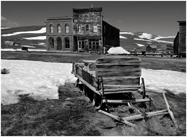
Desat, focus, border, contrast, etc seem to be all good. I like the desat on this image, it'd probably look pretty gross (melting snow in winter) otherwise.
You also have some next textures and shapes in the old building and the wagon. The wagon particularly is interesting and could make a great image on it's own.
Compositionally I think this image has problems (which is probably why you are troubled by it). It just doesn't look right. One problem is that the centers of interest (wagon, building) are centered with empty space on each side. This could be easily fixed by cropping, possibly even a portrait orientation would be nice.
There's also a large dark area to the right of the building -- I find it very distracting and it sucks my eyes in.
Finally, the road cuts the image into two. It'd be fine if the wagon was higher (you used a lower viewpoint) and broke up that line, but the way it looks now, it cuts the image right in half and makes it feel un-unified (if that is a word). And no matter how you crop it, you can't get rid of that line. You'd have to do some 'advanced' editing to break it up.
Other than composition, this image has a ton of stuff going for it. Great texture, the snow is interesting, and great subjects. |