| Author | Thread |
|
|
04/17/2007 11:26:36 PM · #1 |
Experimenting pp with my older photos.Your comments and critique on this one pls...(1st is the processed and the 2nd one is the original to compare)
Added the one with Dust spot cloned...
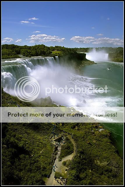
Edited to add original below:

PP Steps: Levels on each channel-->Saturation adjustment-->Little Dodge and Burn-->Sharpen-->Neat Image-->resize-->sharpen-->save for web.
Thanks,
Abhinaba
Message edited by author 2007-04-20 00:19:18. |
|
|
|
04/17/2007 11:28:45 PM · #2 |
| can't compare with the original but this is great. |
|
|
|
04/17/2007 11:30:04 PM · #3 |
I like this photo a lot too but it would benifit from cloning out the sensor dust IMO. Beautiful otherwise!
|
|
|
|
04/17/2007 11:39:20 PM · #4 |
Originally posted by briantammy:
can't compare with the original but this is great. |
Thanks Brian.
I will post the resized original also. |
|
|
|
04/17/2007 11:40:11 PM · #5 |
Originally posted by trevytrev:
I like this photo a lot too but it would benifit from cloning out the sensor dust IMO. Beautiful otherwise! |
Thanks Trevor.
You are right..I need to do that. |
|
|
|
04/18/2007 12:53:11 AM · #6 |
This would be better posted to the "Individual Photograph Discussion" forum...
|
|
|
|
04/19/2007 01:20:22 AM · #7 |
You looking for a critique, or just showing off? :) I can acommodate both...
Ooohhh, aaaaaahhh, wow! That's a nice photo.
OK, now for the critique...
I would have probably gone for a closer crop and the rule of thirds, but I think your wider crop works really well at drawing the viewer into the picture. (along with the little people already there). It sort of fits into a perspective rule of thirds anyway. Bottom third is largest because it's closer, and the sky is smaller, because it's further away. The colours are really rich without being overdone, and the burning is effective without intruding noticeably. I would probably lighten some of the grassy area, particularly in and around the path, because it kind of disappears into nowhere.
There's some blown highlights in the waterfalls to be careful of if you retouch it again, but they aren't too noticeable unless you're looking.
Clone out the few dust spots, and get rid of the little radio tower. I might even think about cloning out the boat, because it somehow makes it feel overly touristy, but maybe not. Ironically, the hundreds tourists don't make it feel touristy at all. They are just a bunch of people trekking to see a wonder. :)
Print this out on a 4-foot canvas and hang it on your wall. Great job!
Message edited by author 2007-04-19 01:22:07. |
|
|
|
04/19/2007 09:23:05 PM · #8 |
Originally posted by jmsetzler:
This would be better posted to the "Individual Photograph Discussion" forum... |
Oops!! Will keep in mind from the next time.. |
|
|
|
04/19/2007 09:31:51 PM · #9 |
Originally posted by surfdabbler:
You looking for a critique, or just showing off? :) I can acommodate both...
Ooohhh, aaaaaahhh, wow! That's a nice photo.
OK, now for the critique...
I would have probably gone for a closer crop and the rule of thirds, but I think your wider crop works really well at drawing the viewer into the picture. (along with the little people already there). It sort of fits into a perspective rule of thirds anyway. Bottom third is largest because it's closer, and the sky is smaller, because it's further away. The colours are really rich without being overdone, and the burning is effective without intruding noticeably. I would probably lighten some of the grassy area, particularly in and around the path, because it kind of disappears into nowhere.
There's some blown highlights in the waterfalls to be careful of if you retouch it again, but they aren't too noticeable unless you're looking.
Clone out the few dust spots, and get rid of the little radio tower. I might even think about cloning out the boat, because it somehow makes it feel overly touristy, but maybe not. Ironically, the hundreds tourists don't make it feel touristy at all. They are just a bunch of people trekking to see a wonder. :)
Print this out on a 4-foot canvas and hang it on your wall. Great job! |
I really appreciate your taking the time to put the comments..I got rid of the dust spots and put the new one..I kind of tend not to mess with the integrity of the photo unless it is really distracting..so I left the radio tower and the boat anyway :).
I am glad that you liked it..thanks again. |
|
|
|
04/19/2007 09:52:15 PM · #10 |
| A great example of editing to bring out what the eye sees, rather than creating new. Beautiful! :) |
|
|
|
04/19/2007 10:08:35 PM · #11 |
Nice work on the editing. I didn't notice, but did you say where these falls are located?
|
|
|
|
04/19/2007 10:35:04 PM · #12 |
Wow...nice editing job!!!
|
|
|
|
04/19/2007 10:46:53 PM · #13 |
Thanks to Sheila, David and Gayle.
David, this is Niagra Falls, US (Or u can say Canada too ;)) |
|
|
|
04/19/2007 11:03:02 PM · #14 |
Thanks. I've never been to Niagra Falls and would love to go some day. Thanks for sharing this beautiful image.
|
|
|
|
04/19/2007 11:04:05 PM · #15 |
I think your last one is great, just maybe a little contrast boost would be nice. try useing curves to do it
|
|
|
|
04/19/2007 11:24:10 PM · #16 |
| I love the first one. Composition has great leading lines. My eyes start at the bottom then follow the steps up and then my eyes follow across the ridge of the water falls. Love the colors. I think it is perfect. It could have benefited by a contrast boost as gi_joe05 said but you won't know unless your try it. Not matter what you have done some fantastic post processing. |
|
Home -
Challenges -
Community -
League -
Photos -
Cameras -
Lenses -
Learn -
Help -
Terms of Use -
Privacy -
Top ^
DPChallenge, and website content and design, Copyright © 2001-2026 Challenging Technologies, LLC.
All digital photo copyrights belong to the photographers and may not be used without permission.
Current Server Time: 05/05/2026 03:28:59 PM EDT.


