| Author | Thread |
|
|
09/10/2003 11:01:35 AM · #1 |
Do you know what photography and America's boring money have in common?
"The use of green on the currency was a happy historical occurrence, born during the Civil War years. At the time, the new science of photography had some treacherous implications. Since color photographic inks had not been invented, green was added to notes to foil counterfeiters trying to use photography to reproduce notes."
Anyone who's spent some time outside the US has to think that good ole American money is just plain boring.
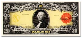
It hasn't always been this way though. In the early twentieth century, this beautiful technicolor bill was issued. I think they should've stuck with it!
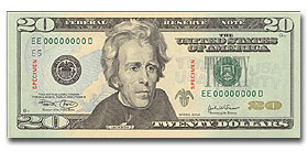
Finally, the point of all this is that Americans are finally getting some color in their money! On Oct 9, The Fed is releasing a new $20 with background colors of pink (peach) and blue, in addition to different shades of green.
This concludes your useless trivia lesson for the day.
(full story at cnn money) |
|
|
|
09/10/2003 11:11:41 AM · #2 |
someone has a little time on their hands, huh :D
Message edited by author 2003-09-10 11:11:47.
|
|
|
|
09/10/2003 11:18:36 AM · #3 |
| You'd think they could make it different sizes and colours like the rest of the world and be a bit more friendly towards folks with bad eyesight |
|
|
|
09/10/2003 11:41:42 AM · #4 |
Originally posted by indigo997:
It hasn't always been this way though. In the early twentieth century, this beautiful technicolor bill was issued. I think they should've stuck with it!
|
I agree - I like the technicolour bill, but the latest one breaks some basic typographic rules (and is a pet hate of mine) by featuring the figure 20 in three different forms - like someone let loose on a Mac for the first time.
Why they felt the need to expand the figure 20 on the top left more than the one top right, I don't know. And then they feature an outlined font just below - very messy.
I'm not a fan of wishy washy pastels on bank notes - and the bust illustration looks more like a mekon from Star Trek too! Other than that it's perfect. ;)
|
|
|
|
09/10/2003 11:45:34 AM · #5 |
Originally posted by Jon Lucas:
I agree - I like the technicolour bill, but the latest one breaks some basic typographic rules (and is a pet hate of mine) by featuring the figure 20 in three different forms - like someone let loose on a Mac for the first time. |
Don't you hate the giant Helvetica numbers on the backs of the bills? They look so out of place, worse than Monopoly money!
|
|
Home -
Challenges -
Community -
League -
Photos -
Cameras -
Lenses -
Learn -
Help -
Terms of Use -
Privacy -
Top ^
DPChallenge, and website content and design, Copyright © 2001-2026 Challenging Technologies, LLC.
All digital photo copyrights belong to the photographers and may not be used without permission.
Current Server Time: 04/30/2026 05:32:57 PM EDT.


