| Author | Thread |
|
|
12/09/2004 03:30:14 PM · #1 |
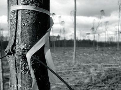
Hi everyone,
I love coming to this site because everyone is extraordinary in their photography expression, and I would hope to one day have half the talents you all carry. I'm relatively new to photography, I've always loved taking pictures, but this year I have been trying to get serious about it. Please no put downs, just give me your honest critique on this photo (it's my favorite). I guess I'm just worried that someone will laugh at my amateurish pictures- just keep in mind, I am only a beginner. Please tell me what I could have done to make this picture better, and what you honestly think about it. The title of the photo I have named "Man's Destruction" and I'm sure you will get the message when you look at the photo. Thanks for looking:
//img.photobucket.com/albums/v404/OceansWave/Freelance%20Photography/MansDestruction.jpg
~SB |
|
|
|
12/09/2004 03:33:41 PM · #2 |
Powerful Image |
|
|
|
12/09/2004 03:50:32 PM · #3 |
I am situated in front of my terrible monitor at work, so it is being viewed at its worst possible, and it still comes through as a very powerful image, as Gusto said. Judging by this one image, it looks like you have a great "eye" and know what to do with a camera! Welcome.
|
|
|
|
12/09/2004 04:04:00 PM · #4 |
|
Thank you both for your kind words...I'm very critical of myself, and there are very few in which I can call "good". Much thanks. |
|
|
|
12/09/2004 04:08:22 PM · #5 |
Hope you become a member and set up a portfolio here - would be great to see more of your work.
All the best - Kyle
|
|
|
|
12/09/2004 04:22:46 PM · #6 |
|
I love B&W, and this photo, although simple to look at first time, carries a strong message. I like its stark reality...a simple, but powerful photo...Well Done and show us some more soon. |
|
|
|
12/10/2004 03:51:31 AM · #7 |
Do you think I should keep it B&W, or should I throw some colors in there?
I messed with it a little bit & came up with this- although I'm not fond of the purple sky, I do like the yellow tree marker:
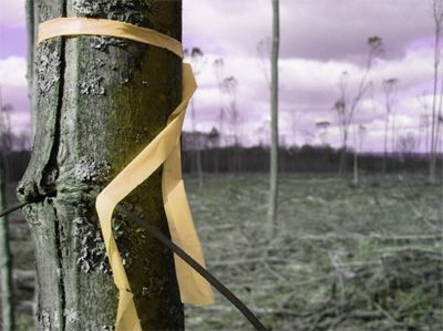
Message edited by author 2004-12-10 03:54:28. |
|
|
|
12/10/2004 04:23:40 AM · #8 |
I personally like the b/w better. Instead of focusing on the colours, you focus on the message. BTW ..... Welcome :)
sue |
|
|
|
12/10/2004 05:02:40 AM · #9 |
I agree with what you've said about the purple sky, and would go further to think of a selective de-saturation, leaving only a "bleached out" yellow ribbon.
|
|
|
|
12/10/2004 05:46:52 AM · #10 |
I think I would desat only the sky. The bits of green and the yellow bow would not be overpowered by anything besides the purple and they add a depth to the starkness.
Not that I'm old enough to have been there, but this reminds me of the destruction in Vietnam. (battle, napalm)
|
|
|
|
12/10/2004 10:56:33 AM · #11 |
|
Even though construction tape is yellow, I think the color version could be confused with the currently pervasive symbolism of the yellow ribbon. What ever side of the political debates, everyone in the US is using the yellow ribbon to represent the American troops in Iraw and Afghanistan. |
|
|
|
12/10/2004 02:18:12 PM · #12 |
Thanks for pointing out the symbolism with the yellow ribbon, something I didn't think about when selecting colors. So, I changed the color of the ribbon, as to not send across a different message. Okay, here is my final piece, just tell me once again, if you like the B&W or this final version. Thanks everyone for your input.
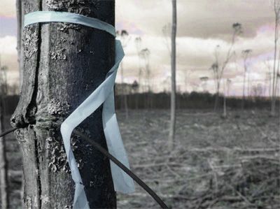
Message edited by author 2004-12-10 14:21:18. |
|
|
|
12/10/2004 04:13:26 PM · #13 |
Too much tinkering causes unhappy photo's :D
The B&W needs nothing doing to it, it's a wonderful piece.
Start messing with colors and it becomes amateur tat and screams "hey I just got hold of my first copy of Photoshop"
:D
Love the B&W!
Message edited by author 2004-12-10 16:13:42.
|
|
|
|
12/10/2004 04:20:02 PM · #14 |
The black and white is classic, go with that.
Its a truly wonderful photo! |
|
|
|
12/10/2004 04:21:37 PM · #15 |
|
|
|
12/10/2004 04:24:49 PM · #16 |
I agree with the most here - the black and white is really a wonderful photo. I just loved it. It's powerful and interesting and it needs no retouching!
|
|
|
|
12/10/2004 10:21:03 PM · #17 |
Jinjit, nico blue, jonpink- Thanks, I think you guys are right, perhaps I am overdoing what should be more simple. I appreciate the critiques, I guess I've just been wacko with photoshop trying to see what I can do (didn't have much luck before, and now I'm starting to "get it").
Kyebosh- I like what you did with that, I was unable to get out the purple & hints of green, that looks great.
Thanks to all who contributed! |
|
|
|
12/11/2004 05:46:37 PM · #18 |
SummerBreeze,
I agree with the majority here, the B&W is excellent! Keep up the good work. I look forward to seeing more from you. |
|
Home -
Challenges -
Community -
League -
Photos -
Cameras -
Lenses -
Learn -
Help -
Terms of Use -
Privacy -
Top ^
DPChallenge, and website content and design, Copyright © 2001-2026 Challenging Technologies, LLC.
All digital photo copyrights belong to the photographers and may not be used without permission.
Current Server Time: 07/05/2026 06:22:43 AM EDT.


