| Author | Thread |
|
|
06/03/2022 10:42:56 AM · #1 |

Thoughts on this one, folks? I never expected it to win or even finish in the top third . . . but I did not expect it to place as low as it did. Is it too soft? Badly composed? Too much color (I'll be kind of disappointed if that's the answer, because I kind of thought having a light colored object/subject with a white background was the point - the challenge title was not "White on White" and I thought the description suggested color)? |
|
|
|
06/03/2022 11:09:08 AM · #2 |
As far as "light" on white goes, the flower, especially the stem, is not particularly light, and even the blossom doesn't read "light" when it is that saturated a yellow, so the entry is sort of edge-wise into the challenge.
Speaking of edge-wise, to my eye the composition is a bit eccentric and it's forcing us to pay a LOT of attention to what is not-subject. From my perspective, if you want to show us "Iris & Shadow" it might make sense to let the shadow be more distinct. But that would have been at odds with the "light on white" goal, so you had a conundrum.
Finally, the blue cast of the "white" is not playing really well with the colors of the subject.
The above is what went through my mind when I voted on this image and gave it a "5". Hope this helps |
|
|
|
06/03/2022 11:11:10 AM · #3 |
| Hi Nikki. The color didn't really bother me, although the greens are bit darker rather than "lighter" ... what held the score back for me was the background with the shadow. Heavy hues of blue/cyan in there and it seemed kind of blotchy. If the background had been plain white it would have scored a point or two higher. The flower itself is a little softer than what I'd usually like to see and while the bluish tint at the back/base of the flower stem may be the actual coloration there, it seems almost like chroma or fringing. |
|
|
|
06/03/2022 11:12:32 AM · #4 |
Looking at the range of scores (and ignoring the single "1" vote) it seems that your entry generated little disagreement. Everyone voted right up the middle. I do think that a couple things negatively impacted your score:
1.) There may have been a perception that you only marginally met the challenge, since the flower is not really all that light
2.) The softness did hurt you, IMO. Preserving the fine detail while adding a soft "glow" is a challenge. I think a little more detail preservation would have gone a long way here. |
|
|
|
06/03/2022 02:12:01 PM · #5 |
Thank you Robert, Barry, and Fritz. All VERY helpful input and points are well taken. Appreciate your time.
I have no problem if others whose entries scored lower than expected add theirs to this thread :) |
|
|
|
06/03/2022 07:38:02 PM · #6 |
I thought I'd piggyback on this thread and ask what was wrong with my entry in your guys opinion

I didn't expect it to win, but thought it would be a solid 6... After all, it fit the challenge description to a T, was pretty solid technically and even had a little bit of drama )). Is there some aversion to mannequins that I should know about? |
|
|
|
06/03/2022 08:43:40 PM · #7 |
| It was a 6 from me, Lev. I didn't find it very interesting or engaging, but it's technically competent and nails the challenge, so... What you said. I think most people use 5 as their "it's average" vote, but since 5.5 is the mean, I've scaled up to using 6 as my "it's average, nothing to write home about" vote. |
|
|
|
06/03/2022 08:49:37 PM · #8 |
| Thanks Robert! I was just curious since Cory's egg photo (also competent, nails the challenge, but not-too-original) ended up in low 6s, where I'd expect mine to be as well. Ah, never mind :). |
|
|
|
06/03/2022 10:30:40 PM · #9 |
I gave yours a 7 Lev... Spot on IMO.
I was really hoping folks would appreciate just how hard it is to get the lighting on an egg that perfected - but, alas, no love.
It's ok, I'm happy with how my lines/circles entry is going. Even has a comment. :)
--
BTW: My overall critique - it's bloody light on WHITE.. LOL.. A lot of light(ish?) on gray in this as best I could tell. ;-)
|
|
|
|
06/04/2022 09:56:02 PM · #10 |
Originally posted by LevT:
I thought I'd piggyback on this thread and ask what was wrong with my entry in your guys opinion

I didn't expect it to win, but thought it would be a solid 6... After all, it fit the challenge description to a T, was pretty solid technically and even had a little bit of drama )). Is there some aversion to mannequins that I should know about? |
I was a 5 because there was no color at all and I read the description to suggest color on white was what was best. |
|
|
|
06/04/2022 10:09:51 PM · #11 |
Originally posted by nam:
I was a 5 because there was no color at all and I read the description to suggest color on white was what was best. |
Oh I see now! Thanks Nikki, that might be the answer. I didn't pay attention to the word "color" thinking that lighter tones of gray would also qualify. Could've easily add a color cast to my lighting... oh well ). |
|
|
|
06/04/2022 11:56:13 PM · #12 |
Originally posted by LevT:
Originally posted by nam:
I was a 5 because there was no color at all and I read the description to suggest color on white was what was best. |
Oh I see now! Thanks Nikki, that might be the answer. I didn't pay attention to the word "color" thinking that lighter tones of gray would also qualify. Could've easily add a color cast to my lighting... oh well ). |
Which leads to my question on my entry - which was a light colored subject in front of a white background....
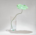 |
|
|
|
06/05/2022 09:23:09 AM · #13 |
Originally posted by tanguera:
Which leads to my question on my entry - which was a light colored subject in front of a white background....
 |
In front of a gray BG, actually, the way it's rendered. That had to cost you points off an otherwise appealing image. |
|
|
|
06/05/2022 10:02:59 AM · #14 |
Originally posted by Bear_Music:
Originally posted by tanguera:
Which leads to my question on my entry - which was a light colored subject in front of a white background....
 |
In front of a gray BG, actually, the way it's rendered. That had to cost you points off an otherwise appealing image. |
... and it's heavily processed with loss of detail.
Although, this ribbon winner was also heavily processed / filtered as well. :-)

|
|
|
|
06/05/2022 11:49:52 AM · #15 |
Originally posted by glad2badad:
Originally posted by Bear_Music:
Originally posted by tanguera:
Which leads to my question on my entry - which was a light colored subject in front of a white background....
 |
In front of a gray BG, actually, the way it's rendered. That had to cost you points off an otherwise appealing image. |
... and it's heavily processed with loss of detail.
Although, this ribbon winner was also heavily processed / filtered as well. :-)
 |
Art does not need detail ;) |
|
|
|
06/05/2022 12:59:32 PM · #16 |
Originally posted by MargaretNet:
Originally posted by glad2badad:
Originally posted by Bear_Music:
Originally posted by tanguera:
Which leads to my question on my entry - which was a light colored subject in front of a white background....
 |
In front of a gray BG, actually, the way it's rendered. That had to cost you points off an otherwise appealing image. |
... and it's heavily processed with loss of detail.
Although, this ribbon winner was also heavily processed / filtered as well. :-)
 |
Art does not need detail ;) |
Indeed ... but Art does require a healthy dose of post-processing. I did like the entries that obtained a more natural "light on white" rather than the obvious post-processed ones. Personal preference, and all that. :-) |
|
|
|
06/05/2022 01:52:46 PM · #17 |
Originally posted by LevT:
Originally posted by nam:
I was a 5 because there was no color at all and I read the description to suggest color on white was what was best. |
Oh I see now! Thanks Nikki, that might be the answer. I didn't pay attention to the word "color" thinking that lighter tones of gray would also qualify. Could've easily add a color cast to my lighting... oh well ). |
Actually, I seem to have been the only one to have taken the description that way - was just explaining my own vote :)
|
|
|
|
06/05/2022 01:55:14 PM · #18 |
Originally posted by tanguera:
Originally posted by LevT:
Originally posted by nam:
I was a 5 because there was no color at all and I read the description to suggest color on white was what was best. |
Oh I see now! Thanks Nikki, that might be the answer. I didn't pay attention to the word "color" thinking that lighter tones of gray would also qualify. Could've easily add a color cast to my lighting... oh well ). |
Which leads to my question on my entry - which was a light colored subject in front of a white background....
 |
And I did give you "points" for having a bit of color (and light tones, at that). I also liked the simplicity. As others have suggested, the gray held me back. 6 from me |
|
|
|
06/05/2022 08:09:02 PM · #19 |
Originally posted by nam:

Thoughts on this one, folks? I never expected it to win or even finish in the top third . . . but I did not expect it to place as low as it did. Is it too soft? Badly composed? Too much color (I'll be kind of disappointed if that's the answer, because I kind of thought having a light colored object/subject with a white background was the point - the challenge title was not "White on White" and I thought the description suggested color)? |
On my screen, the background is a weirdly blotchy. If it’s white on yours, bump the contrast up a lot and you’ll see the blotchy. I’ve had this problem with many of my photos with a white background. So I have one monitor purposely set to show problematic backgrounds. Because many times it looks great on my good monitor and then weirdly blotchy on the bad one. So I edit to have it look right on both.
Plus, the flower isn’t “light”, imo. It’s bright and rather brash. Light would have been more of a pale yellow, imo? Pastel lightness.
Lastly, I don’t really care for the shadow placement. It seems to take over the photo without having a lot to say about it. Having it back a bit, or up or down, but having it even and that far away really didn’t work for me. I forgot to vote on this challenge, but it would have been a 5. |
|
|
|
06/05/2022 08:13:51 PM · #20 |
Originally posted by LevT:
I thought I'd piggyback on this thread and ask what was wrong with my entry in your guys opinion

I didn't expect it to win, but thought it would be a solid 6... After all, it fit the challenge description to a T, was pretty solid technically and even had a little bit of drama )). Is there some aversion to mannequins that I should know about? |
Photos of mannequins are kind of like photos of statues or knickknacks. They don’t have a lot of interest even done well. The tears were an interesting touch, but not quite interesting enough. Plus the forehead seems really larger. I think a tighter crop at the top would have helped a lot. Something just feels uncomfortable about that crop. It probably would have been a 6 or a 7 because of technicals, but it didn’t have enough interest to score higher, imo.
|
|
|
|
06/05/2022 08:17:06 PM · #21 |
Originally posted by tanguera:
Originally posted by LevT:
Originally posted by nam:
I was a 5 because there was no color at all and I read the description to suggest color on white was what was best. |
Oh I see now! Thanks Nikki, that might be the answer. I didn't pay attention to the word "color" thinking that lighter tones of gray would also qualify. Could've easily add a color cast to my lighting... oh well ). |
Which leads to my question on my entry - which was a light colored subject in front of a white background....
 |
That would have scored low for me. Probably a 4, because it’s definitely not a white background. It’s grey not really trying to be white. To me, that was one of the biggest difficulties to the challenge, getting a white background without blowing the item or losing it’s details when trying to make it light, as well. I actually think this could have been very interesting bringing up the exposure quite a bit |
|
Home -
Challenges -
Community -
League -
Photos -
Cameras -
Lenses -
Learn -
Help -
Terms of Use -
Privacy -
Top ^
DPChallenge, and website content and design, Copyright © 2001-2026 Challenging Technologies, LLC.
All digital photo copyrights belong to the photographers and may not be used without permission.
Current Server Time: 04/26/2026 03:47:24 PM EDT.

