| Author | Thread |
|
|
02/04/2015 12:00:24 AM · #1 |
| Post your outtakes from the Oil II challenge here. |
|
|
|
02/04/2015 03:56:36 AM · #2 |
Same basic idea as the entry. This time the bottle is full. Personally, i like them both equally and i believe that this one would have scored equally.
Entry:
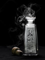
Outtake:
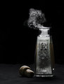
ETA: Changed the thumbnail of the entry. It pointed to a workshop image from which i copied the entry, not the actual challenge entry. Who knew that they had different image IDs?
Message edited by author 2015-02-04 11:52:49. |
|
|
|
02/04/2015 08:03:55 AM · #3 |
I like your entry much better only because of the more smoke and foam look it gives, really cool
I was bouncing back and fourth and really was trying for a certain look I really wanted to use a real older bible but couldn't find one, I think most poeple understood what I was trying to convey and it showed in the votes and comments and I thank you for it. Its one of these things where I should have seeked help and I did not.
This is what I need help with 80% of the time, trying to get my vision perfected, I know what I want but its the getting there and fine tuning things.
Entry

I was trying on a lighter version but just was not liking how things were coming out esp with the tones so wasn't sure on how to go about fine tuning this, was not very happy with this shot.

Message edited by author 2015-02-04 08:05:52. |
|
|
|
02/04/2015 10:12:22 AM · #4 |
I like both your entries better.
Damjan, because the smoke looks more untamed on the entry oicture
And Julie, because on the outtake picture there is more emphasis on the grain of the book surface, which distracts from the oil theme.
|
|
|
|
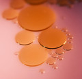
02/04/2015 10:17:27 AM · #5 |
I've got oil outtakes in almost every colour... fiddled around with my macro extension several hours at the weekend, trying different fluids, backgrounds and light. Here are some of them
  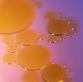 
and this was my entry:
 |
|
|
|
02/04/2015 11:50:41 AM · #6 |
 jgirl57, The entry is way sharper and less grainy than the outtake. jgirl57, The entry is way sharper and less grainy than the outtake.
primabarbara, I like the edge and the definition of the entry, but the color of the blue (first) one ;-)
|
|
Home -
Challenges -
Community -
League -
Photos -
Cameras -
Lenses -
Learn -
Help -
Terms of Use -
Privacy -
Top ^
DPChallenge, and website content and design, Copyright © 2001-2026 Challenging Technologies, LLC.
All digital photo copyrights belong to the photographers and may not be used without permission.
Current Server Time: 04/29/2026 07:30:57 AM EDT.


