| Author | Thread |
|
|
11/06/2025 11:53:00 PM · #1 |
I know I can just do a black and white or a sepia or other toned image for this challenge, but I thought it would be fun to try a "true" duotone. I have spent way too much time watching and reading video tutorials the last couple of days and still can't follow the instructions. I have Photoshop 2026 as well as Elements 2026. All the tutorials are way too fast - I keep pausing and trying to do what they say but can't even find the place to do it in most of them. And then just as one gets me to a point where it looks and sounds promising, instead of finishing, it veers off and the presenter says something like "Now, if you want to add a third color . . . " and proceeds to mess it all up!!
A good link or two, please - preferably one with a nice, slow, video AND a written tutorial to accompany it. |
|
|
|
11/07/2025 02:29:37 AM · #2 |
If you look at the last duotone challenge you don't need to worry to much - however this image of Lev puzzles me 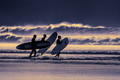 . It seems to be a true duotone, but the challenge specifically stated "Your submission should only consist of two tones (black/white, sepia, etc)." If this was the case how did Lev pass the test? . It seems to be a true duotone, but the challenge specifically stated "Your submission should only consist of two tones (black/white, sepia, etc)." If this was the case how did Lev pass the test?
This is a conundrum.
What to do?? |
|
|
|
11/07/2025 03:17:28 AM · #3 |
Even black and white photos aren't true duotones. There are all the shades of gray in between...
Lev's picture is an ideal example of this.
This simply results from the different brightness levels within an image. Unless, of course, you manage to capture an image that truly consists only of black and white (and nothing in between) or two other colors.
Ultimately, it's the voter who decides how well an entry fits the topic. |
|
|
|
11/07/2025 03:24:01 AM · #4 |
Originally posted by primabarbara:
Even black and white photos aren't true duotones. There are all the shades of gray in between...
Lev's picture is an ideal example of this.
This simply results from the different brightness levels within an image. Unless, of course, you manage to capture an image that truly consists only of black and white (and nothing in between) or two other colors.
Ultimately, it's the voter who decides how well an entry fits the topic. |
I have to agree with this one :) |
|
|
|
11/07/2025 06:01:18 AM · #5 |
Black & white photos aren't true duotones, they're monotones :) The Duotone concept comes from old times when printers were saving ink and using only two colors to print a color sheet instead of four colors. So basically the process involves putting one color in shadows and another color in highlights, this use to be easily done in Lightroom using the Split Toning tools but they've replaced it with the new Color Grading tool, which can do the same effect. Here's a tutorial I found online that shows how: https://www.youtube.com/watch?v=dnP-0CSg_as
If I had voted in any of the older duotone challenges here on DPChallenge, I would have considered most of the entries outside of the required theme.
I know this will be a difficult challenge for most, myself included :) Good luck! |
|
|
|
11/07/2025 08:37:24 AM · #6 |
Originally posted by nam:
I know I can just do a black and white or a sepia or other toned image for this challenge, but I thought it would be fun to try a "true" duotone. I have spent way too much time watching and reading video tutorials the last couple of days and still can't follow the instructions. I have Photoshop 2026 as well as Elements 2026. All the tutorials are way too fast - I keep pausing and trying to do what they say but can't even find the place to do it in most of them. And then just as one gets me to a point where it looks and sounds promising, instead of finishing, it veers off and the presenter says something like "Now, if you want to add a third color . . . " and proceeds to mess it all up!!
A good link or two, please - preferably one with a nice, slow, video AND a written tutorial to accompany it. |
I'm headed out of town, so I can't give more info now, but this is what we talked about in our thread:
"funky -- go into photoshop, click on the magnifying glass in the upper right corner, and type in duotone. and play from there.
Image"
duotone
[url=https://cdn.discordapp.com/attachments/1399826109595517043/1434940189242953728/image.png?ex=690ec4f1&is=690d7371&hm=f6d8fc541047b5cbf530eb81b4a21ba186c19e37fedb01dd269afb199679eff8
]more duotone info[/url]
Probably not helpful, but that's what we've found so far. |
|
|
|
11/07/2025 09:50:21 AM · #7 |
As mentioned, a "true" duotone is made by printing with two colors of ink, typically one lighter and one darked. Photoshop has a Duotone mode, but to use it you first have to convert the image to Grayscale mode, then to Duotone mode, and when your totally finished you have to convert back to RGB mode to make a JPEG.
This folder has an example with the original color image and a couple of duotone treatments. If you do an image search for duotones limited to my username there's about 4 pages of various entries in duotone or near-duotone ...
I've made duotones both traditionally (film) and digitally if you have more questions. |
|
|
|
11/07/2025 09:59:09 AM · #8 |
What  GeneralEsaid. In PS - Image/Mode - Greyscale and Duotone are dropdowns. There are lots of "ink" choices/combinations to pick from. GeneralEsaid. In PS - Image/Mode - Greyscale and Duotone are dropdowns. There are lots of "ink" choices/combinations to pick from. |
|
|
|
11/07/2025 11:46:02 AM · #9 |
 Thank you all for the helpful suggestions. I'm not "worried" per se - just saw this challenge as an incentive to learn something new :) Thank you all for the helpful suggestions. I'm not "worried" per se - just saw this challenge as an incentive to learn something new :)
GeneralE or  PennyStreet - This is the method I've tried to use but I keep getting stuck. I get to this point with 2 colors and expect the blue to be in the shadows, the orange in the highlights . . . but no matter what I do, I get either a blue toned or an orange toned result. What am I missing? PennyStreet - This is the method I've tried to use but I keep getting stuck. I get to this point with 2 colors and expect the blue to be in the shadows, the orange in the highlights . . . but no matter what I do, I get either a blue toned or an orange toned result. What am I missing?
Message edited by author 2025-11-07 11:46:21. |
|
|
|
11/07/2025 12:02:15 PM · #10 |
@nam -- your tone curves are too similar to show the effect.
As an extreme example to show what's happening, try setting the lighter color to 100% in 60% out, and the darker color to 40% in 0% out. You should end up with the lighter color in the light areas and the darker color in the shadows, with a blend in between.
I can be more helpful later when I'm home and can put up some screen shots.
If any of you want, post a sample image (not your actual entry) where I can download it and the color scheme you want and I can make you s sample. |
|
|
|
11/07/2025 12:26:50 PM · #11 |
Originally posted by GeneralE:
@nam -- your tone curves are too similar to show the effect.
As an extreme example to show what's happening, try setting the lighter color to 100% in 60% out, and the darker color to 40% in 0% out. You should end up with the lighter color in the light areas and the darker color in the shadows, with a blend in between.
I can be more helpful later when I'm home and can put up some screen shots.
If any of you want, post a sample image (not your actual entry) where I can download it and the color scheme you want and I can make you s sample. |
I think I need to work on understanding and manipulating curves first. But I'll be back. It is very helpful to know that you can "see" from the graphs why I'm only seeing one color. I did try to do what you suggested but am still only seeing one color. Will be back. Much to do today myself :) THANKS!! |
|
|
|
11/07/2025 01:51:41 PM · #12 |
Another way of making true duotones is to use Nik Silver Efex plugin, it has the Toning section where you can choose colors for your "silver" (dark) and "paper" (light) tones and regulate with sliders their intensity and balance. Very easy and intuitive ...if you have this plugin, that is ).
The challenge description is indeed a bit confusing. Both examples given (black/white, sepia) are monochromatic images. I guess they could also fall into the category of duotones where one of the tones isn't used, but then it would be more accurate if the description said no more than two tones
Message edited by author 2025-11-07 19:18:50. |
|
|
|
11/07/2025 03:46:54 PM · #13 |
Originally posted by nam:
Thank you all for the helpful suggestions. I'm not "worried" per se - just saw this challenge as an incentive to learn something new :) |
I took a screenshot of your image and played with it for a few minutes. For the first example I used your colors (as sampled by Photoshop), then for the second I used the same curves but changed the colors to those shown in the dialog box (C-M-Y-K values).
Duotone tests
FWIW duotones don't work that well for high-contrast images -- you end up with blocks of solid color. Compare the tones in the image with those in the gradient scale in the dialog box -- the idea is to add a degree of depth and realism to an otherwise monochromatic image. And it's perfectly fine for black to be one of the colors.
 |
|
|
|
11/07/2025 04:26:24 PM · #14 |
| Thanks, Paul. I think I have the colors reversed for a start . . . from what I imagined, that is. |
|
|
|
11/07/2025 07:45:35 PM · #15 |
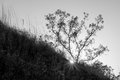
Just can't get it, so I'm taking you up on your offer, GeneralE I would like blues in shadows, light orange in highlights. I know you said this wasn't a good candidate, but I have spent so much time with it, I have formed a sort of bond (despite the fact that I just grabbed it to experiment with in the first place LOL). It's from well before the dates for current challenges and I have no intention of ever using it at DPC :)
|
|
|
|
11/07/2025 09:22:59 PM · #16 |
|
|
|
11/08/2025 08:14:21 PM · #17 |
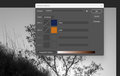
I've put up an new version, along with screenshots of the settings used. As I said this king of high-contrast image isn't the best source for duotones; I made a crude mask for the sky and tree and applied a curve to the lower part to try and bring out some detail in the grassy area. I also started with lighter colors; on a press using two inks in the same area can darken things up quickly. FWIW they sky is lighter on this monitor after uploading than on the one where I was editing, but you get the idea ...
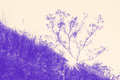 Duotone Tests Duotone Tests
Message edited by author 2025-11-08 20:15:04. |
|
|
|
11/08/2025 09:00:35 PM · #18 |
Originally posted by GeneralE:
I've put up an new version, along with screenshots of the settings used. As I said this king of high-contrast image isn't the best source for duotones; I made a crude mask for the sky and tree and applied a curve to the lower part to try and bring out some detail in the grassy area. I also started with lighter colors; on a press using two inks in the same area can darken things up quickly. FWIW they sky is lighter on this monitor after uploading than on the one where I was editing, but you get the idea ...
Duotone Tests |
Thank you. I don't think I can do this but I really appreciate seeing how it would look and I especially appreciate the time you spent working on it and saving the screen shots for me so I can better understand. |
|
|
|
11/08/2025 09:06:35 PM · #19 |
You can do it -- try starting with an easier image, like a typical landscape without too much fine detail.
ETA: To further simplify use black as one of the colors and pick something other than :sepia" as the second; for rolling grassy hills us black/green, a nice sunset black and red/orange, a nightscape black and blue, etc.
Message edited by author 2025-11-08 21:52:34. |
|
|
|
11/10/2025 12:32:48 AM · #20 |
.
Message edited by author 2025-11-10 00:49:21. |
|
|
|
11/10/2025 03:53:42 PM · #21 |
Originally posted by GeneralE:
You can do it -- try starting with an easier image, like a typical landscape without too much fine detail.
ETA: To further simplify use black as one of the colors and pick something other than :sepia" as the second; for rolling grassy hills us black/green, a nice sunset black and red/orange, a nightscape black and blue, etc. |
Thanks for all the help - you and everyone else who chimed in. It wasn't hard but there was so much that was mentioned in this thread that ended up being helpful - not least of all the fact that I had to convert back to RGB to be able to save as a jpg (used the PS duotone drop-down in Images > Mode). I'd never have figured that out!
I'm in :) |
|
|
|
11/10/2025 03:58:16 PM · #22 |
Originally posted by nam:
I'm in :) |
That's the spirit! I'm still (about to be) working on mine ... ;-) |
|
|
|
11/10/2025 06:03:14 PM · #23 |
| Since this is supposed to be an educational site, I plan to post color and grayscale versions of my duotone entry in the auto-generated Outtakes thread when the challenge is over, hopefully others will too ... |
|
Home -
Challenges -
Community -
League -
Photos -
Cameras -
Lenses -
Learn -
Help -
Terms of Use -
Privacy -
Top ^
DPChallenge, and website content and design, Copyright © 2001-2026 Challenging Technologies, LLC.
All digital photo copyrights belong to the photographers and may not be used without permission.
Current Server Time: 04/24/2026 02:45:43 AM EDT.


