| Author | Thread |
|
|
12/10/2013 09:08:45 AM · #26 |
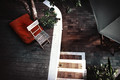 . . 
My take: side by side, I can see that the original leads your eye into the comp from the bottom left, curving around to the left to the chair/mat, exiting at the left edge,& coming back in to do it again in a natural, pleasing eye movement. The straightened version leads your eye from the lower left corner, along a diagonal to follow the rib of the umbrella, straight out of the comp thru the upper right corner (ignoring the chair/mat), never to return.
In the original, the non-subject spaces are distributed in a way to give your eye room to roam. In the edited version, those spaces are straightened up, leading your eye out of the frame on a strong left-to-right diagonal. Such a small change creates such a different comp.
This article on composition might be of interest.
Message edited by author 2013-12-10 09:11:48. |
|
|
|
12/10/2013 09:40:19 AM · #27 |
Originally posted by posthumous:
Originally posted by Cory:
- that is what I'm talking about, compare this to the original. |
just that slight change ruins it. I don't understand why any better than you do and I find it just as threatening as you do, but I won't deny what I see. |
It's been my experience that a slight diagonal extending through the "exit point" of an image IMPEDES exit and tends to act like a flipper in a pinball machine, so to speak. For me, the image spirals in a clockwise direction from the white chair, as drawn earlier. The diagonal of the step at the bottom bounces me back into the image and right back at the black umbrella, where I get lost. It's a death thing, I guess.
Anyway, if I *analyze* why it works structurally (sort of like analyzing the metrics of a poem) that's what I end up with. It's all after the fact: the image works for me one way, and not the other way, and if I ask myself why, this immediately comes to mind. |
|
|
|
12/10/2013 10:43:14 AM · #28 |
Fascinating.
And the darkest part is that I too don't really think the edited version works as well. |
|
|
|
12/10/2013 01:33:56 PM · #29 |
Originally posted by Cory:
Fascinating.
And the darkest part is that I too don't really think the edited version works as well. |
I was rooting for you, Cory. I hate the unalignment, but have to agree the original is better by a mile than the "corrected" one. I wonder if maybe that piece of top step was cloned out instead of rotating the whole image/cropping it would have more appeal, while stil passing the "tidy" test? |
|
|
|
12/10/2013 02:51:34 PM · #30 |
| Art is rarely tidy, folks :-) |
|
|
|
12/11/2013 03:17:01 AM · #31 |
| Function in chaos..... finish in style. I'm SUCH a messsz..... ;-)))) |
|
|
|
12/13/2013 05:43:20 PM · #32 |
Golden Ratio Images
This might help too. ;)
|
|
Home -
Challenges -
Community -
League -
Photos -
Cameras -
Lenses -
Learn -
Help -
Terms of Use -
Privacy -
Top ^
DPChallenge, and website content and design, Copyright © 2001-2026 Challenging Technologies, LLC.
All digital photo copyrights belong to the photographers and may not be used without permission.
Current Server Time: 04/27/2026 08:13:39 PM EDT.


