| Author | Thread |
|
|
05/25/2012 03:14:13 PM · #1 |
What is wrong with this picture? This is a fresh hatched chicken still in the incubator (the weird lighting is the warming light). The commenters all seemed to like it. So if you were one of the 1 through 4 voters, what turned you off? The dof? The lighting?
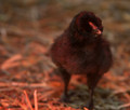
Place: 123 out of 131
Avg (all users): 4.5565
Avg (commenters): 7.6667
Avg (participants): 4.2200
Avg (non-participants): 4.8154
|
|
|
|
05/25/2012 03:16:56 PM · #2 |
| Kelli, I was one of your 4 voters. The very shallow depth of field didn't work for me. On a personal and subjective level, I would have preferred a depth of field that allowed the beak as well as the eye to be in focus. |
|
|
|
05/25/2012 03:23:15 PM · #3 |
Originally posted by Kelli:
So if you were one of the 1 through 4 voters, what turned you off? The dof? The lighting? |
The combo of both. I vote in relation to the other photos, and not on a photos own merit. Of all the photos with birdies in them, I personally thought this was the least interesting compositionally, and there were technical flaws in relation to the others.
I had assumed it was under a heat lamp, so didn't care as much about the colour, but it was still unappealing. The DOF was hard to notice since the bird is black and that's where the detail is located.
Message edited by author 2012-05-25 15:23:49. |
|
|
|
05/25/2012 03:24:19 PM · #4 |
It's just an out-of-focus snapshot. That's how it comes across. Absolutely nothing engaging about it other than that it's of a baby chicken and baby chickens are cute. But then again, as baby chickens go, I gotta say this one's not all that cute anyway. So I sorta shrug my shoulders, give it a 4, and move on.
|
|
|
|
05/25/2012 03:32:29 PM · #5 |
Originally posted by Kelli:
What is wrong with this picture? This is a fresh hatched chicken still in the incubator (the weird lighting is the warming light). The commenters all seemed to like it. So if you were one of the 1 through 4 voters, what turned you off? The dof? The lighting?

Place: 123 out of 131
Avg (all users): 4.5565
Avg (commenters): 7.6667
Avg (participants): 4.2200
Avg (non-participants): 4.8154 |
Most of this could have alleviated with a little more PP. Shadows are heavily prevalent so your histogram must've had a strong left presence. There are no highlights to help give contrast to the shadows to add depth. So darker darks and lighter lights in essence.Also, the focus seems a tad off, though I think some USM could've helped as well. Composition is mostly good, though the foot is a little cropped giving it a cramped feeling. Hope that helps! Also, do you shoot in RAW and what do you use for PP? |
|
|
|
05/25/2012 03:51:07 PM · #6 |
| For me less shallower dof would have worked better. Because the image is dark it makes it seem oof vs. simply shallow dof. |
|
|
|
05/25/2012 03:56:27 PM · #7 |
| Although I'm not in the category (5 from me), still a comment (you asked for it :). The DoF is very narrow (perhaps too), the light , well , it doesn't make this cute bird pop out and the WB could be better. But at least there's some point of focus and it meets the challenge. |
|
|
|
05/25/2012 04:05:16 PM · #8 |
I guess maybe I should have gone with a less shallow dof, and maybe a cuter bird. LOL! 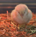 Next time, I'll stick to flowers. ;D Next time, I'll stick to flowers. ;D |
|
|
|
05/25/2012 04:18:28 PM · #9 |
 I believe this ia the better of the two photographs. Most importantly, the colors are more natural. And for this subject, even though I love shallow dof, I think having more of the chick in focus works better. Cute idea for the challenge! I believe this ia the better of the two photographs. Most importantly, the colors are more natural. And for this subject, even though I love shallow dof, I think having more of the chick in focus works better. Cute idea for the challenge! |
|
|
|
05/25/2012 04:26:02 PM · #10 |
| I was a low scorer for the reasons mentioned - Bear_Music said it best for me when he said it comes across as "an out-of-focus snapshot". I would have scored the second chick way better. I entered a flower, but I really think a very good newly hatched chick capture would have been way better than a flower :) |
|
|
|
05/25/2012 04:36:23 PM · #11 |
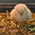
I really prefer this one. Couldn't resist do to some work on the colors. The red tint is really bothering me.
 |
|
|
|
05/25/2012 05:02:37 PM · #12 |
Originally posted by hajeka:
I really prefer this one. Couldn't resist do to some work on the colors. The red tint is really bothering me.
 |
Very nice! I guess I was thinking to leave the lighting to show they were still in the incubator. They were shot through glass, in the zoo's children section. I really wanted to get one coming out of the shell, but none were at the time. I think what I really need to do is stop entering my oob stuff if I want a decent score. |
|
|
|
05/25/2012 05:26:14 PM · #13 |
|
|
|
05/25/2012 05:39:48 PM · #14 |
Originally posted by hajeka:
I really prefer this one. Couldn't resist do to some work on the colors. The red tint is really bothering me.
 |
I'm not around my computer right now, but I would say there's still too much red tint for me. I would shift it a little more toward green while cooling the temperature (lowering the Kelvin value) to add a little more bluish tint to make the lighting seem a tad more natural. |
|
|
|
05/25/2012 06:06:00 PM · #15 |
Originally posted by SaraR:
Kelli, I was one of your 4 voters. The very shallow depth of field didn't work for me. On a personal and subjective level, I would have preferred a depth of field that allowed the beak as well as the eye to be in focus. |
I was also a low voter for the same reasons SaraR mentioned.
I do prefer the second peep you posted on this thread. I would've scored that one better. I am glad you didn't do a flower, though. I got sooo sick of looking at flower after flower! |
|
|
|
05/25/2012 06:27:45 PM · #16 |
This is all very helpful! To see how others see something is so much better than a number. ;D
I'm still listening if anyone else wants to chime in an opinion. |
|
|
|
05/25/2012 07:03:46 PM · #17 |
 Yanko, that was impressive - curious to know how you managed to bring out so much detail. Yanko, that was impressive - curious to know how you managed to bring out so much detail. |
|
|
|
05/25/2012 07:17:46 PM · #18 |
Kelli,  Yanko's edit shows that you had a photo with great potential, just needed the pp to exploit that. The way he has done it I prefer that one to the yellow chick. (I gave you 6 because I did think he was a bit cute.) Yanko's edit shows that you had a photo with great potential, just needed the pp to exploit that. The way he has done it I prefer that one to the yellow chick. (I gave you 6 because I did think he was a bit cute.)
|
|
|
|
05/25/2012 08:22:03 PM · #19 |
I have to admit, Yanko breathed new life into that shot. Good job, Richard!
|
|
|
|
05/26/2012 12:37:09 AM · #20 |
Originally posted by SaraR:
 Yanko, that was impressive - curious to know how you managed to bring out so much detail. Yanko, that was impressive - curious to know how you managed to bring out so much detail. |
The first thing I did, which immediately boosted detail was to fix the color cast. There's a DPC tutorial on how to do that. Kelli said it was shot under a warming light so all that red was really muddying up the detail so that color cast fix was a huge help as it also brighten up the entire image.
In addition, I boosted detail via some dodging of the highlights (i.e. the bright spots in the feathers). I used a highlights mask for this. In this case shift+ctrl+alt+3. I also did some selective sharpening as well as a light application of Nik's Color Efex Tonal Contrast filter applied to just the highlights of the chicken. Afterwards I added some blur to the feathers to soften it as well as the background. This help make the facial details pop in contrast. Speaking of those facial details, I obviously did some work on the eye. I added a small catch light and some highlights dodging. This gave it more pop. That's pretty much as far as the detail is concern. I also did some color work and cleaned up some things with the clone tool here and there. I think that's it.
ETA: I forgot to mention I am using masks on each of these steps except for the first one which was a global adjustment. The rest I'm basically massaging into the image by applying it either with the use of highlight, midtone or shadow masks or by freehand in some spots.
Message edited by author 2012-05-26 00:41:36.
|
|
|
|
05/26/2012 02:17:04 AM · #21 |
| Richard, what do you mean by "the use of highlight, midtone, or shadow masks"? Does this imply, for example, using a 50% grey mask in various blend modes? |
|
|
|
05/26/2012 03:59:08 AM · #22 |
Originally posted by cosmicassassin:
The combo of both. I vote in relation to the other photos, and not on a photos own merit. Of all the photos with birdies in them, I personally thought this was the least interesting compositionally, and there were technical flaws in relation to the others.
I had assumed it was under a heat lamp, so didn't care as much about the colour, but it was still unappealing. The DOF was hard to notice since the bird is black and that's where the detail is located. |
I am confused by the above statement. When you vote you do not vote on the photo itself but in relation to other similar photos?
|
|
|
|
05/26/2012 07:16:18 AM · #23 |
Originally posted by Sevlow:
Originally posted by cosmicassassin:
The combo of both. I vote in relation to the other photos, and not on a photos own merit. Of all the photos with birdies in them, I personally thought this was the least interesting compositionally, and there were technical flaws in relation to the others.
I had assumed it was under a heat lamp, so didn't care as much about the colour, but it was still unappealing. The DOF was hard to notice since the bird is black and that's where the detail is located. |
I am confused by the above statement. When you vote you do not vote on the photo itself but in relation to other similar photos? |
i think he means he compares them to the other entries. i think a lot of us do that to an extent. |
|
|
|
05/26/2012 07:21:08 AM · #24 |
sorry Kelli, but its a boring photo. i don't succumb to the animal cuteness factor, so it need to really pull me in and this didn't do that. plus the lighting was very poor and the dof has no real clear focus point, the background is too blurred and is actually distracting to me.
i hate to be harsh but this photo really did nothing for me. i didn't vote in this challenge, but since it wasn't dnmc i would have given it a 4 or 5.
the better question to ask in the future than "why didn't this do well", is "what could i have done to improve it?"
Message edited by author 2012-05-26 07:23:04. |
|
|
|
05/26/2012 10:00:47 AM · #25 |
I had to play with it, but now that I look at the thread, I like Yanko's much better. Mine's way too heavy handed.

But anyway, the problem is that everything was way too muddy, and we couldn't really see the subject. It's not a great shot, but would have done much better, imo, if you had brought him out more. More detail, and especially we want to see his face.
I actually like this shot much better than your outtake (once it's cleaned up). The outtake is ordinary, the entry -- as yanko so aptly said -- is quirky and much more interesting.
Your outtake would have been much better if you would have gotten down on the chick's level, and taken the photo basically eye to eye with him. He's in a great pose, but shooting from above doesn't do it.
I think that's one of the keys to nature photography -- if you can get on their level. Your entry is great because he's looking up. That point of view is awesome. But on the outtake, we're just looking at the top of his head. If he was just on paper, that angle would be better because then we get the feet -- which are always great -- and it would have been more of a focal point. But straight on his level, the outtake would have been much more interesting.
|
|
Home -
Challenges -
Community -
League -
Photos -
Cameras -
Lenses -
Learn -
Help -
Terms of Use -
Privacy -
Top ^
DPChallenge, and website content and design, Copyright © 2001-2026 Challenging Technologies, LLC.
All digital photo copyrights belong to the photographers and may not be used without permission.
Current Server Time: 04/16/2026 12:19:31 PM EDT.

