|
| Author | Thread |
|
|
06/22/2010 01:05:46 PM · #1901 |
Originally posted by pawdrix:
Originally posted by clive_patric_nolan:
Most recent reject.
Ursula-i would very much value your thoughts on this one.
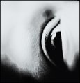
When i get more time i'm going to start commenting over at 1x so that i can get some critique there. Out of the 15 or so images i've had rejected only one came back with comments and they were all positive saying things like 'Great'. |
I'm not Ursula but I'll chime in...
It's a very good image though I have to admit, after reading your comments that I didn't get it. There's nothing wrong with the shot, whatsoever. Perhaps it's either too deep or not strong enough to communicate your message...which left me in the zone of an abstract using the human eye. And I honestly like it as that...an abstract BUT beyond that, I wasn't able to draw more from the image. You can also chalk that up as my shortcoming, as a viewer and not yours.
I wouldn't change a thing but sometimes messages either need to be dumbed down...or punched up. Depends how you look at it and who your audience is. |
Thanks for the thoughts Steve. That makes sense. I can see how it just works as an abstract and not as anything more without additional info and that defeats the purpose really. |
|
|
|
06/22/2010 01:05:56 PM · #1902 |
Originally posted by ursula:
Robert, of all your photos this is one of my most favourite! That sounds weird. I mean, I really like it, and I'm sad it wasn't published. It has that gentle delicacy that so few pictures have, it is delicious. |
Thanks... When I got this is aid to myself, "If I ever make a 1x landscape, this is it!" I was flabbergasted it got bounced, actually. Not only that, not a single comment from any screeners :-(
And the subject itself is so strange, they stick these saplings in the water to mark the channel to this fishing harbor every year. No permanent buoys, just the saplings. Never seen anything like it anywhere else.
R.
|
|
|
|
06/22/2010 01:07:37 PM · #1903 |
Originally posted by clive_patric_nolan:
Most recent reject.
Ursula-i would very much value your thoughts on this one.
When i get more time i'm going to start commenting over at 1x so that i can get some critique there. Out of the 15 or so images i've had rejected only one came back with comments and they were all positive saying things like 'Great'. |
I don't think I can critique this one at all. I like it as it is. I see a woman in a long black coat walking away with a bent head, remembering ... her times by the ocean, elephants, good times with her family. I don't know why she's walking away, maybe she's old now.
But as a picture, it could be said that it is crap, or genius, or somewhere in between. I just don't know how to critique it. |
|
|
|
06/22/2010 01:10:43 PM · #1904 |
Originally posted by Bear_Music:
Originally posted by ursula:
Robert, of all your photos this is one of my most favourite! That sounds weird. I mean, I really like it, and I'm sad it wasn't published. It has that gentle delicacy that so few pictures have, it is delicious. |
Thanks... When I got this is aid to myself, "If I ever make a 1x landscape, this is it!" I was flabbergasted it got bounced, actually. Not only that, not a single comment from any screeners :-(
And the subject itself is so strange, they stick these saplings in the water to mark the channel to this fishing harbor every year. No permanent buoys, just the saplings. Never seen anything like it anywhere else.
R. |
It went to vote, and I guess it just didn't resonate with viewers enough for anyone to leave a comment. It is a dangerous thing to fall in love with our own images, Bear. What I'm guessing is that you're putting a lot of feelings into the image, things that you felt and thought about and experienced, and that you wanted to show with that image, and yet ... a few may connect to those feelings mainly because of common experiences, but for most it isn't like that. Does that make sense? |
|
|
|
06/22/2010 01:26:54 PM · #1905 |
Originally posted by ursula:
Originally posted by clive_patric_nolan:
Most recent reject.
Ursula-i would very much value your thoughts on this one.
When i get more time i'm going to start commenting over at 1x so that i can get some critique there. Out of the 15 or so images i've had rejected only one came back with comments and they were all positive saying things like 'Great'. |
I don't think I can critique this one at all. I like it as it is. I see a woman in a long black coat walking away with a bent head, remembering ... her times by the ocean, elephants, good times with her family. I don't know why she's walking away, maybe she's old now. |
I like that. The concept i was attempting to portray with the image was one of the slippery fickleness of inner perception and, in particular, memory.
Originally posted by ursula:
But as a picture, it could be said that it is crap, or genius, or somewhere in between. I just don't know how to critique it. |
That'll do for me! I'd be happy if many of my images generated that response. |
|
|
|
06/22/2010 01:35:56 PM · #1906 |
Originally posted by ursula:
It is a dangerous thing to fall in love with our own images, Bear. |
And yet, if we DON'T, then why are we doing this at all?
Don't get me wrong, I'm not beefing or anything; it's just that of all my submissions, this is the one I felt was by far the strongest, at least in a classic sense, so I am disappointed.
Something else you said up there is worth examining:
Originally posted by ursula:
It went to vote, and I guess it just didn't resonate with viewers enough for anyone to leave a comment. |
Obviously, that's the case. But this business of "going to vote"... I've been screening, as a member, since I started submitting there again, I do enough screening to get bonus slots, even. And one thing that strikes me, is how *alike* DPC and 1x are, in this sense — in both cases, to get recognition you have to appeal to the "voters", plain and simple.
It's a different *pool* of voters, obviously, but whether or not you're accepted, if you get passed into member screening, is going to depend entirely on which particular cross-section of members makes up the first 100 to "vote" on your image...
There have been numerous occasions where I have "voted" an image-in-screening "down", saying in essence "Don't publish this!", usually with detailed comments appended, and yet the image has ended up being accepted, and showing up on the front page.
So there's nothing monolithic about 1x, it's just like DPC in the sense that acceptance/rejection represents a consensus among a subset of members during any particular week :-)
I'm not sure how many posting to this thread realize that, it's just sort of dawned on me recently :-)
R.
|
|
|
|
06/22/2010 01:37:58 PM · #1907 |
I think I already said it in this thread about a 100 pages ago :), in my opinion 1x does not particularly reward subtlety. The image has to convey the message or the mood loud and clear to stand a chance of being published. Call it "wow factor" or whatever. I call it to myself "eye candy for sophisticated people". Nothing wrong with that, I have a good share of such images which have been appreciated at 1x, but many of my (in my opinion) better images have been soundly rejected there because the voters did not see "the story" or "motif"... oh well, I think it is understandable, almost inevitable for any voting-based system. For example, Bear's latest example (a nice and subtle landscape) probably would've had a better luck if he amplified the brightness, especially in the reflection part. It would not make for a better image, but would make it more "publishable". Try it Robert, and let's see what happens!
ETA: I am positive that the most of Henri Cartier-Bresson iconic photos (if they were not widely known that is) would be rejected in 1x. too subtle, too "imperfect" :)
Message edited by author 2010-06-22 13:52:30. |
|
|
|
06/22/2010 01:46:39 PM · #1908 |
Originally posted by ursula:
Originally posted by yanko:
Ursula since you're in the commenting mood care to take a crack at this recent rejection? :) I had no plans to submit it to 1x but a few people here seem to really like it. I have my own reasons why I think it got rejected but would be curious to hear what you think.
 |
Interesting how different this one looks on a light gray background vs. a very dark background. As one of your commenters says, it's a rather daring picture, "audacious". Very much first impressions, but on the light gray background the big empty sky looks quite impressive, but on the black background, it disappears. The bottom part of the image, the dark part (the lake?), looks almost fake. The skyline looks almost chunky rather than clear (small chunky) especially on the dark background. It feels both rather centred (even with the huge sky) and unbalanced at the same time. My main first impression is that it gets lost against black and that it is too "unbelievable" as a picture to work as a picture.
What are your reasons why you think it got rejected?
Added: There also are some funny almost vertical areas (thick lines) right above the skyline (distortions from the plane window?). They are quite annoying. There's also a dust-bunny at bottom left (hey, why not get perfectionistic, it sometimes helps!) |
Thank you Ursula. To answer your question, my theory mirrors what I've said in the past regarding 1x, which is they over emphasize craft in general and subject appeal rather than the photograph itself. I didn't have high hopes for the photo because it wasn't made to be a showcase of what I can do technically and the subject itself wasn't particular showy in the mainstream sense.
Now I don't care too much about this particular rejection because like you said some of the flaws (i.e. window smudge, sensor dust) could and should have been fixed. However, I suspect even if this were fixed it still wouldn't matter. It's not the greatest image in the world but what you said about it being too unbelievable as a picture is precisely why it didn't get trashed in the first place. Must everything be so believable, so predictable? |
|
|
|
06/22/2010 01:56:06 PM · #1909 |
Originally posted by Bear_Music:
Originally posted by ursula:
It is a dangerous thing to fall in love with our own images, Bear. |
And yet, if we DON'T, then why are we doing this at all?
|
Falling in love with them in the sense of thinking that everyone else has to see them the same way we do.
Originally posted by Bear_Music:
So there's nothing monolithic about 1x, it's just like DPC in the sense that acceptance/rejection represents a consensus among a subset of members during any particular week :-) |
It's not just like DPC, and I'm really glad about that! Life would be so boring if the two were the same. Some of us like one site better than the other, heck, that's the way it is with all things, isn't it? It's rather silly to compare the two, over and over and over again.
I've been waiting for a thread at 1X, something about the "DPC Reject Club". Something like, "My picture was published here at 1X and got many accolades and favourites and so on, then I sent it in to a challenge at DPC, and WHAM! It got slammed! What's wrong with my picture?" That would be interesting :) |
|
|
|
06/22/2010 02:01:58 PM · #1910 |
Well, Ursula, I never said everybody has to see it the same way I do. I don't even THINK that, let alone say it. But I certainly DO love a few of my images :-)
And my point about 1x being "like" DPC was carefully qualified by "in the sense that..." — it's just about the fact that both involve voting as a measure of popularity. In most other respects they couldn't be much more different, and as you say "Thank goodness for that!" I didn't (and don't) feel like I've been "comparing" the two; it's just that there's a bit of a sense that keeps cropping up in this thread that 1x is more monolithic than DPC, more of a single POV, and I have realized that is not true...
Look, I actually LIKE both places. I haven't gotten involved in the community over there (only have time to do justice to two, DPC and my gaming site), but I love the pictures and i enjoy submitting and screening...
R.
|
|
|
|
06/22/2010 02:03:21 PM · #1911 |
Originally posted by Bear_Music:
I actually LIKE both places. .... , but I love the pictures and i enjoy submitting and screening...
R. |
So do I! |
|
|
|
06/22/2010 02:04:46 PM · #1912 |
Originally posted by LevT:
ETA: I am positive that the most of Henri Cartier-Bresson iconic photos (if they were not widely known that is) would be rejected in 1x. too subtle, too "imperfect" :) |
Pity he's not around to try it! |
|
|
|
06/22/2010 02:05:39 PM · #1913 |
Originally posted by ursula:

One of my own latest rejects. I was very sad about this one being rejected. It is flawed, I admit to that, but I liked it. It is always dangerous to like my own pictures :) I am still thinking about it to see if I can improve it so that it will be published. In my mind it belongs with my portfolio, flawed and all.
I also would appreciate opinions on it. |
It's beautiful and subtle, but for me the story lies in the single seed that's surrounded by the others, and I don't get enough of its story from the photograph. In context, it's too much like the others. I suppose metaphorically it would have been wonderful if the seed was somewhere more separated from the others, larger, more offset, more isolated, singled out; but it would have also been important compositionally in my view. |
|
|
|
06/22/2010 02:10:45 PM · #1914 |
Originally posted by Louis:
Originally posted by ursula:
One of my own latest rejects. I was very sad about this one being rejected. It is flawed, I admit to that, but I liked it. It is always dangerous to like my own pictures :) I am still thinking about it to see if I can improve it so that it will be published. In my mind it belongs with my portfolio, flawed and all.
I also would appreciate opinions on it. |
It's beautiful and subtle, but for me the story lies in the single seed that's surrounded by the others, and I don't get enough of its story from the photograph. In context, it's too much like the others. I suppose metaphorically it would have been wonderful if the seed was somewhere more separated from the others, larger, more offset, more isolated, singled out; but it would have also been important compositionally in my view. |
Thank you, Louis! I appreciate the input very much! Story of my life: reshoot, reshoot, reshoot ... :)
It is very interesting how I think I knew what you (and others) pointed out about this image, its flaws. I knew it, but I wasn't able to put it into words (because of what I call "falling in love with my own image"). When others spell it out, it makes sense all of a sudden, much more sense. I appreciate that very much. |
|
|
|
06/22/2010 02:15:44 PM · #1915 |
|
Yeah, it's tough. I think many photographers get too close to their subjects, or their iconography, and start to lose the perspective of the other qualifying factors that make up a successful picture. Not saying that in relation to your photo here, but that's certainly been my experience with my own stuff. I think 1x is a great equalizer in that regard. Even wonderful photographers need to very careful when submitting there. Its venue really forces introspection. |
|
|
|
06/22/2010 03:51:22 PM · #1916 |
freshly rejected

...this time with a couple of comments which do provide some clues
* Nice try. The image would improve a lot if you cropped it more. Get rid of the guy on the left and also of the concrete slabs in the front and you'll get a much stronger image.
* Good idea to try to make a modern version of this world-famous photograph. My main objection would be that the guy on the left is quite distracting since he's not looking toward the couple. On Doisneau's photograph there were a few more passers-by and a man's shoulder on the foreground, so the other people looked more like context elements and didn't distract the viewer too much from the couple.
I appreciate these comments but don't quite agree with them... Lots of "distractions" in the Doisneau's original, but they do not take away from the image, they make it work. in my view, the strength of the Doisneau's image (which I tried to imitate) is the juxtaposition and disconnect between the mundane chaos of a busy street and a fleeting moment of intimacy between two people who completely ignore all of that. And nobody in the Doisneau's photo is looking at the couple, either. Of course since Doisneau's photo is famous, one can make all kinds of arguments why its distractions are different and better, but in truth, I doubt very much that if it was unknown it would be published in 1x, either. Hard to check now, of course... :)
|
|
|
|
06/22/2010 03:59:23 PM · #1917 |
I read into it that the you and the screener agree on the original....that the "other" people in the original added to the photo and were not distractions.
However, in yours I think he/she is saying that the man on the left is a distraction b/c he is not looking at the kissers.
Originally posted by LevT:
freshly rejected
...this time with a couple of comments which do provide some clues
* Nice try. The image would improve a lot if you cropped it more. Get rid of the guy on the left and also of the concrete slabs in the front and you'll get a much stronger image.
* Good idea to try to make a modern version of this world-famous photograph. My main objection would be that the guy on the left is quite distracting since he's not looking toward the couple. On Doisneau's photograph there were a few more passers-by and a man's shoulder on the foreground, so the other people looked more like context elements and didn't distract the viewer too much from the couple.
I appreciate these comments but don't quite agree with them... Lots of "distractions" in the Doisneau's original, but they do not take away from the image, they make it work. in my view, the strength of the Doisneau's image (which I tried to imitate) is the juxtaposition and disconnect between the mundane chaos of a busy street and a fleeting moment of intimacy between two people who completely ignore all of that. And nobody in the Doisneau's photo is looking at the couple, either. Of course since Doisneau's photo is famous, one can make all kinds of arguments why its distractions are different and better, but in truth, I doubt very much that if it was unknown it would be published in 1x, either. Hard to check now, of course... :) |
|
|
|
|
06/22/2010 04:06:14 PM · #1918 |
Originally posted by LevT:
freshly rejected
...this time with a couple of comments which do provide some clues
* Nice try. The image would improve a lot if you cropped it more. Get rid of the guy on the left and also of the concrete slabs in the front and you'll get a much stronger image.
* Good idea to try to make a modern version of this world-famous photograph. My main objection would be that the guy on the left is quite distracting since he's not looking toward the couple. On Doisneau's photograph there were a few more passers-by and a man's shoulder on the foreground, so the other people looked more like context elements and didn't distract the viewer too much from the couple.
I appreciate these comments but don't quite agree with them... Lots of "distractions" in the Doisneau's original, but they do not take away from the image, they make it work. in my view, the strength of the Doisneau's image (which I tried to imitate) is the juxtaposition and disconnect between the mundane chaos of a busy street and a fleeting moment of intimacy between two people who completely ignore all of that. And nobody in the Doisneau's photo is looking at the couple, either. Of course since Doisneau's photo is famous, one can make all kinds of arguments why its distractions are different and better, but in truth, I doubt very much that if it was unknown it would be published in 1x, either. Hard to check now, of course... :) |
The comparision to the original is pretty remarkable. However, I do prefer the original mainly because of how the energy in the busy scene is being used. In your version, the overall movement is suggesting a left to right flow with a downward angle. As a result the kiss almost seems rushed as if they are walking quickly down a hill and so the power of the kiss is dissipated making it less romantic, IMO. In the original the energy of the kiss is traveling against the current so to speak and as a result the kiss generates a greater impact and is more romantic.
ETA for spelling.
Message edited by author 2010-06-22 16:09:04. |
|
|
|
06/22/2010 04:07:33 PM · #1919 |
Originally posted by kenskid:
I read into it that the you and the screener agree on the original....that the "other" people in the original added to the photo and were not distractions.
However, in yours I think he/she is saying that the man on the left is a distraction b/c he is not looking at the kissers.
|
except for in the original he is not looking at the couple either :) |
|
|
|
06/22/2010 04:20:52 PM · #1920 |
Originally posted by yanko:
The comparision to the original is pretty remarkable. However, I do prefer the original mainly because of how the energy in the busy scene is being used. In your version, the overall movement is suggesting a left to right flow with a downward angle. As a result the kiss almost seems rushed as if they are walking quickly down a hill and so the power of the kiss is dissipated making it less romantic, IMO. In the original the energy of the kiss is traveling against the current so to speak and as a result the kiss generates a greater impact and is more romantic. |
We're probably talking about the same thing, but notice how, in the original, her posture is such that she's been stopped in her tracks and forced backwards by the power of the kiss. In the remake, it's a rushed kiss-in-motion, nowhere near as powerful. It's a pretty subliminal clue, but I think it's real important.
R.
|
|
|
|
06/22/2010 04:34:32 PM · #1921 |
Originally posted by Bear_Music:
Originally posted by yanko:
The comparision to the original is pretty remarkable. However, I do prefer the original mainly because of how the energy in the busy scene is being used. In your version, the overall movement is suggesting a left to right flow with a downward angle. As a result the kiss almost seems rushed as if they are walking quickly down a hill and so the power of the kiss is dissipated making it less romantic, IMO. In the original the energy of the kiss is traveling against the current so to speak and as a result the kiss generates a greater impact and is more romantic. |
We're probably talking about the same thing, but notice how, in the original, her posture is such that she's been stopped in her tracks and forced backwards by the power of the kiss. In the remake, it's a rushed kiss-in-motion, nowhere near as powerful. It's a pretty subliminal clue, but I think it's real important.
R. |
Exactly. Now I do like Lev's shot since it has it's own way about it. I'm glad he didn't try to unravel the thing so it wouldn't look so busy. |
|
|
|
06/22/2010 04:36:12 PM · #1922 |
|
thanks Richard and Robert, it is an astute observation. indeed, in the original the guy presumably "stopped" her momentarily with the kiss, and "my" couple continued walking, which it created a subtly different feel to the kiss. Richard, I am not sure I see the counter-flow of traffic in the original, except for one person, everything there moves in the same direction.. |
|
|
|
06/22/2010 04:42:03 PM · #1923 |
No 1x fame for my famous recreation!
 |
|
|
|
06/22/2010 05:02:19 PM · #1924 |
Originally posted by LevT:
thanks Richard and Robert, it is an astute observation. indeed, in the original the guy presumably "stopped" her momentarily with the kiss, and "my" couple continued walking, which it created a subtly different feel to the kiss. Richard, I am not sure I see the counter-flow of traffic in the original, except for one person, everything there moves in the same direction.. |
Yes everything is moving in the same direction except for the one guy in the background. You can't see his features at all except that he's in motion and from our view he's merging into the woman that is sandwiched inbetween him and the couple kissing. Perhaps a stronger motion blur would make it more obvious but there's a transfer of energy going on there which is moving from right to left counter to everything else. It adds to the power of the kiss, IMO. If the kisser himself was turing to the right I don't think it would have worked as well.
ETA: The other aspect I didn't mention was the man closest to the camera. In a way he acts as the viewer to the whole thing which adds yet another dynamic to the image. Basically, all of the so called clutter in the original is adding to the narrative, not detracting from it.
Edited for clarity.
Message edited by author 2010-06-22 17:09:39. |
|
|
|
06/22/2010 05:12:03 PM · #1925 |
|
Doisneau's kissers are more sensual -- the male is noticeably taller than the female, she is drawn back against his arm, he's really planting one on her. The crowd around them is more kinetic probably because there are simply more people, and the fact that they are ignoring the kiss helps, whereas in your version, only one guy is really visible, and his ignoring the kiss detracts because it seems odd. Also, Doisneau's has a café-eye-view. It was taken from his table and strengthens the impression that the viewer is part of the scenery in my view. |
|

|
|
Current Server Time: 06/11/2026 05:20:38 PM  |
Home -
Challenges -
Community -
League -
Photos -
Cameras -
Lenses -
Learn -
Help -
Terms of Use -
Privacy -
Top ^
DPChallenge, and website content and design, Copyright © 2001-2026 Challenging Technologies, LLC.
All digital photo copyrights belong to the photographers and may not be used without permission.
Current Server Time: 06/11/2026 05:20:38 PM EDT.
|


