|
| Author | Thread |
|
|
06/22/2010 12:43:19 AM · #1876 |
Originally posted by Prash:
Originally posted by ursula:
Originally posted by kenskid:
Oh man....that shot looks like the kind of stuff that makes it !
Originally posted by Prash:
I tried my last submission again after taking care of some of the critique comments:
 . .
SPLAT! Rejected. |
|
May I ask, why would you say that? I had nothing to do with the not publishing of this image (I've been gone for the last 10 days), but I'm very curious why you would think that it is the kind of image that makes it. To me it doesn't look anything like that. |
 Ursula: first of all, I am a big fan. Ursula: first of all, I am a big fan.
Next, if you could please take some time to be brutally honest about how banal/common this shot is, I will try and improve what I can.
Puhleaazzeee????
Thank you. |
Sure you're not going to get mad? :)
Anyway. The picture just doesn't do justice to the gentle grace of these flowers. It also doesn't give a feeling for the environment in which the flowers do their magic, nor does it interpret the flowers/their environment, make a metaphor, a story, out of them. Last, it doesn't abstract them, get to the essense of what makes an orange poppy an orange poppy. It is a couple of disconnected closed orange poppies on a dull background, from a rather common viewers POV, no context, no real strong point of interest, no extension story, no simple visual beauty. Quite possibly others would see the image very differently, and again, I didnt' have anything to do with it not being published at 1X, but that is the way I see this image.
Tell me though, why would you think that it is worth sending in for publishing? How do you see it? What do you see in it that makes you think it is worth it?
|
|
|
|
06/22/2010 12:46:59 AM · #1877 |
Originally posted by kenskid:
IMO it kind of has the same feel as these.
1 23
I've looked through hundreds since discovering the site. The three above are only a few of the ones that I think have the same feel as the one  Prash submitted....just my opinion of course. Prash submitted....just my opinion of course. |
Interesting. I would agree that it is going in the same direction, the same attempted spirit (at least as intention by the photographer), and I applaud the photog for that. One thing is for sure - making flower (or nature) images is no easy task. But I disagree with you in that it "is" the same feel/spirit -- the execution needs to be better. Just think light for one. The two examples you posted have very good light. Prash's picture, even though it is very natural light, from making a picture POV it is not in any way light that stands out.
Message edited by author 2010-06-22 00:50:15. |
|
|
|
06/22/2010 12:47:55 AM · #1878 |
Originally posted by JustCaree:
Just submitted my next reject!
|
Now why in the world would you do that? Send in something publisheable, for crying out loud! :) |
|
|
|
06/22/2010 12:58:59 AM · #1879 |
Originally posted by ursula:
Originally posted by Prash:
Originally posted by ursula:
Originally posted by kenskid:
Oh man....that shot looks like the kind of stuff that makes it !
Originally posted by Prash:
I tried my last submission again after taking care of some of the critique comments:
.
SPLAT! Rejected. |
|
May I ask, why would you say that? I had nothing to do with the not publishing of this image (I've been gone for the last 10 days), but I'm very curious why you would think that it is the kind of image that makes it. To me it doesn't look anything like that. |
Ursula: first of all, I am a big fan.
Next, if you could please take some time to be brutally honest about how banal/common this shot is, I will try and improve what I can.
Puhleaazzeee????
Thank you. |
Sure you're not going to get mad? :)
Anyway. The picture just doesn't do justice to the gentle grace of these flowers. It also doesn't give a feeling for the environment in which the flowers do their magic, nor does it interpret the flowers/their environment, make a metaphor, a story, out of them. Last, it doesn't abstract them, get to the essense of what makes an orange poppy an orange poppy. It is a couple of disconnected closed orange poppies on a dull background, from a rather common viewers POV, no context, no real strong point of interest, no extension story, no simple visual beauty. Quite possibly others would see the image very differently, and again, I didnt' have anything to do with it not being published at 1X, but that is the way I see this image.
Tell me though, why would you think that it is worth sending in for publishing? How do you see it? What do you see in it that makes you think it is worth it? |
No I am NOT mad a bit. I am very happy I could get you to comment here, something that many aspire for on 1X:-)
So thank you!
Now if I may, this is what I I submitted as a supporting comment to this (original) submission:

"I was on my usual evening walk with my other arm (the camera:-) on sidewalk to a busy street, and suddenly noticed these pretty orange-yellowish tiny buds swaying amidst a lot of dirt, trash, and weeds on a barren and unmanaged piece of land. I was taken by a surprise, specially because I didn't expect such beauty to be so close to a dirty urban setting with all the traffic and smoke!
You wouldn't believe how I got into that dirt mound with sandals and shorts only, so engaged by all the different perspectives I wanted to capture them in. Before I could realize, I was already 45 minutes into capturing them, probably making the passersby wonder if I am crazy:-)
I took at least 30 shots. But I think this one engages me the most. To me the bud on the left is like a curious soul who just discovered the other one (to the right) after an apocalypse, and is looking at it, as if asking "say... you look just like me! And I thought I was the last one left...""
I won't lie. The day I shot these, and came back home and started looking at them, I was amazed at how a simple subject can be so engaging. Granted I was not comparing these to other images on 1X, since each image is unique, and I did not start with the intention of copying someone'e work (albeit I am inspired by the abstraction of shape, color, and motion in some of your work).
In summary: I really did not know if it was worthy publishing on 1X, but I was truly excited about how I can improve. Of course the screeners were probably too busy, so all I could get was comments from critiques, and worked on the image to make the background more dull and smooth as people pointed out, the result was the image you reviewed.
I still love the original one though (not comparing to any other image, just relative to my own work).
Thanks again for being candid! |
|
|
|
06/22/2010 01:02:15 AM · #1880 |
|
|
|
06/22/2010 01:04:34 AM · #1881 |
|
Prash, I like your original much better than the reworked version. I love your description of finding beauty in dismal surroundings! It would be a very interesting project to somehow be able to put that feeling, that view, into a picture, so that viewers also could see beauty in dismal surroundings, really feel it, both the beauty, and the strangeness of finding it where you found it. That would be some picture! |
|
|
|
06/22/2010 01:08:48 AM · #1882 |
Originally posted by ursula:
Prash, I like your original much better than the reworked version. I love your description of finding beauty in dismal surroundings! It would be a very interesting project to somehow be able to put that feeling, that view, into a picture, so that viewers also could see beauty in dismal surroundings, really feel it, both the beauty, and the strangeness of finding it where you found it. That would be some picture! |
Thank you very much again! I understand it is not an easy thing to teach: this story telling. I guess it only comes with practice.
Btw I still see these less than a dozen orange poppies on my way to walk every evening. I just wish you (or someone more experienced than I am) were able to see them, take my camera away from me, and just give me that one shot that shows how to bring their beauty out.
Regardless, I hope they are still there the next time I go there.. and I will surely try to get a more interesting and provoking capture.
P.S. Some people apparently thought I was crazy leaning down to dirt taking these shots, and would honk loud as they would pass by. This one van guy really scared me once as I was so engaged in planning a shot;-) |
|
|
|
06/22/2010 01:17:35 AM · #1883 |
I lucked out? No, seriously, I don't think the two pictures have much in common except for both of them being boats on water. Outside of that, not much in common at all. For one, light is very, very different! So is the overall feel.
I agree that Robert's (Bear_Music) picture is good. It worked nicely in the DPC challenge it was made for. However, the subject/situation is very common, as is the light. The treatment applied to the picture is debatable, some might call it artistic, some heavy-handed, whatever; in my view, it stands out too much on its own (as a treatment) to work. It comes down to the question, is the image special in any way? How does it stand out over many others like it? Does the treatment enhance the image for most viewers? Imagine yourself one of crew at 1X ... why would you publish Robert's picture? It's easy to say, it's a good picture. But how is it a good picture? How does it work, what magic does it have, how does it stand out, what makes it a publisheable image? |
|
|
|
06/22/2010 01:17:54 AM · #1884 |
Ursula since you're in the commenting mood care to take a crack at this recent rejection? :) I had no plans to submit it to 1x but a few people here seem to really like it. I have my own reasons why I think it got rejected but would be curious to hear what you think.
Message edited by author 2010-06-22 01:18:27. |
|
|
|
06/22/2010 01:28:18 AM · #1885 |
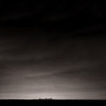
Originally posted by yanko:
Ursula since you're in the commenting mood care to take a crack at this recent rejection? :) I had no plans to submit it to 1x but a few people here seem to really like it. I have my own reasons why I think it got rejected but would be curious to hear what you think.
|
Interesting how different this one looks on a light gray background vs. a very dark background. As one of your commenters says, it's a rather daring picture, "audacious". Very much first impressions, but on the light gray background the big empty sky looks quite impressive, but on the black background, it disappears. The bottom part of the image, the dark part (the lake?), looks almost fake. The skyline looks almost chunky rather than clear (small chunky) especially on the dark background. It feels both rather centred (even with the huge sky) and unbalanced at the same time. My main first impression is that it gets lost against black and that it is too "unbelievable" as a picture to work as a picture.
What are your reasons why you think it got rejected?
Added: There also are some funny almost vertical areas (thick lines) right above the skyline (distortions from the plane window?). They are quite annoying. There's also a dust-bunny at bottom left (hey, why not get perfectionistic, it sometimes helps!)
Message edited by author 2010-06-22 01:30:27. |
|
|
|
06/22/2010 01:34:19 AM · #1886 |
Originally posted by Citadel:
Well..I am 0 for 2.
A version of this was fav'd twice here and twice on Flickr.
//www.flickr.com/photos/crtaylor/4380467129/in/set-72157623060416816/
It was something different so I thought I would try it. It was probably too different and thus didn't resonate with the viewers. It did get to member screening so I guess it wasn't entirely awful. |
if anyone would care to comment on my recent reject I'd be grateful. (The flickr one is the same as what I submitted) And Ursula...if you don't want to I understand :)
|
|
|
|
06/22/2010 01:44:26 AM · #1887 |
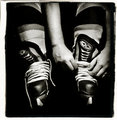
Originally posted by Citadel:
Originally posted by Citadel:
Well..I am 0 for 2.
A version of this was fav'd twice here and twice on Flickr.
//www.flickr.com/photos/crtaylor/4380467129/in/set-72157623060416816/
It was something different so I thought I would try it. It was probably too different and thus didn't resonate with the viewers. It did get to member screening so I guess it wasn't entirely awful. |
if anyone would care to comment on my recent reject I'd be grateful. (The flickr one is the same as what I submitted) And Ursula...if you don't want to I understand :) |
The Flickr version looks a lot sharper than the image you sent in to screening at 1X. Probably the smaller size. The hands, laces, and front part of the skates look not too sharp in the 1X version. Overall, I think the B/W treatment and more square cut you used for DPC work better. As a picture it also works better at DPC because it fits a challenge, a theme, but as a stand alone work it doesn't have as much strength. The background is very dark, and the hands/arms look like they're floating there lacing up the skates. Including more at the top (in the 1X version) intensifies the floatiness feel. You also reversed it at both Flickr and 1X (compared to the challenge entry) - I tend to think I like the right side placement of DPC better than the left side placement you used at the other sites.
IMO, what undoes this as a stand alone picture is that it seems to want to tell a story, but what is the story - in a way, it's a very easy story, lacing up for a game. Too easy. So what if someone is doing that. It needs more. I'm thinking while typing here. It's like maybe it is simply too cliche to work and at the same time not cliche enough to work in the way that the dumb waterdrops work over and over. Does that make any sense at all? That, and from the technical POV, the too dark background (no detail), lack of sharpness, and not so strong compo.
I hope this helps. I always worry about people getting mad, I don't like it at all when people get mad. :) |
|
|
|
06/22/2010 01:50:33 AM · #1888 |
Originally posted by ursula:
I hope this helps. I always worry about people getting mad, I don't like it at all when people get mad. :) |
Of course I'm not mad! :) I appreciate the feedback. Sometimes its tough to get a good critique because people are afraid of hurting feelings. Now had you just said "what the hell were you thinking????" I might have been a little offended... :)
Once again, thank you! |
|
|
|
06/22/2010 01:55:38 AM · #1889 |

One of my own latest rejects. I was very sad about this one being rejected. It is flawed, I admit to that, but I liked it. It is always dangerous to like my own pictures :) I am still thinking about it to see if I can improve it so that it will be published. In my mind it belongs with my portfolio, flawed and all.
I also would appreciate opinions on it. |
|
|
|
06/22/2010 02:04:27 AM · #1890 |
|
comment left. A brief one I am afraid because I can't see much to improve it. That might be because its midnight and I should be asleep but it probably has more to do with the fact I like it just the way it is. :) |
|
|
|
06/22/2010 02:07:51 AM · #1891 |
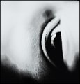
Originally posted by ursula:
One of my own latest rejects. I was very sad about this one being rejected. It is flawed, I admit to that, but I liked it. It is always dangerous to like my own pictures :) I am still thinking about it to see if I can improve it so that it will be published. In my mind it belongs with my portfolio, flawed and all.
I also would appreciate opinions on it. |
I may not be worthy of it, but here are my 2 cents:
- I may have seen a color version of it somewhere (unless I am hallucinating.. that last Jalapeno was real killer:-). If so, I think absence of colors makes me focus more on the busy background.
- I like the composition and the framing, no issues there.
Hope that helps... |
|
|
|
06/22/2010 03:31:49 AM · #1892 |
Most recent reject.
Ursula-i would very much value your thoughts on this one.
When i get more time i'm going to start commenting over at 1x so that i can get some critique there. Out of the 15 or so images i've had rejected only one came back with comments and they were all positive saying things like 'Great'.
|
|
|
|
06/22/2010 08:45:11 AM · #1893 |
|
A suggestion - for those asking for feedback on their rejects here, please look at what Ursula wrote on Prash's shot, then do a self-eval when you post for comments. In other words, do your own assessment of your shot with respect to story, light, etc. |
|
|
|
06/22/2010 09:01:23 AM · #1894 |
Originally posted by Melethia:
A suggestion - for those asking for feedback on their rejects here, please look at what Ursula wrote on Prash's shot, then do a self-eval when you post for comments. In other words, do your own assessment of your shot with respect to story, light, etc. |
Yes,thats true i'm also aware that Ursula is probably very busy and may not have much time to stick around here critiquing everyone shots. I've done all the self-evaluation i can on the above shot. It's very clear, to my mind, the metaphorical narrative and concept it's attempting to portray. I know what the story is and what it 'means'. Whether or not that translates well to others is what i'm unsure about of course although as it's already been in a challenge the comments help. Ursula's opinion is always welcome on anything of course!
Message edited by author 2010-06-22 09:02:09. |
|
|
|
06/22/2010 10:42:15 AM · #1895 |
Originally posted by clive_patric_nolan:
Most recent reject.
Ursula-i would very much value your thoughts on this one.
When i get more time i'm going to start commenting over at 1x so that i can get some critique there. Out of the 15 or so images i've had rejected only one came back with comments and they were all positive saying things like 'Great'. |
I'm not Ursula but I'll chime in...
It's a very good image though I have to admit, after reading your comments that I didn't get it. There's nothing wrong with the shot, whatsoever. Perhaps it's either too deep or not strong enough to communicate your message...which left me in the zone of an abstract using the human eye. And I honestly like it as that...an abstract BUT beyond that, I wasn't able to draw more from the image. You can also chalk that up as my shortcoming, as a viewer and not yours.
I wouldn't change a thing but sometimes messages either need to be dumbed down...or punched up. Depends how you look at it and who your audience is.
eta:I just uploaded the incorrect version of this that I couldn't delete and it got rejected...

I have a gloomier edit of these Tulips that were in a graveyard called Funeral For A Friend. Not sure if the proper version would have done better but I thought I would try a mood shot.
Message edited by author 2010-06-22 11:50:49. |
|
|
|
06/22/2010 12:42:06 PM · #1896 |
Originally posted by ursula:
I lucked out? No, seriously, I don't think the two pictures have much in common except for both of them being boats on water. Outside of that, not much in common at all. For one, light is very, very different! So is the overall feel.
I agree that Robert's (Bear_Music) picture is good. It worked nicely in the DPC challenge it was made for. However, the subject/situation is very common, as is the light. The treatment applied to the picture is debatable, some might call it artistic, some heavy-handed, whatever; in my view, it stands out too much on its own (as a treatment) to work. It comes down to the question, is the image special in any way? How does it stand out over many others like it? Does the treatment enhance the image for most viewers? Imagine yourself one of crew at 1X ... why would you publish Robert's picture? It's easy to say, it's a good picture. But how is it a good picture? How does it work, what magic does it have, how does it stand out, what makes it a publisheable image? |
Obviously, the folks at 1x love pictures that have been photoshopped to the max. They are not interested in just good photos, they want you to photoshop the crap out of them. I'm not sure of this, since I don't sit on their screening committee, but from the pictures I have seen on there, that's what I have noticed. Hey, to each their own, if thats what they like, I suggest that's what you submit to them. As far as I can see, however, the pic from bear has more to say than the pic from ursula. I'm not saying ursula's is a bad pic, but I would prefer the one bear has hanging on my wall to the other. |
|
|
|
06/22/2010 12:50:07 PM · #1897 |
Originally posted by rugman1969:
Obviously, the folks at 1x love pictures that have been photoshopped to the max. They are not interested in just good photos, they want you to photoshop the crap out of them. |
Nonsense.
Originally posted by rugman1969:
As far as I can see, however, the pic from bear has more to say than the pic from ursula. I'm not saying ursula's is a bad pic, but I would prefer the one bear has hanging on my wall to the other. |
And yet Ursula's image has far less obvious processing than Bear's thus totally disproving your point. |
|
|
|
06/22/2010 12:50:48 PM · #1898 |
Originally posted by rugman1969:
Originally posted by ursula:
I lucked out? No, seriously, I don't think the two pictures have much in common except for both of them being boats on water. Outside of that, not much in common at all. For one, light is very, very different! So is the overall feel.
I agree that Robert's (Bear_Music) picture is good. It worked nicely in the DPC challenge it was made for. However, the subject/situation is very common, as is the light. The treatment applied to the picture is debatable, some might call it artistic, some heavy-handed, whatever; in my view, it stands out too much on its own (as a treatment) to work. It comes down to the question, is the image special in any way? How does it stand out over many others like it? Does the treatment enhance the image for most viewers? Imagine yourself one of crew at 1X ... why would you publish Robert's picture? It's easy to say, it's a good picture. But how is it a good picture? How does it work, what magic does it have, how does it stand out, what makes it a publisheable image? |
Obviously, the folks at 1x love pictures that have been photoshopped to the max. They are not interested in just good photos, they want you to photoshop the crap out of them. I'm not sure of this, since I don't sit on their screening committee, but from the pictures I have seen on there, that's what I have noticed. Hey, to each their own, if thats what they like, I suggest that's what you submit to them. As far as I can see, however, the pic from bear has more to say than the pic from ursula. I'm not saying ursula's is a bad pic, but I would prefer the one bear has hanging on my wall to the other. |
That's fine. I don't mind one bit.
However, Bear's picture is photoshopped a heck of a lot more than mine. Mine hardly is photoshopped at all, his qualifies as photoshopped the crap out of it. So it seems that your taste sort of agrees with 1X's taste! :)
Something else you might want to remember. Those two pictures were taken a few years apart. Things change over time. Many pictures that were accepted in the past may not be accepted today. Many pictures that are accepted now may not have been accepted in the past. That doesn't make any of them bad pictures, they are what they are in their own time. I think it really would be worth it to mostly critique pictures by themselves, without bringing up comparisons to try and bolster or bring down opinions. It is pretty silly to say that one picture is good because it is supposedly "better" than another one, when in reality the pictures have nothing to do with each other.
Message edited by author 2010-06-22 12:57:12. |
|
|
|
06/22/2010 12:57:20 PM · #1899 |
Originally posted by ursula:
However, Bear's picture is photoshopped a heck of a lot more than mine. Mine hardly is photoshopped at all, his qualifies as photoshopped the crap out of it. So it seems that your taste sort of agrees with 1X's taste! :) |
You noticed that, didya? :-)
But you know the interesting thing? I have submitted some "straight" photos and they have been rejected without exception. The two they have accepted, I "photoshopped the crap out of them", one of them in pretty much exactly the way I did this latest boat shot.
This one is a straight photo, and it was rejected. Depressingly, I might add, as i think it's one of my best of the year; fascinating subject and ethereal light... Voters didn't much care for it here either, in "Famous Photograph", but I can't tell if that's because it didn't really emulate any widely-known specific image, but rather a certain photographer's way of seeing:

R.
|
|
|
|
06/22/2010 12:59:12 PM · #1900 |
Originally posted by Bear_Music:
Originally posted by ursula:
However, Bear's picture is photoshopped a heck of a lot more than mine. Mine hardly is photoshopped at all, his qualifies as photoshopped the crap out of it. So it seems that your taste sort of agrees with 1X's taste! :) |
You noticed that, didya? :-)
But you know the interesting thing? I have submitted some "straight" photos and they have been rejected without exception. The two they have accepted, I "photoshopped the crap out of them", one of them in pretty much exactly the way I did this latest boat shot.
This one is a straight photo, and it was rejected. Depressingly, I might add, as i think it's one of my best of the year; fascinating subject and ethereal light... Voters didn't much care for it here either, in "Famous Photograph", but I can't tell if that's because it didn't really emulate any widely-known specific image, but rather a certain photographer's way of seeing:
R. |
Robert, of all your photos this is one of my most favourite! That sounds weird. I mean, I really like it, and I'm sad it wasn't published. It has that gentle delicacy that so few pictures have, it is delicious.
Message edited by author 2010-06-22 13:02:25. |
|

|
|
Current Server Time: 06/12/2026 05:55:32 AM  |
Home -
Challenges -
Community -
League -
Photos -
Cameras -
Lenses -
Learn -
Help -
Terms of Use -
Privacy -
Top ^
DPChallenge, and website content and design, Copyright © 2001-2026 Challenging Technologies, LLC.
All digital photo copyrights belong to the photographers and may not be used without permission.
Current Server Time: 06/12/2026 05:55:32 AM EDT.
|


