| Author | Thread |
|
|
06/14/2010 01:13:37 PM · #26 |
Originally posted by hihosilver:
Originally posted by Bear_Music:
...one of my particular areas-of-experience is pulling a better dynamic range out of single, RAW exposures, when multiple image HDR isn't feasible, so I'll be gald to share some of that.
R. |
I'd be interested to know your detailed thoughts on this. Generally, I work with one image more than sets of images. |
Me too! maybe you can start another thread so you don't cut in here? |
|
|
|
06/14/2010 01:35:51 PM · #27 |
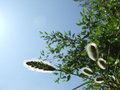
This was my first experience with this technique/software -- this scored 4.57 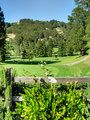
Originals resized to 25% of the original size are linked in the additional info area along with my editing steps.
I found the comment on the photo about it being so bright interesting ... I thought part of the idea of this type of processing was to gain the ability to capture a bright, contrasty day, while not blowing out the sky or blocking the shadows. |
|
|
|
06/14/2010 01:42:15 PM · #28 |
Originally posted by GeneralE:
This was my first experience with this technique/software -- this scored 4.57
Originals resized to 25% of the original size are linked in the additional info area along with my editing steps.
I found the comment on the photo about it being so bright interesting ... I thought part of the idea of this type of processing was to gain the ability to capture a bright, contrasty day, while not blowing out the sky or blocking the shadows. |
Indeed it is.. I think you just managed to draw too much attention to your midtones.. They are indeed a bit too bright, and too saturated... |
|
|
|
06/14/2010 01:50:35 PM · #29 |
Scored 5.3554.
I will upload the original exposures when I get home (only two).
|
|
|
|
06/14/2010 01:50:57 PM · #30 |
Originally posted by coryboehne:
Indeed it is.. I think you just managed to draw too much attention to your midtones.. They are indeed a bit too bright, and too saturated... |
Yeah, but it was a clear, bright sunny day at about 4:30 pm. with the sun at about 35-45° elevation behind me and to the left, and the well-tended plant life is pretty lush -- the photo is as close as I could make it to what it looked like to my eye when I was there. Oh well ... :-) |
|
|
|
06/14/2010 01:52:37 PM · #31 |
Originally posted by vawendy:
Ok -- the torture is, in fact, over.
Post your originals here!
Here's the rules: If you scored above a 6, take someone's originals with a score less than 6 and show us what you did. If you score below a 6, playing with a successful shot and see what you can do! |
I guess most of us will be at the mercy of the 6.0+ scorers to stop by and bless us;-)
|
|
|
|
06/14/2010 01:58:03 PM · #32 |
Originally posted by GeneralE:
Originally posted by coryboehne:
Indeed it is.. I think you just managed to draw too much attention to your midtones.. They are indeed a bit too bright, and too saturated... |
Yeah, but it was a clear, bright sunny day at about 4:30 pm. with the sun at about 35-45° elevation behind me and to the left, and the well-tended plant life is pretty lush -- the photo is as close as I could make it to what it looked like to my eye when I was there. Oh well ... :-) |
The scene may have been what you saw, however, being as bright as it was means it would not produce a pleasing (IMO) image. HDR provides the tool to stretch the dynamic range. Even though there are no blowouts doesn't mean that it shouldn't be toned down a bit.
I think you managed to bring up the shadows nicely but the highlights need to be toned down so they don't overpower the image.
Message edited by author 2010-06-14 13:58:37. |
|
|
|
06/14/2010 02:04:08 PM · #33 |
Originally posted by cpanaioti:
The scene may have been what you saw, however, being as bright as it was means it would not produce a pleasing (IMO) image. HDR provides the tool to stretch the dynamic range. Even though there are no blowouts doesn't mean that it shouldn't be toned down a bit.
I think you managed to bring up the shadows nicely but the highlights need to be toned down so they don't overpower the image. |
Thanks -- that also makes sense. As I said, this is my first experience with this, and as an exercise in the technique it seems successful to me, even if the overall look still needs improvement. I am going out of town for a few days, but I'll play with it some more when I get back. |
|
|
|
06/14/2010 02:41:24 PM · #34 |
Originally posted by GeneralE:
This was my first experience with this technique/software -- this scored 4.57
Originals resized to 25% of the original size are linked in the additional info area along with my editing steps.
I found the comment on the photo about it being so bright interesting ... I thought part of the idea of this type of processing was to gain the ability to capture a bright, contrasty day, while not blowing out the sky or blocking the shadows. |
Here are your 3 base originals merged in Photomatix Pro and tonemapped. No other adjustments made. Saturation may be a bit high, but...
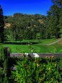
There's considerably more of a sense of dimensionality here, nobody would "tag" this as HDR if they didn't know...
Message edited by author 2010-06-14 14:44:12.
|
|
|
|
06/14/2010 02:45:46 PM · #35 |
Originally posted by Bear_Music:
Originally posted by GeneralE:
This was my first experience with this technique/software -- this scored 4.57
Originals resized to 25% of the original size are linked in the additional info area along with my editing steps.
I found the comment on the photo about it being so bright interesting ... I thought part of the idea of this type of processing was to gain the ability to capture a bright, contrasty day, while not blowing out the sky or blocking the shadows. |
Here are your 3 base originals merged in Photomatix Pro and tonemapped. No other adjustments made. Saturation may be a bit high, but...
There's considerably more of a sense of dimensionality here, nobody would "tag" this as HDR if they didn't know... |
That's the stuff Bear... I would have liked to see a bit more in the shadows... Just a touch.. :) And, it's a hair soft.. LOVELY highlight work though, you really made those highlights look great..
Message edited by author 2010-06-14 14:47:39. |
|
|
|
06/14/2010 02:51:22 PM · #36 |
Originally posted by coryboehne:
That's the stuff Bear... I would have liked to see a bit more in the shadows... Just a touch.. :) And, it's a hair soft.. But, yeah.. That's nice. :) |
As a rule of thumb, in Zone System or in "natural" HDRI, you *want* to have true blacks in the deepest shadows, it's one of the keys to a realistic image. A lot of the "cartoon" look comes from forcing the shadows unnaturally. In general, I'll only force up the parts of the image that NEED to read detail, and let the deep shadows be what they want to be.
If this were a picture of, say, a white clapboard house with an open garage doors, inside of garage in deep shadow, and antique car in garage, then I'd pull the shadows up a lot more to "read" that car, but I'd still allow the not-car shadows in the deepest recesses of the garage to go black if possible.
This is assuming the goal is a natural-looking rendition, not an exaggerated cartoon...
ETA: regarding "softness", I did nothing but merge & tone map; no other processing. I'd play with the intensity of the blue, for sure, if I were going further, and I'd definitely do output sharpening as well.
Message edited by author 2010-06-14 14:52:28.
|
|
|
|
06/14/2010 02:52:50 PM · #37 |
The thumbnail looks really dark, but the larger version looks more natural, though perhaps as if the sun had gone behind the hills in back (the course is near the bottom of a fairly steep valley).
This was only with the three originals? I made the other two because I was striving to retain just a tiny bit of detail to the right of the fencepost -- in the remake that area looks pretty solid on my monitor. |
|
|
|
06/14/2010 02:58:42 PM · #38 |
Originally posted by GeneralE:
This was only with the three originals? I made the other two because I was striving to retain just a tiny bit of detail to the right of the fencepost -- in the remake that area looks pretty solid on my monitor. |
Yes, I'm letting that area, and some other "unimportant" shadows go dark, to keep depth. I could bring those shadows up, still using only the three originals, but at the expense of overflattening the image to the point of being unnatural. That's just doing a straight merge with photomatix and tonemapping, BTW. Another approach would be to take the version I just made, then do a whole second tonemapping to accentuate the shadows, layer the two versions, and mask out everything but that little area of shadow you want more detail in, then fade the overlay to adjust it so it looks natural.
|
|
|
|
06/14/2010 05:33:30 PM · #39 |
So the issue that I have with mine, and other HDR's that I've tried, is that they end up so flat looking:
Anyone want to take a crack at it? (the originals are further down in the list)
|
|
|
|
06/14/2010 05:57:19 PM · #40 |
Originally posted by vawendy:
So the issue that I have with mine, and other HDR's that I've tried, is that they end up so flat looking:
Anyone want to take a crack at it? (the originals are further down in the list) |
You're right about the flatness. I am going to have a crack at it, but it's a more complex problem than generale's, and I have been busy with my new macro lens :-)
R.
|
|
|
|
06/14/2010 06:12:17 PM · #41 |
Originally posted by vawendy:
So the issue that I have with mine, and other HDR's that I've tried, is that they end up so flat looking:
Anyone want to take a crack at it? (the originals are further down in the list) |
I gave you a 9, I thought you did a really nice job, but I'll take a crack at it later this evening after I get home and try out my idea for the Long Exposure challenge. It'll be up by tomorrow morning when you wake up (damn time zones).
- Alex
|
|
|
|
06/15/2010 12:31:09 AM · #42 |
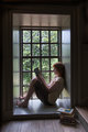
OK, some may feel it's pushed too far, but I love warm pictures that feel like they have glow...my only concern is that I'm starting to wonder about post processing on my iMac and MacBook, which both have glossy screens. I'm thinking that what I see when I'm processing is not what is actually there...

If you like it I'll talk you through the processing. If not, then I guess I won't need to. :-)
- Alex
|
|
|
|
06/15/2010 01:34:02 AM · #43 |
Originally posted by Alex_Europa:
OK, some may feel it's pushed too far, but I love warm pictures that feel like they have glow...my only concern is that I'm starting to wonder about post processing on my iMac and MacBook, which both have glossy screens. I'm thinking that what I see when I'm processing is not what is actually there...
If you like it I'll talk you through the processing. If not, then I guess I won't need to. :-)
- Alex |
Disregarding the issue of whether the warm color is an improvement (in my eyes, definitely), just on tonalities alone this is a dramatic improvement. There is readable detail everywhere there needs to be, but the bright spots are in a natural-looking relationship with the shadows, so there is depth and luminosity where, in the original, there was a sense of dull flatness.
Well done! I can cross that one off my list, no need to try to improve on this :-)
ETA: The inclusion of the paneling on the stairwell is a huge asset for this image...
Message edited by author 2010-06-15 01:35:16.
|
|
|
|
06/15/2010 05:18:40 AM · #44 |
And my three exposures, also from -2, 0 and +2.
  
|
|
|
|
06/15/2010 12:05:51 PM · #45 |
I only had two:
This was the result:
|
|
|
|
06/15/2010 12:21:38 PM · #46 |
I would be interested in learning from  DrAchoo and Bear_Music how they edited their HDRs. I loved both, and it would be great if they are willing share the skills:-):-) DrAchoo and Bear_Music how they edited their HDRs. I loved both, and it would be great if they are willing share the skills:-):-) |
|
|
|
06/15/2010 12:32:57 PM · #47 |
These 3 originals are not correct for HDRI. The brightest original should be the one where the shadows look exactly right, and the darkest original should be the one where the highlights look exactly right. Anything outside those two points is making your HDR worse, not better. It gets all muddy, you have to fight it.
This is why you "suddenly lost your photomatix skills", actually, and had to resort to manual blending. You did a good job of that, a very good job, but I suspect you could have done as well from the single, darkest original...
R.
Message edited by author 2010-06-15 12:46:04.
|
|
|
|
06/15/2010 12:45:30 PM · #48 |
Originally posted by Prash:
I would be interested in learning from DrAchoo and Bear_Music how they edited their HDRs. I loved both, and it would be great if they are willing share the skills:-):-) |
From my photographer's comments:
A flat scene has been expanded using Photomatix Pro and Topaz Detail & Simplify. Uncropped, shot in RAW, processed from single original, gradients added top and bottom, touch of PS Diffuse Glow" to bring up luminance in the water.
The single RAW image: 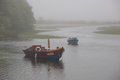
This was tone mapped in Photomatix Pro to bring pop into the scene. Topaz Detail was used aggressively to bring color and luminance, then Topaz Simplify was used to smooth the whole scene out and give it a dreamy quality. Hue/saturation adjustment was done on an adjustment layer. The purplish hue crept into the sky as an artifact of the above processing, and I decided to keep it. I duped off the final, composite image layer and ran Photoshop's "Diffuse Glow" filter at a low level to bring up the lighter parts of the water surface. the "channels". I added a multiply layer above the whole thing and popped in gradients top and bottom. I resized to 1600 pixels, duped BG and sharpened, repeated twice more, resized to 800 and sorted through the sharpenings, eventually keeping 1 1/2 layers of it; this is "Adamus Sharpening".
R.
|
|
|
|
06/15/2010 01:06:12 PM · #49 |
Originally posted by Alex_Europa:
OK, some may feel it's pushed too far, but I love warm pictures that feel like they have glow...my only concern is that I'm starting to wonder about post processing on my iMac and MacBook, which both have glossy screens. I'm thinking that what I see when I'm processing is not what is actually there...
If you like it I'll talk you through the processing. If not, then I guess I won't need to. :-)
- Alex |
Thanks, Alex. I'd be interested in the steps, but I also think it's overly warm. Would you be willing to put it in your workshop so that I can play with it? I'm curious what the tonal aspects look like when it's not quite as warm. (that was some of the issues I was having with photomatix; it was creating some really bizarre colors -- yours aren't bizarre, they're much better than what I came up with, but I'd still like to play a little.)
thanks!
|
|
|
|
06/15/2010 02:17:05 PM · #50 |
Originally posted by Bear_Music:
These 3 originals are not correct for HDRI. The brightest original should be the one where the shadows look exactly right, and the darkest original should be the one where the highlights look exactly right. Anything outside those two points is making your HDR worse, not better. It gets all muddy, you have to fight it.
This is why you "suddenly lost your photomatix skills", actually, and had to resort to manual blending. You did a good job of that, a very good job, but I suspect you could have done as well from the single, darkest original...
R. |
Awesome, it's good to know these things, for the next shot :)
I still have to analyse the scene first, and not just put it in auto-bracketing and hope to get a good range.
Thanks for the valuable tip, Robert!
|
|


