| Author | Thread |
|
|
05/08/2010 06:15:47 AM · #1 |
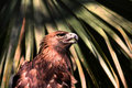
On the most recent Free Study, I earned the lowest score (both actual score and percentile wise) I've ever gotten on any of the DPC contests I've entered. I'm quite confused, because I thought this was one of the best entries I've ever submitted to DPC. I would have consolation if there were comments for my work, but unfortunately, there were only 3, and those people seemed to really like my work.
At some level, I feel like I was robbed, but I also want to learn from what I did wrong. I know it could have been sharper, I know how I could have achieved that sharpness, but .. I just want input on anything that could have been improved. It disappoints me greatly to see that what I thought was my best submission yet achieved lower scores than my first submission, something I thought was subpar.
|
|
|
|
05/08/2010 06:19:04 AM · #2 |
|
5.6 isnt bad, but that is a neat image, it's probably the lighting and the crop. im not critique expert so sorry. |
|
|
|
05/08/2010 06:27:11 AM · #3 |
What I would have tried to achieve with this image is the illusion of greater depth of field.
I looked at you comments on the entry and I like what you have done but if you have done all those adjustments by selecting just the bird itself you would have a much better image IMO.
There is very little separation of background and your processing has added to this with the whites taking the same colour cast as the bird if you created a blur for the background by post processing or better still in camera the image would have gained some contrast but as it stands there is very little to give that wow factor.
All in all I think you have scored quite well for the way this image has been presented.
Message edited by author 2010-05-08 06:27:41. |
|
|
|
05/08/2010 06:27:47 AM · #4 |
First, I looked at your other entries and this was not your best and in my opinion it was one of your worse entries. The photo is a little a soft, the eye is just not in sharp focus and without that you are not going to get a real high score. Also there is nothing about the photograph that really pops out and gets your attention. I think it is the background that just turns me off from the photograph but I am not sure. Maybe a tighter crop would have worked better.
Just my 2 cents.
Ronnie
|
|
|
|
05/08/2010 06:37:36 AM · #5 |
To me it's a case of too much palm, not enough eagle. 5.6 is not to be sniffed at, especially in a free study. Try getting a 3 point something and a brown ribbon. Been there done that more than once.
|
|
|
|
05/08/2010 09:21:16 AM · #6 |
|
To me it's the harsh lighting and softness of the bird that lets this image down. The palm is not an issue for me. |
|
|
|
05/08/2010 09:36:44 AM · #7 |
|
Since nobody has mentioned it, I will. Your background is too bright and in focus. Blur the background and maybe darken it and you'll see an improvement instantly. Lighting is harsh but you weren't in a studio so you used the most natural light of all, the sun, try diffusing that sucker on a cloudless day on location? lol Unless you carry 8ft wide diffusing screens but I don't think so. ;) |
|
|
|
05/08/2010 10:33:04 AM · #8 |
A few more thoughts --
(i) its a free study, and competition is always tougher there ... especially with bird shots. While your shot is nice (a tighter crop may have improved it, imo), there were a number of other bird shots in the challenge that are better. I think most voters, intentionally or not, tend to grade on a curve, comparing like shots to one another in handing out scores
(ii) look at your vote distribution. Most people gave you a 6 or 5, and you had a good number of 7s, but fell off a cliff after that with only a few 9s 9s and 10s. That didn't give you the chance to balance out all those 3 and 4 votes.
(iii) been said hundreds of times before, but if you like the shot forget the score. hard to do but, really, its just a collective snap judgment of the DPC masses. Perhaps a good indicator of instant appeal, but not necessarily a reliable measure of the "goodness" of your work. |
|
|
|
05/08/2010 10:48:22 AM · #9 |
Left you a long message with the photo.
I think it's amazing - very edgy and (thankfully) different. |
|
|
|
05/08/2010 11:25:45 AM · #10 |
Posted my opinion on your photo: just my two cents, which is worth about 1.24 pennies in today's economy :(
Anyway - hopefully my 2c will at least show my perspective. :) |
|
|
|
05/08/2010 11:31:33 AM · #11 |

this photo scored lower than yours. it is by any reasonable standard magazine quality photojournalism.
dpc voters are incompetent to judge photography.
feel better? |
|
|
|
05/08/2010 12:19:47 PM · #12 |
I also didn't think that it was your best photo by any means - the jaguars are better for my money. Don't worry too much about the voters - they are capricious at best.
For curiosity (and based on seeing another massively oversharpened photo do well) I significantly oversharpened my last FS entry:

Just to see what the public would make of that.  glad2badad called me on it (and was right to do so) but he was the only one. I don't think I'll be doing it again though, it doesn't look right and it makes me a vote whore! ;o) glad2badad called me on it (and was right to do so) but he was the only one. I don't think I'll be doing it again though, it doesn't look right and it makes me a vote whore! ;o) |
|
|
|
05/08/2010 12:40:41 PM · #13 |
Originally posted by posthumous:
this photo scored lower than yours. it is by any reasonable standard magazine quality photojournalism.
dpc voters are incompetent to judge photography.
feel better? |
Though responding to all of the people, I thought this was the most fitting message to quote in my reply. First off, wow. That photograph is certainly worthy of a much higher score than it did; once again posthumous, you're right. Second, although the initial shock of having a low score (compared to my other challenge's scores) was painful, I was more upset in the effectively useless comments I received -- the people that ranked me down gave no reason for the low ranking and probably gave their critiques to a more impressive picture (or perhaps worse picture, either way, it left me with nothing). With no information from others, I have nothing to work with.
And now to respond to each person in.. pretty much the order I feel like. I apologize if I missed someone.
Jac, keegbow: taking a second look at the photograph, much more closely at the background, and perhaps how distracting it is, I definitely see the potential problem there. Although my eyes don't wander about the background too much when I look at the photograph (they actually do what I had intended, first looking at the eagles eye and then at the shape of the eagle's head and then off to the rest of the photograph, including the streaks of light that shine down on the eagle), they are sometimes distracted by it. The most annoying part of the background, I found even before I posted the image, though I neglected to remove it for thinking it was too much post processing, was the small off-color dot at the 1 o'clock point of the image. It's not only that point, though, but the entire presence of the frons behind the golden eagle. They are the same brightness as the bird (affected by the same light, it's little wonder), and because of this, the busy-ness of the frons really can detract from the photograph.
Everyone that mentioned the photographs softness: first off, to be sure, the frons are not in near the focus as the bird. And second. Yes, this was probably the single most irritating part about this photograph to me, hands down. If my photographic knowledge serves me, I was near the sharpest point of the lens, as far as the aperture is concerned, but I was using this lens at 300mm, and it's known to not be relatively soft. I did what I could to try and fix that, but nothing ever came out perfect; most of the time it just looked post processed, more post processed than it was, already.
Kobba: at first, I wouldn't have agreed with you, I really wouldn't have. I was incredibly proud of this photograph, and the way the light worked on the image (the diagonal lines of light pointing toward the eagle), and, despite what people have been saying about harsh light on the eagle, I still hold that to be my favorite part about this image. However, having looked at my gallery, ignoring the fact that my highest scoring photo to date actually has quite bad subject motion in it and the eyes are actually the part that shook (look closely, you'll see), I'd have to say that, save my first entry to this place, this is possibly my weakest entry on at least one regard, than all my other photographs.
Really, thank you all for your comments and critiques, and you're slight bit of biting remark. It's what I had been looking for.
Edit: FrankRobinson posted before I finished my reply and I didn't notice. Yes, I really disapprove of the over-sharpening of photographs and what they do to the resultant image. I admit, though, if you hadn't called me on it, I would have probably been one of the "OOO PRETTY KITTY!" responses and given you a 6+ (my actual response has now been scarred by hearing about the oversharpening). And, hehe, I really liked the Polkadotted Grumps photograph, too. Too bad I decided to shoehorn it into the polka-dots competition, I would have liked to see how it would have really scored
Edit 2: I'm looking at some of the other photographs that scored lower than mine this contest and I'm disappointed ... there are ones that were certainly better than mine and got lower scores...
Message edited by author 2010-05-08 12:52:43. |
|
|
|
05/08/2010 01:14:00 PM · #14 |
I wouldn't say you were marked down so much as the image just didn't receive a lot of 6+ votes. The problem was you received a lot of 5's which tells me that the voters judged this to be average. And unfortunately, with images that around the 5.5 range they don't get a lot of comments especially in a free study. Free studies also have a lot more images so its really hard to stand out in the crowd. Again, its not because of any glaring deficiency in your image, it just wasn't especially remarkable.
Keep in mind too that you have only a few challenges under your belt so you don't really have a very large sample to compare to. :)
edit to add: Keep in mind that 5.5 is the site average so your score is actually ABOVE average
Message edited by author 2010-05-08 13:17:08. |
|
|
|
05/08/2010 01:23:49 PM · #15 |
|
Low score? hahahaha, no no no, if you want to see a low score look at my entry lol |
|
|
|
05/08/2010 01:33:50 PM · #16 |
In a nutshell, the image is chaotic. Chaotic doesn't do well on DPC, even "good" chaotic like the rice-blessing photo Posthumous mentioned, and this isn't very good chaos to my eye. The fronds are at war with the bird, plain and simple. Making the fronds sharper would have made it even more chaotic. I'd have opted, given the choice, for having the fronds much more OUT of focus, actually.
That's my take on it, anyway...
R.
|
|
|
|
05/08/2010 05:16:24 PM · #17 |
Originally posted by Bear_Music:
Making the fronds sharper would have made it even more chaotic. I'd have opted, given the choice, for having the fronds much more OUT of focus, actually. |
Did I say make the frons more in focus? I didn't mean to say that, if I did |
|
|
|
05/08/2010 06:35:22 PM · #18 |
Originally posted by sukuriant:
Jac, keegbow: taking a second look at the photograph, much more closely at the background, and perhaps how distracting it is, I definitely see the potential problem there. Although my eyes don't wander about the background too much when I look at the photograph (they actually do what I had intended, first looking at the eagles eye and then at the shape of the eagle's head and then off to the rest of the photograph, including the streaks of light that shine down on the eagle), they are sometimes distracted by it. The most annoying part of the background, I found even before I posted the image, though I neglected to remove it for thinking it was too much post processing, was the small off-color dot at the 1 o'clock point of the image. It's not only that point, though, but the entire presence of the frons behind the golden eagle. They are the same brightness as the bird (affected by the same light, it's little wonder), and because of this, the busy-ness of the frons really can detract from the photograph.
|
As I mentioned in my earlier post you needed more separation of the subject and background. The best way to achieve this would have been in camera but since you didn't you could have simply applied a blur layer over the background and darken or any number of things to help the subject stand out.
I was interested to hear how you view the photo and I think thise is where you make the mistake!! no one looks at your photo the way you the photographer looks at it especially here in a challenge, in general, here voters get a first impression look and vote accordingly. The first impression of this picture is in my view "too busy"
Can I suggest you do a few re-edits and see for yourself if you could have improved it, then maybe repost here. |
|
Home -
Challenges -
Community -
League -
Photos -
Cameras -
Lenses -
Learn -
Help -
Terms of Use -
Privacy -
Top ^
DPChallenge, and website content and design, Copyright © 2001-2026 Challenging Technologies, LLC.
All digital photo copyrights belong to the photographers and may not be used without permission.
Current Server Time: 07/19/2026 12:53:39 PM EDT.


