| Author | Thread |
|
|
11/30/2009 07:39:57 PM · #1 |
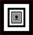
Borders----BIG and W I D E
What is it with these oversize above and below the photo borders?

I agree the photo is outstanding. I also agree with most of the commenter's words...I don't get em . I think they distract. Would not a crop worked better? |
|
|
|
11/30/2009 07:42:13 PM · #2 |
| I think so. And I believe this "letterbox" style of border is meant to emulate the movie-going experience on TV, in a photo on your screen. Or something. |
|
|
|
11/30/2009 07:44:32 PM · #3 |
| I thought so too, however, it is not nearly wide enough pic for that to work well. |
|
|
|
11/30/2009 08:12:50 PM · #4 |
Well, there is 800 pixels worth of real estate to fill now.
FWIW, I thought this border was a big large also and didn't really fit the "letterbox" style either.
But hey, it worked! :-) |
|
|
|
11/30/2009 08:36:14 PM · #5 |
| I am a proponent of the letterbox..used properly..I was surprised at this one...lol..and surprised it ribboned in despite of it (knowing DPC)...I am apprehensive at using the letterbox now..at least for a while...lol |
|
|
|
11/30/2009 08:45:19 PM · #6 |
| personally I use borders alot...I love them...for me they are "frames" for my pictures, if it were on my table at home it would have a frame, therefore...this (DPC) is my table....I try to vary them and I really like the drama that they add...especially in this example...I no longer look at the borders first (unless they are totally terrible) it is the picture that I look at then the border...I think that it compliments the picture and it often does...I wish people would get over the border thing...look past it...see the picture... |
|
|
|
11/30/2009 08:54:11 PM · #7 |
In the case of this photo, I like the border. It isnt the traditional letterbox (which I have used sparingly myself), and the width of the border makes the overall photo square, thus maximizing the available pixels.
I think it would be ridiculous for people to vote an image down because of the border. In my mind that is equivalent to saying that the Mona Lisa is devalued if it is placed in a gaudy frame. The frame/border is secondary. |
|
|
|
11/30/2009 09:09:21 PM · #8 |
I thought the big borders were the sure ticket to a high score. Wrong.
 |
|
|
|
11/30/2009 11:57:13 PM · #9 |
Originally posted by Ja-9:
I think that it compliments the picture and it often does...I wish people would get over the border thing...look past it...see the picture... |
I tried to look, but to me the border is so big it becomes the subject. No idea how it still got a ribbon. Surely would have been a blue ribbon without the god awful border. |
|
|
|
12/01/2009 12:38:46 AM · #10 |
I think a subtle, tasteful border can often complement an image, don't you? ;-)

Seriously, some people will (should) use a largish border to provide a background color other than the standard light gray if it sets off the photo better, though I'm not a big fan of the letterbox style myself. |
|
|
|
12/01/2009 01:56:34 AM · #11 |
| The border on Tareq's image may appear big but on a 24" Wide Screen monitor it gives it a cinematic feel. On a pisswilly 17" / 19" or 1024x768 / 1280x1024 window it looks too large. Think OOB. |
|
|
|
12/01/2009 02:15:54 AM · #12 |
| Also, do you think sometimes it is to show the image off against a black background rather than the grey that is DPC? I think many images look much better against pure black or pure white and adding the border could help with that. Just a thought, I have no insight. |
|
|
|
12/01/2009 04:47:53 AM · #13 |
Personally I think borders should be kept very subtle
|
|
|
|
12/01/2009 05:02:50 AM · #14 |
Originally posted by Lutchenko:
Personally I think borders should be kept very subtle
|
Like this : )

|
|
|
|
12/01/2009 08:56:13 AM · #15 |
Originally posted by Magnum_za:
The border on Tareq's image may appear big but on a 24" Wide Screen monitor it gives it a cinematic feel. On a pisswilly 17" / 19" or 1024x768 / 1280x1024 window it looks too large. Think OOB. |
It's not the size, it's the aspect ratio that's off.
BTW - Want to send me a new monitor that's bigger than a "pisswilly" 19" for Christmas? How's that for OOB? :-P |
|
|
|
12/01/2009 08:58:50 AM · #16 |
Originally posted by salmiakki:
Also, do you think sometimes it is to show the image off against a black background rather than the grey that is DPC? I think many images look much better against pure black or pure white and adding the border could help with that. Just a thought, I have no insight. |
That thought can be picked up and discussed in this thread --> I wish we could. :-D |
|
|
|
12/01/2009 09:14:36 AM · #17 |
I think people would be better served trying to understand how and why they work instead dismissing them for whatever reason...
Like anything else, they don't always work but what I find is that they wonderfully plant the eye into the image and help accentuate contrast. So, here on DPC in particular, with the sites standard gray background, they are very effective. Look at 1x.com and how images pop out on black...there's a world of difference in how images appear. I think my work looks better over there and these borders are a creative way of achieving that effect.
If you think about it many companies have different versions of their logo...black lettering on a white background or vice versa and perhaps other variations for where they will be used. The same exact image will be framed different ways depending on the home or wall which it is placed. Makes sense doesn't it...?
Works for me.
eta:  nixter uses them to great effect. They're perfect for his work and help bring out the shadows and toning. nixter uses them to great effect. They're perfect for his work and help bring out the shadows and toning.
It's pretty clear what the large border does for those images.
Message edited by author 2009-12-01 09:21:35. |
|
|
|
12/01/2009 09:35:11 AM · #18 |
Originally posted by glad2badad:
It's not the size, it's the aspect ratio that's off.
BTW - Want to send me a new monitor that's bigger than a "pisswilly" 19" for Christmas? How's that for OOB? :-P |
Lol, I have 2 pisswilly 19" Sony LCD's at 1280x1024. Thus the comment. I'll swop you them for a 24" Wide seeing as "it's the season to be jolly...fo lo lo lo lah la lah lah lah" |
|
|
|
12/01/2009 09:36:53 AM · #19 |
| Interesting thread, glad I found it. Personally I am not a fan of borders, letterbox or otherwise, but generally don't let that affect my voting unless the border seems to be there only to gaudy up an otherwise blah picture. In that case, imho, the border is there to do the job of the photo. |
|
|
|
12/01/2009 09:39:03 AM · #20 |
| Borders are a crutch that many DPC photographers rely on to make up for lower quality exposures. |
|
|
|
12/01/2009 09:44:31 AM · #21 |
Originally posted by Lutchenko:
Personally I think borders should be kept very subtle
|
Hehe Will, about as subtle as an Elephant tiptoeing through Tulips... |
|
|
|
12/01/2009 10:13:36 AM · #22 |
Originally posted by snaffles:
...Personally I am not a fan of borders, letterbox or otherwise, but generally don't let that affect my voting unless the border seems to be there only to gaudy up an otherwise blah picture... |
Surely everything inside the site's 1 pixel line is there to be voted on, including the border?
To me the question is are these borders affecting the vote received? I've yet to see a comment complementing this style of border, but I have seen and given comments that show a dislike, potentially implying a loss of score.
Personally I dislike them, so given two similar quality images I would have a bias to giving a higher score to an image without this style of border.
Message edited by author 2009-12-01 10:14:18. |
|
|
|
12/01/2009 10:38:37 AM · #23 |
| How do you guys feel about frames on paintings (or photo's) in Museums? |
|
|
|
12/01/2009 10:49:38 AM · #24 |
Originally posted by paynekj:
... To me the question is are these borders affecting the vote received? I've yet to see a comment complementing this style of border, but I have seen and given comments that show a dislike, potentially implying a loss of score. ... |
Many are quick to point out faults, and some fail to comment on elements that compliment a photo and it's presentation. What I'm saying here is that sometimes it's likely that a border enhances the viewers experience, yet not to the degree to say something about it. Many successful photos here at DPC have used a letterbox border and may not have been seen as favorably without it.
Do borders influence a score? Sure they do. Is it always visible as to positive/negative feedback? No. Different strokes for different folks. :-)
Just give the photographer some background options for the voting page presentation of their challenge entry and the border issue goes away. :-D Of course, that would open another can of worms. Always a can to be opened or discussed here at DPC. Rarely a consensus on anything. |
|
|
|
12/01/2009 06:59:56 PM · #25 |
Well, I have no problem with the four b/w examples shown by pawdrix. They work well with those photos even though they make the pics looked chopped off on the right and left. It seems a small line on each end would be in order. But, what if they were in color rather than black? I wouldn't think they would be nearly as appealing.
"It's not the size, it's the aspect ratio that's off."
Probably.
"How do you guys feel about frames on paintings (or photo's) in Museums?"
I think they are fine, kind of adds a finished look. However, I have yet to see a framed painting or photo with only half a frame, be it top/bottom or ends or a combination of the two. (or three)
Regardless, it's a nice picture....deserving a ribbon as are others in the challenge. |
|
Home -
Challenges -
Community -
League -
Photos -
Cameras -
Lenses -
Learn -
Help -
Terms of Use -
Privacy -
Top ^
DPChallenge, and website content and design, Copyright © 2001-2025 Challenging Technologies, LLC.
All digital photo copyrights belong to the photographers and may not be used without permission.
Current Server Time: 10/13/2025 08:39:47 AM EDT.


