| Author | Thread |
|
|
11/24/2009 03:49:28 PM · #51 |
|
I would love to see something like this happen... |
|
|
|
11/24/2009 04:42:02 PM · #52 |
Played with it a little. Working with trial version of cs4.

|
|
|
|
11/24/2009 04:46:39 PM · #53 |
A bit of blur and split toning...

|
|
|
|
11/24/2009 04:54:06 PM · #54 |
Originally posted by clive_patric_nolan:
A bit of blur and split toning...
|
That's cool! Definitely makes the view itself the focal point.
|
|
|
|
11/24/2009 05:07:25 PM · #55 |


These are just amazing pictures to miss an opportunity - Thanks for sharing them! .. I barely have any photoshop skills.. but here is my take at one of them! Only Photoshop - no Topaz or HDR (don't know how to use them effectively yet!)
Message edited by author 2009-11-24 17:17:36. |
|
|
|
11/24/2009 07:58:05 PM · #56 |

Nothing major done.
levels
curves
new layer
B&W
erase
USM
new layer
Gaussian Blur hard light setting
USM
bump up the saturation |
|
|
|
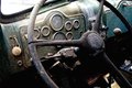
11/24/2009 08:46:11 PM · #57 |

Lets see, what did I do? I sometimes have a hard time remembering, one day I shall start to write this stuff down.
levels
curves
burn the shadows
saturation bump
USM
new layer
gaussian blur hard light (yes I know, used it on window as well) I rather like the effect
USM
I didn't crop it as much as others have, one I like the knob and rust in that area and I think that showing some of the window, even though its blown out, helps tell the whole story. I also really like the clutter on the floor.
Message edited by author 2009-11-24 20:48:17. |
|
|
|
11/24/2009 10:08:08 PM · #58 |
Originally posted by cryan:
Nothing major done.
levels
curves
new layer
B&W
erase
USM
new layer
Gaussian Blur hard light setting
USM
bump up the saturation |
NICE!!!!
I like the way you guys seem to be making this all about the view. I kinda liked having the window a major portion of the image when I did it the first time, but I'm thinking now after seeing the edits that make the window itself recognizable, but secondary to the view, the edits are actually more in keeping with the theme.
|
|
|
|
11/24/2009 10:09:10 PM · #59 |
I wanted to try this after seeing the conversions. Little different crop, rotation, and *NO* Topaz! LOL!!!

|
|
|
|
11/24/2009 10:11:28 PM · #60 |
Originally posted by vikas:
These are just amazing pictures to miss an opportunity - Thanks for sharing them! .. I barely have any photoshop skills.. but here is my take at one of them! Only Photoshop - no Topaz or HDR (don't know how to use them effectively yet!) |
I like these, save for one thing.....
I'm seriously anal/OCD, and I restored cars for years.
That add-on horn button just hanging there with two screws rammed through that beautiful dash and the wires just trailing through a hole all but make me cry.
|
|
|
|
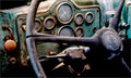
11/24/2009 10:21:03 PM · #61 |

A slightly alternative take on  cryan's take. cryan's take.
|
|
|
|
11/24/2009 10:34:46 PM · #62 |
Originally posted by NikonJeb:
I like these, save for one thing.....
I'm seriously anal/OCD, and I restored cars for years.
That add-on horn button just hanging there with two screws rammed through that beautiful dash and the wires just trailing through a hole all but make me cry. |
lol
I purposefully kept it in because it was a nice balance to the gearshift, which I wanted to keep in because I liked it.
Message edited by author 2009-11-24 22:35:32. |
|
|
|
11/24/2009 10:47:55 PM · #63 |
Originally posted by NikonJeb:
I like these, save for one thing.....
I'm seriously anal/OCD, and I restored cars for years.
That add-on horn button just hanging there with two screws rammed through that beautiful dash and the wires just trailing through a hole all but make me cry. |
Originally posted by spiritualspatula:
lol
I purposefully kept it in because it was a nice balance to the gearshift, which I wanted to keep in because I liked it. |
No, really, I'm fine.......twitch
|
|
|
|
11/24/2009 10:50:55 PM · #64 |
Originally posted by NikonJeb:
No, really, I'm fine.......twitch |
Look at things ilke this; You should be happy there isn't any duct tape or similar holding something together. |
|
|
|
11/25/2009 06:21:04 AM · #65 |
Originally posted by NikonJeb:
No, really, I'm fine.......twitch |
Originally posted by spiritualspatula:
Look at things ilke this; You should be happy there isn't any duct tape or similar holding something together. |
I hate seeing beautiful old things like this wasting away into nothing.
Lately, I've been seeing a lot of the things that I've shot in the past couple of years disappearing entirely.
That's really sad, IMO, 'cause not only am I losing subject material, but these glimpses into the past are gone forever.
|
|
|
|
11/25/2009 03:53:25 PM · #66 |
One of my first photoshops, be kind... I might have gone overboard. Thanks for the great image to practice with.
 |
|
|
|
11/25/2009 04:07:47 PM · #67 |
Here's mine. I really love this old stuff.
 |
|
|
|
11/25/2009 04:07:54 PM · #68 |
Originally posted by vikas:
These are just amazing pictures to miss an opportunity - Thanks for sharing them! .. I barely have any photoshop skills.. but here is my take at one of them! Only Photoshop - no Topaz or HDR (don't know how to use them effectively yet!) |
I know borders are often taboo here on DPC, but they are used wondefully here. I like the crop |
|
|
|
11/25/2009 05:15:34 PM · #69 |

My goal was to get close to what Jeb did with PS and Lightroom. Jeb's is better, but I didn't do badly considering I don't really do grunge. |
|
|
|
11/25/2009 06:37:49 PM · #70 |
I couldn't resist...I had to play,car...grain...seriously.

In CS3, I saturated, played with the contrast...then in NIK Color Efex 3.0 I used the Darken/lighten edges to darken the edges. I then opened it in Alien Skin Exposure and used one of my presets, which was a derivative of the Daguerreotype preset that is a "prepackaged" preset that comes with the filter set. I was going for a more noir vibe, a habit of mine I guess.
: } |
|
|
|
11/26/2009 08:18:19 PM · #71 |
I couldn't go with B&W.....I loved the one I did on the Mack, both with the orientation change and B&W conversion, but this one......

....I just like everything about the original configuration, and I love the color.
Whadda y'all think of the re-edit????
|
|
|
|
11/26/2009 09:17:41 PM · #72 |
Just a stab at is as I love the subject:
 |
|
|
|
11/27/2009 07:00:25 AM · #73 |
Originally posted by NikonJeb:
I couldn't go with B&W.....I loved the one I did on the Mack, both with the orientation change and B&W conversion, but this one......
....I just like everything about the original configuration, and I love the color.
Whadda y'all think of the re-edit???? |
I really like it. Looks much more real than your challenge entry.
|
|
|
|
11/27/2009 09:13:24 AM · #74 |
Originally posted by GinaRothfels:
I really like it. Looks much more real than your challenge entry. |
Uh....thanks, I think.....8>)
|
|
|
|
11/27/2009 11:07:10 AM · #75 |
Thanks Jeb that was fun.
No clue all I did, Sorry ;p
 |
|
Home -
Challenges -
Community -
League -
Photos -
Cameras -
Lenses -
Learn -
Help -
Terms of Use -
Privacy -
Top ^
DPChallenge, and website content and design, Copyright © 2001-2026 Challenging Technologies, LLC.
All digital photo copyrights belong to the photographers and may not be used without permission.
Current Server Time: 07/19/2026 03:50:40 PM EDT.


