| Author | Thread |
|
|
04/09/2009 11:13:42 AM · #976 |
I have had loads of rejects recently; here are a few of them:


|
|
|
|
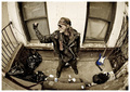
04/09/2009 11:43:20 AM · #977 |
Originally posted by ursula:
Probably wouldn't make a difference in the end, but ... the blue guitar gets a lot of visual attention in this otherwise rather evenly brown-tones image. Did you leave it as it is to intentionally stand out, or simply because it was there that way, or what? The other two things: (1) it is a very centred compo, which some at least might object to, and (2) the face "feels" not sharp (it is, I think, but it feels that way, maybe because the hand/body/fore and background contain so many sharp parts). I like this photo, but in this case, the addition of a hat and/or goat would probably not do it. Although, it would be an interesting thing to look at, with the hat/goat. :) |
Believe it or not the blue guitar is toned down. It's a very rich detailed metalic blue and honestly I like it. I enjoy people moving around the frame and picking different details as they are true and simply reality. I know people have problems with cluttered images but occasionally that's the point, like in this case. And those afflicted with the "Aquired ADD" usually don't like my work. No biggie but you'd hope the screeners at 1x are way beyond that.
Centerd compo was chosen because for a few reasons mostly because he would have looked like Shaggy from Scooby Doo with curvature of the spine if placed on either side of the frame with the fisheye. The fisheye also sizes down his significance and "rage" in a cartoonish way which he play into. Almost like a Robert Crumb character (Natural Man for example) from the 60's. His head looks sharper in the one I posted at 1x and was probably the exact point of focus...don't remember.
At the very least, a well thought out image...nothing gratuitous, even though it might appear campy. What else can you do?
I still might try the goat and straw hat. :0
Honestly...I wouldn't change a single thing.
eta: Thanks for the critique. I know all that stuff going in but keep hopeful that people will see the intent. 1x generally sees my work more clearly than DPC but some of the more sublte things/messages I try to get in don't always cut it.
Message edited by author 2009-04-09 12:05:18. |
|
|
|
04/09/2009 01:00:21 PM · #978 |
 Most recent reject from 1x. Most recent reject from 1x.
 Most recently published image at 1x. Most recently published image at 1x. |
|
|
|
04/09/2009 01:54:51 PM · #979 |
Originally posted by pawdrix:
Originally posted by ursula:
Probably wouldn't make a difference in the end, but ... the blue guitar gets a lot of visual attention in this otherwise rather evenly brown-tones image. Did you leave it as it is to intentionally stand out, or simply because it was there that way, or what? The other two things: (1) it is a very centred compo, which some at least might object to, and (2) the face "feels" not sharp (it is, I think, but it feels that way, maybe because the hand/body/fore and background contain so many sharp parts). I like this photo, but in this case, the addition of a hat and/or goat would probably not do it. Although, it would be an interesting thing to look at, with the hat/goat. :) |
Believe it or not the blue guitar is toned down. It's a very rich detailed metalic blue and honestly I like it. I enjoy people moving around the frame and picking different details as they are true and simply reality. I know people have problems with cluttered images but occasionally that's the point, like in this case. And those afflicted with the "Aquired ADD" usually don't like my work. No biggie but you'd hope the screeners at 1x are way beyond that.
Centerd compo was chosen because for a few reasons mostly because he would have looked like Shaggy from Scooby Doo with curvature of the spine if placed on either side of the frame with the fisheye. The fisheye also sizes down his significance and "rage" in a cartoonish way which he play into. Almost like a Robert Crumb character (Natural Man for example) from the 60's. His head looks sharper in the one I posted at 1x and was probably the exact point of focus...don't remember.
At the very least, a well thought out image...nothing gratuitous, even though it might appear campy. What else can you do?
I still might try the goat and straw hat. :0
Honestly...I wouldn't change a single thing.
eta: Thanks for the critique. I know all that stuff going in but keep hopeful that people will see the intent. 1x generally sees my work more clearly than DPC but some of the more sublte things/messages I try to get in don't always cut it. |
I quite like it myself, ESPECIALLY the blue guitar! I was trying to analyze it from the POV of the screeners, but that's probably silly, since I really am not up with screening at all anymore. I really like pictures that have something different, quirky, about them, and this one does. They often are passed over though ... everywhere, not only at OE.
|
|
|
|
04/09/2009 02:26:54 PM · #980 |
|
|
|
04/09/2009 04:02:57 PM · #981 |
Well, as mentioned at other times...I reckon not all good pictures get accepted. 1x does go for certain styles. A Picture rejected there may receive prestigious praise elsewhere... There are a few pics (of the many) of mine which got rejected which I like better than some (of the few) that were accepted... Of, course the site still remains a great place to check out some top notch work and is a feather in one's cap when a pic of theirs is on display!
Oh, and congrats to Lev for his latest shot up!
Message edited by author 2009-04-09 16:12:44. |
|
|
|
04/09/2009 06:49:16 PM · #982 |
Another reject for me today; a departure from my normal work but I quite like it:

|
|
|
|
04/09/2009 07:01:10 PM · #983 |
Originally posted by Iraklis:
Well, as mentioned at other times...I reckon not all good pictures get accepted. 1x does go for certain styles. A Picture rejected there may receive prestigious praise elsewhere... There are a few pics (of the many) of mine which got rejected which I like better than some (of the few) that were accepted... Of, course the site still remains a great place to check out some top notch work and is a feather in one's cap when a pic of theirs is on display!
Oh, and congrats to Lev for his latest shot up! |
Now, there's a shot that kicks some major ass. Nice work Lev.
New word
Lev-A-Licious adj.
1. Having relatively great weight: AWE-some.
2. Having relatively high density; having a high specific gravity.
3. Granular, spatiotemporal and dynamic (whatever that means...?)
(see: picture)
Message edited by author 2009-04-09 19:17:15. |
|
|
|
04/12/2009 05:47:47 PM · #984 |
|
I'm trying to upload one that I worked pretty hard on, but the uploaded version at 1x shows up different than the local version on my PC. I see some very noticeable artifacts in an area that should be almost black. I looked at it in IE7 and FF -- same thing. So frustrating... |
|
|
|
04/12/2009 09:01:48 PM · #985 |
Originally posted by bvy:
I'm trying to upload one that I worked pretty hard on, but the uploaded version at 1x shows up different than the local version on my PC. I see some very noticeable artifacts in an area that should be almost black. I looked at it in IE7 and FF -- same thing. So frustrating... |
perhaps, it is the black background of 1x what makes a difference in perception - what appears almost black on light backgrounds starts to show gradations of dark gray... |
|
|
|
04/13/2009 09:45:41 PM · #986 |
Rejected.

Thanks, Lev. I confirmed and it wasn't perceptual. I ended up blacking out the problem area which was the microphone stand. All for naught, I guess. I really thought this would fly over there...
|
|
|
|
04/16/2009 10:23:55 AM · #987 |
|
|
|
04/16/2009 04:36:42 PM · #988 |
Given that I think I've had a run of about 40 images rejected after some early success, I don't feel too bad about going off topic slightly to share a success:
So there is hope, even for the recipients of serial rejection like myself!! I probably would've thrown the towel in had I had many more rejected!
Message edited by author 2009-04-16 17:55:03. |
|
|
|
04/16/2009 09:48:28 PM · #989 |
my last couple of rejections...
 
on the bright side, my last published shot garnered more than 80,000 views. isn't that astonishing?! |
|
|
|
04/16/2009 10:44:39 PM · #990 |
Originally posted by pawdrix:
1x generally sees my work more clearly than DPC but some of the more sublte things/messages I try to get in don't always cut it. |
That's probably a good thing. If they accepted everything you entered over there or anywhere for that matter then that's when you know you've compromised too much. It's the same thing with friends. I rather have just one that totally gets me than a thousand who don't. Really when you get down to it showing off your photography is like the bait to finding people who do get you. Unless of course you're just in it for the money or there's a huge hole inside then you compromise like hell. :P
Message edited by author 2009-04-16 22:46:45.
|
|
|
|
04/17/2009 03:18:14 PM · #991 |
Originally posted by yanko:
Originally posted by pawdrix:
1x generally sees my work more clearly than DPC but some of the more sublte things/messages I try to get in don't always cut it. |
That's probably a good thing. If they accepted everything you entered over there or anywhere for that matter then that's when you know you've compromised too much. It's the same thing with friends. I rather have just one that totally gets me than a thousand who don't. Really when you get down to it showing off your photography is like the bait to finding people who do get you. Unless of course you're just in it for the money or there's a huge hole inside then you compromise like hell. :P |
the downside of this filtering process is however that you end up with a portfolio on their site which reflects their collective sensibility as much as yours. OK, maybe not as much, but still.
Message edited by author 2009-04-17 15:18:55. |
|
|
|
04/18/2009 05:04:47 PM · #992 |
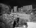
 Pawdrix's theory on third world pictures failed me again - I'm 0 for 2 in that respect. So apparently it's not a 100% deal, Steve! Pawdrix's theory on third world pictures failed me again - I'm 0 for 2 in that respect. So apparently it's not a 100% deal, Steve!
Latest reject:

Then again, not sure if Afghanistan counts as "third world" or not.
Oh, and if there's no info at all on the rejected photo, does that mean it never made it past the screeners into member screening? It did take 24 hours to get rejected.
Message edited by author 2009-04-18 17:31:17. |
|
|
|
04/19/2009 02:14:23 AM · #993 |
Originally posted by Melethia:
Pawdrix's theory on third world pictures failed me again - I'm 0 for 2 in that respect. So apparently it's not a 100% deal, Steve!
Latest reject:
|
Now, I feel like total dirt but you did it all wrong. You took a straight, serious, formal portrait. There's no "A-Liciousness". Afghanistan is 3rd world to the 5th power, for the record...in my book, anyway.
Anything too western kills the vibe, for starters. In this case, maybe the formality.
Candid or slightly candid, muddy dwellings, cracks in the walls, farm animals...Kalashinkov's, opium pipes, anything you'll never see in Indiana...now, we're talkin. Everything before the Kalashinkov's and after the opium pipes you could nail in your sleep. Of course, I'm talkin from my butt in the relative safety of Mid-Town Manhattan but you know what I mean.
...did I mention, I love the shot? |
|
|
|
04/19/2009 02:41:57 AM · #994 |
|
Heh! I'm not too terribly upset about the rejection. I've come to embrace rejection, low scores, and complete ignorance on flickr. All good by me. Glad you like the shot. Hard to get "environment" when he's in a very dark stall complete with a ghastly "Booth number XX" sign over his wares, so I went with the straight candid portrait. I like it. Lately, that's pretty much all I'm looking for. |
|
|
|
04/20/2009 01:39:33 AM · #995 |
|
Now sitting at 46 rejects and 6 published, what's that...a 7% acceptance ratio.....! Feeling somewhat disheartened! |
|
|
|
04/20/2009 03:02:04 PM · #996 |
Think I should try this one, or is the story limited to those here at DPC? :-)
 |
|
|
|
04/20/2009 05:09:13 PM · #997 |
Originally posted by Melethia:
Think I should try this one, or is the story limited to those here at DPC? :-)
|
Wow, thanks Deb! I should get on a plane and claim this car. Don't know about 1x, but rest assured that you'll get at least one "yes" vote :).
oh, by the way, my latest rejection
 |
|
|
|
04/21/2009 01:17:16 PM · #998 |
Rejected...
 |
|
|
|
04/21/2009 02:11:46 PM · #999 |
Ribbon winner........rejected!

|
|
|
|
04/21/2009 02:18:40 PM · #1000 |

One of many rejections in the last few months ...
To put it very bluntly, I am royally p&##*%! Right now I'm thinking that all the talk about learning from your rejections, getting better, blah, blah, is just a bunch of bologna. "Don't whine, don't this, don't that, blah, blah, blah!" Well, maybe all the rejections are good for something after all - if nothing else, they are teaching me to trust my own judgment a lot more and write off all the people who try to shape you (me) into something I'm not. Whatever! I'm happy :)
Plus, I'm done trying. There!
Message edited by author 2009-04-21 14:28:16. |
|
Home -
Challenges -
Community -
League -
Photos -
Cameras -
Lenses -
Learn -
Help -
Terms of Use -
Privacy -
Top ^
DPChallenge, and website content and design, Copyright © 2001-2026 Challenging Technologies, LLC.
All digital photo copyrights belong to the photographers and may not be used without permission.
Current Server Time: 06/24/2026 10:57:28 AM EDT.